Create a Basic Area Chart
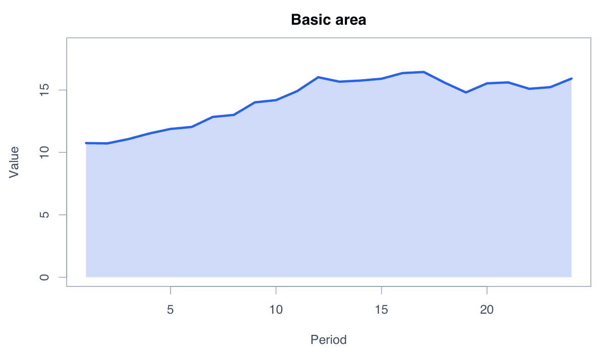
A filled area chart emphasizes the magnitude of a series relative to a baseline.
R Graphics · Area Chart
Create single, stacked, proportional, stepped, uncertainty, and ggplot2 area displays.
Area charts emphasize accumulated magnitude across an ordered axis. They work best with a meaningful baseline and a small number of clearly distinguishable series.
A filled area chart emphasizes the magnitude of a series relative to a baseline.

Run the code, inspect how the visual encoding changes, and adapt the labels, scales, and styling to the analytical question rather than treating the defaults as fixed.
x <- 1:24; y <- cumsum(rnorm(24, .3, .5)) + 10
plot(x, y, type="n", xlab="Period", ylab="Value")
polygon(c(x, rev(x)), c(y, rep(0, length(y))), col="#bfdbfe", border=NA)
lines(x, y, col="#2563eb", lwd=3)Stacked areas show how several components contribute to a changing total.
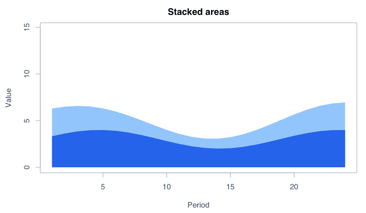
Run the code, inspect how the visual encoding changes, and adapt the labels, scales, and styling to the analytical question rather than treating the defaults as fixed.
x <- 1:20; a <- 3 + sin(x/3); b <- 2 + cos(x/4); c <- 1 + .05*x
y <- rbind(a, a+b, a+b+c)
matplot(x, t(y), type="n", xlab="Period", ylab="Total")
polygon(c(x,rev(x)),c(y[3,],rep(0,20)),col="#dbeafe",border=NA)
polygon(c(x,rev(x)),c(y[2,],rep(0,20)),col="#60a5fa",border=NA)
polygon(c(x,rev(x)),c(y[1,],rep(0,20)),col="#1d4ed8",border=NA)A proportional area chart compares composition while holding the total height constant.
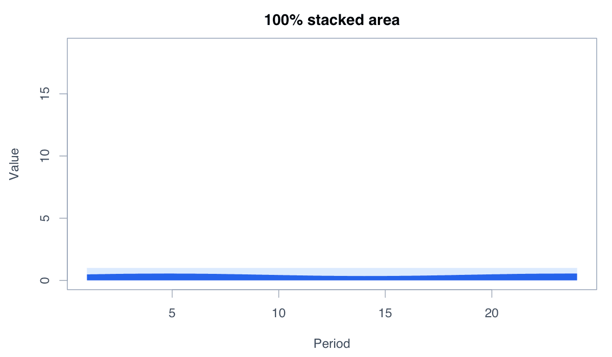
Run the code, inspect how the visual encoding changes, and adapt the labels, scales, and styling to the analytical question rather than treating the defaults as fixed.
x <- 1:20; parts <- rbind(2+sin(x/3), 2+cos(x/4), 1+.05*x)
shares <- apply(parts, 2, function(z) cumsum(z/sum(z)))
plot(x, shares[3,], type="n", ylim=c(0,1), ylab="Share")
for(i in 3:1) polygon(c(x,rev(x)),c(shares[i,],rep(0,20)), col=c("#1d4ed8","#60a5fa","#dbeafe")[i], border=NA)A stepped area is appropriate when values remain constant until the next recorded change.
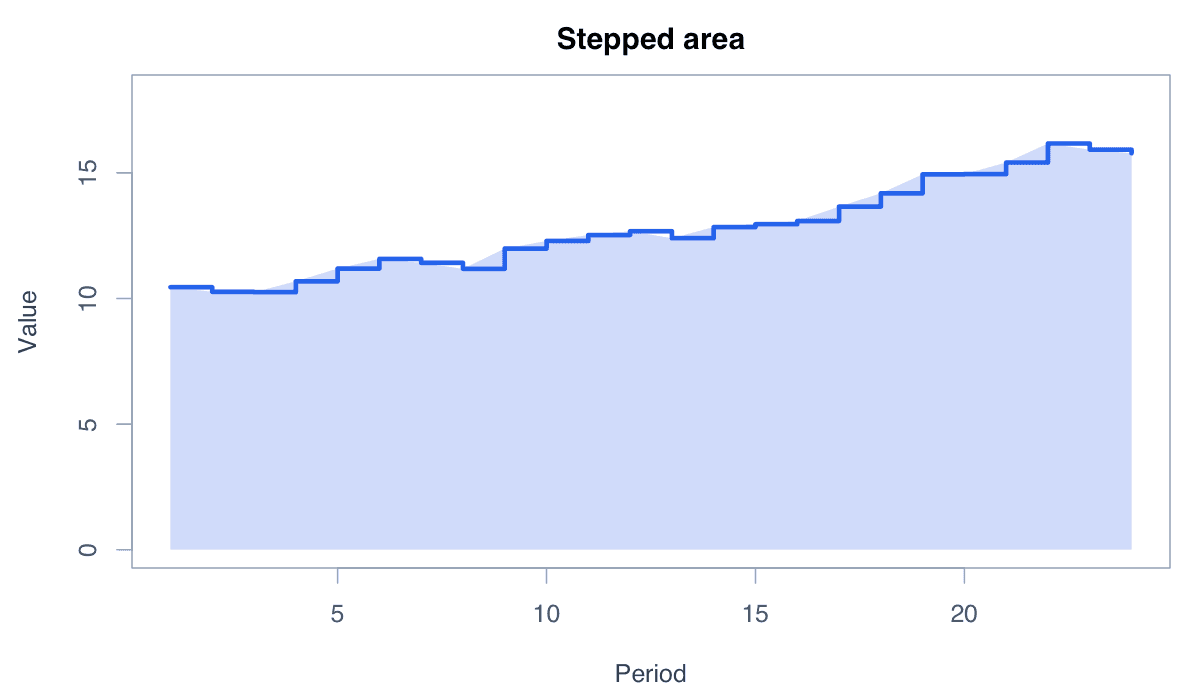
Run the code, inspect how the visual encoding changes, and adapt the labels, scales, and styling to the analytical question rather than treating the defaults as fixed.
x <- 1:12; y <- c(4,4,5,5,7,7,6,8,8,9,9,10)
plot(x,y,type="s",lwd=3,col="#2563eb",ylim=c(0,11))
polygon(c(x,rev(x)),c(y,rep(0,12)),col=adjustcolor("#2563eb",.2),border=NA)A ribbon-shaped area communicates a range around an estimated series.
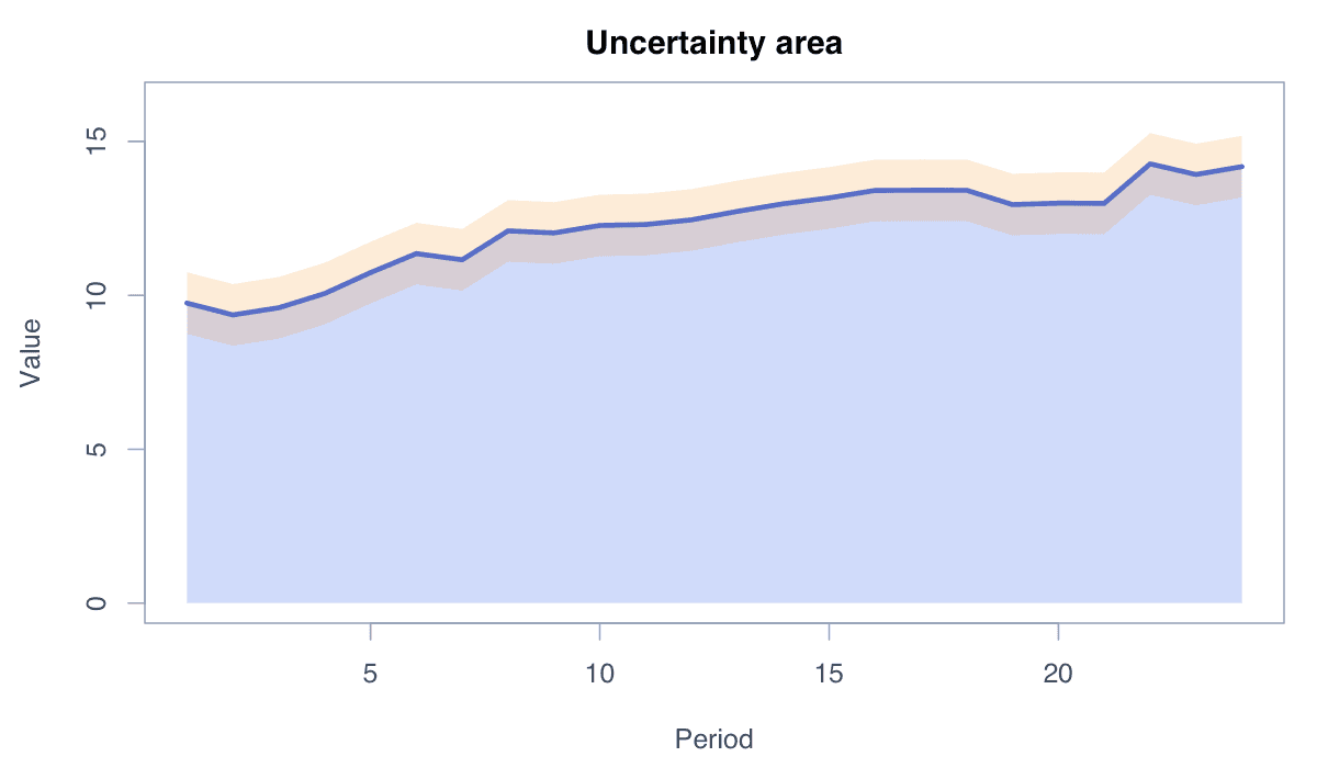
Run the code, inspect how the visual encoding changes, and adapt the labels, scales, and styling to the analytical question rather than treating the defaults as fixed.
x<-1:30; fit<-10+.2*x+sin(x/4); se<-.8+.01*x
plot(x,fit,type="n",ylim=range(fit-se,fit+se))
polygon(c(x,rev(x)),c(fit-se,rev(fit+se)),col=adjustcolor("#2563eb",.2),border=NA)
lines(x,fit,col="#2563eb",lwd=3)geom_area() provides a layered grammar for filled time-series displays.
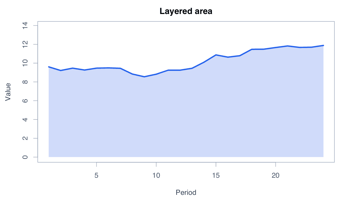
Run the code, inspect how the visual encoding changes, and adapt the labels, scales, and styling to the analytical question rather than treating the defaults as fixed.
library(ggplot2)
data <- data.frame(period=1:24, value=cumsum(rnorm(24,.3,.5))+10)
ggplot(data,aes(period,value))+geom_area(fill="#60a5fa",alpha=.6)+geom_line(color="#1d4ed8")+theme_minimal()