Tutorial · Beginner

R Graphics

Definitions, reproducible R code, and figures generated directly from each example.

19 graph typesBase R

How to use this guide

Choose a graphic, read what it communicates, inspect the output, and run the accompanying code in R or RStudio. Every displayed figure was produced from its example code.

Dataset used in the examples

Getting the Iris dataset in R

Several tutorials use iris, a dataset included with R. It contains 150 flower observations from three iris species, with measurements for sepal length, sepal width, petal length, and petal width. You do not need to download a file or install a package.

Load the dataset, preview its first rows, inspect its structure, and open the official R documentation with the commands shown here.

RLoad and inspect Iris
data(iris)       # Load the built-in dataset
head(iris)       # Display the first six rows
str(iris)        # Inspect variables and data types
summary(iris)    # View descriptive statistics
?iris            # Open the R help page
01

Barplot

A barplot compares numerical values across categories. The length or height of each bar represents the value associated with that category.

Explore the detailed barplot guide →
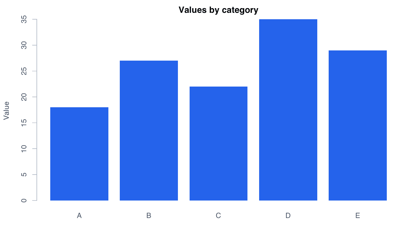
Barplot generated in R
Barplot generated with the R code shown below.
RReproducible code
values <- c(A = 18, B = 27, C = 22, D = 35, E = 29)
barplot(values, col = "#2563eb", border = NA,
        ylab = "Value", main = "Values by category")
02

Boxplot

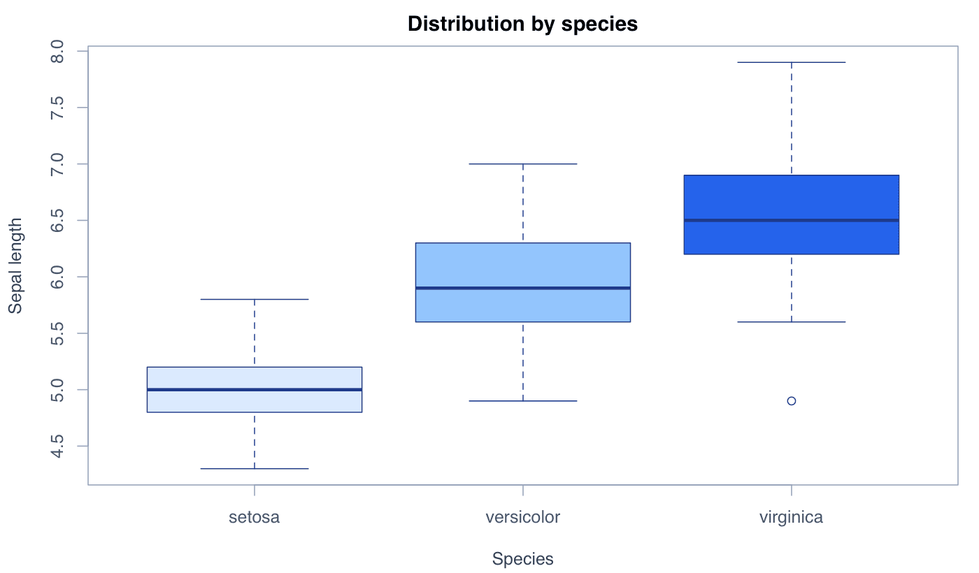
A boxplot summarizes a numerical distribution through its median, quartiles, spread, and potential outliers, making group comparisons compact and clear.

Explore the detailed boxplot guide →
Boxplot generated in R
Boxplot generated with the R code shown below.
RReproducible code
boxplot(Sepal.Length ~ Species, data = iris,
        col = c("#dbeafe", "#93c5fd", "#2563eb"),
        ylab = "Sepal length", main = "Distribution by species")
03

Density Plot

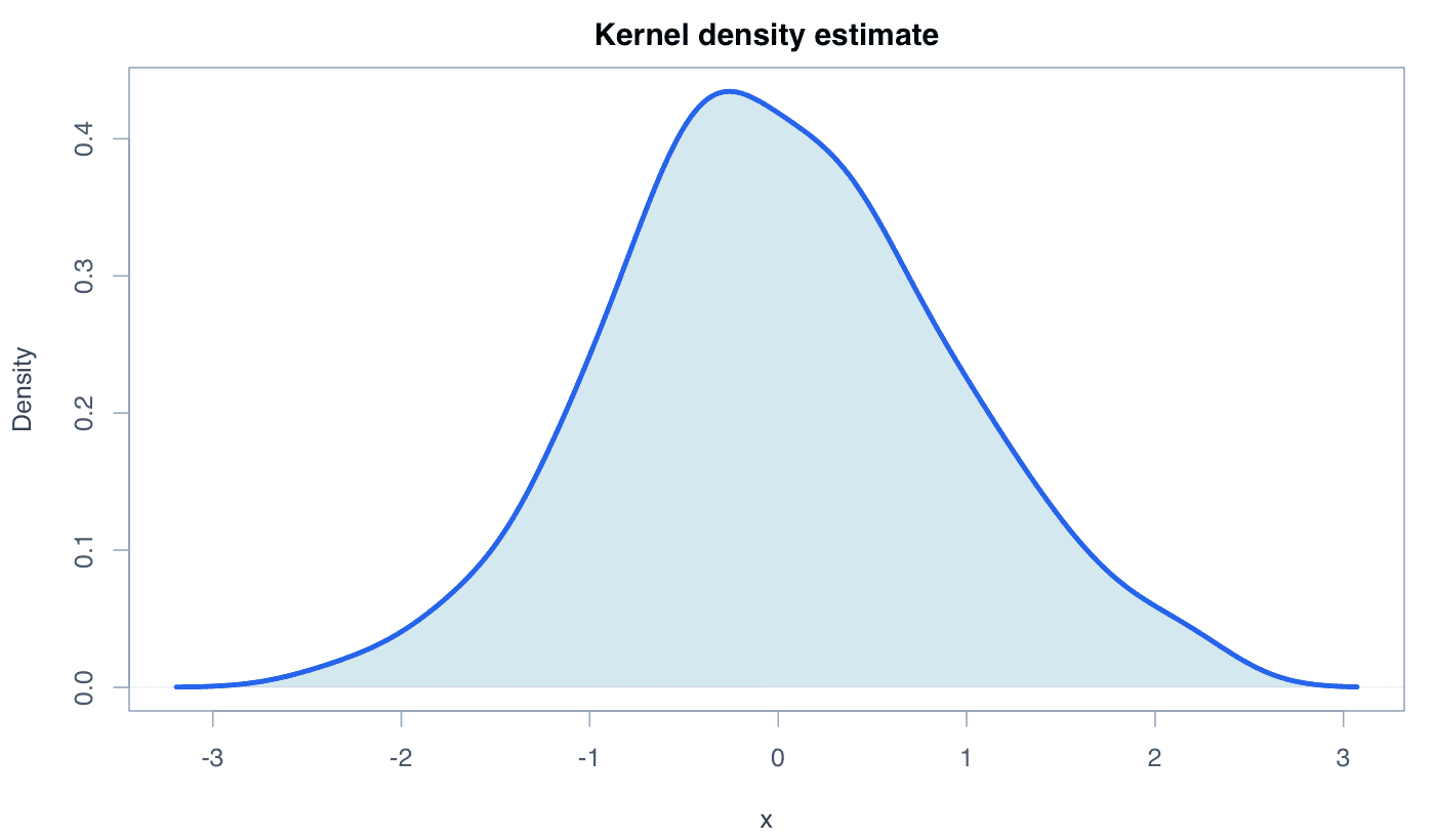
A density plot provides a smoothed estimate of a continuous variable’s distribution. Peaks indicate ranges where observations are concentrated.

Explore the detailed density plot guide →
Density Plot generated in R
Density Plot generated with the R code shown below.
RReproducible code
set.seed(123)
x <- rnorm(120)
d <- density(x)
plot(d, lwd = 3, col = "#2563eb", xlab = "x")
polygon(d, col = adjustcolor("#0891b2", 0.22), border = NA)
lines(d, lwd = 3, col = "#2563eb")
04

Heatmap

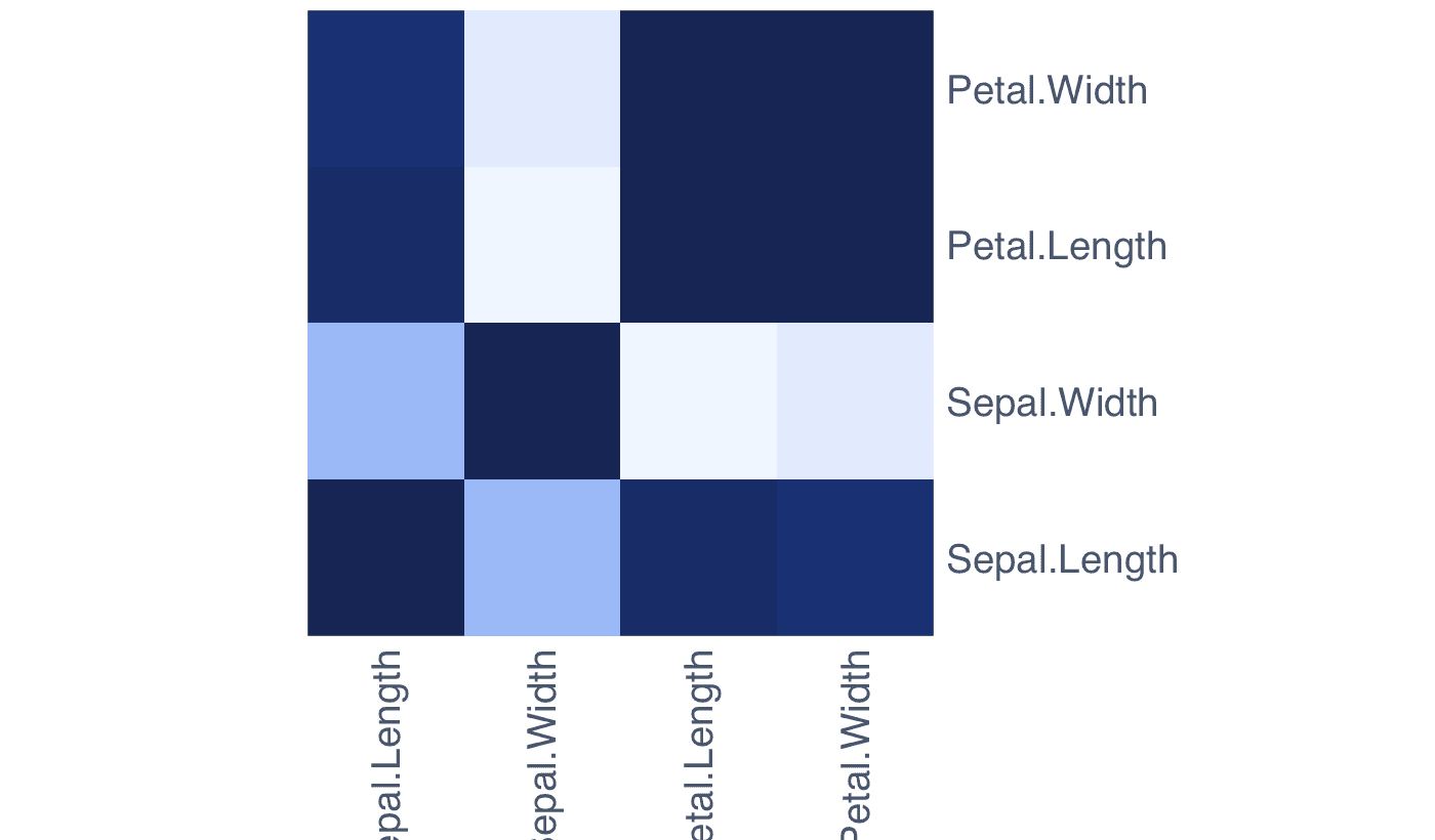
A heatmap represents matrix values with color. It is useful for identifying high and low values, clusters, and correlation patterns.

Explore the detailed heatmap guide →
Heatmap generated in R
Heatmap generated with the R code shown below.
RReproducible code
m <- cor(iris[, 1:4])
heatmap(m, Rowv = NA, Colv = NA, scale = "none",
        col = colorRampPalette(c("#eff6ff", "#2563eb",
                                 "#172554"))(30))
05

Histogram

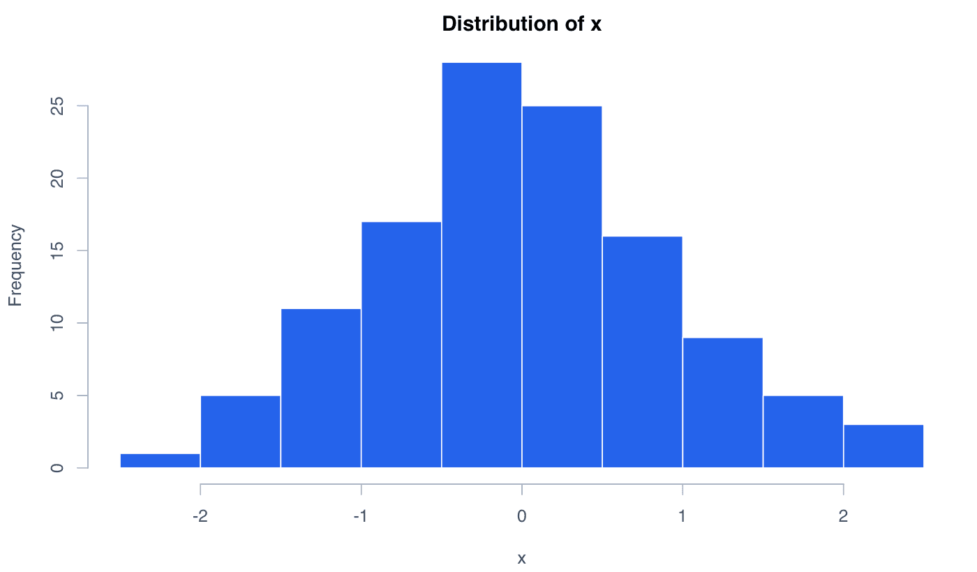
A histogram divides continuous observations into intervals and uses bar heights to show how many values fall within each interval.

Explore the detailed histogram guide →
Histogram generated in R
Histogram generated with the R code shown below.
RReproducible code
set.seed(123)
x <- rnorm(120)
hist(x, breaks = 12, col = "#2563eb", border = "white",
     main = "Distribution of x", xlab = "x")
06

Line Plot

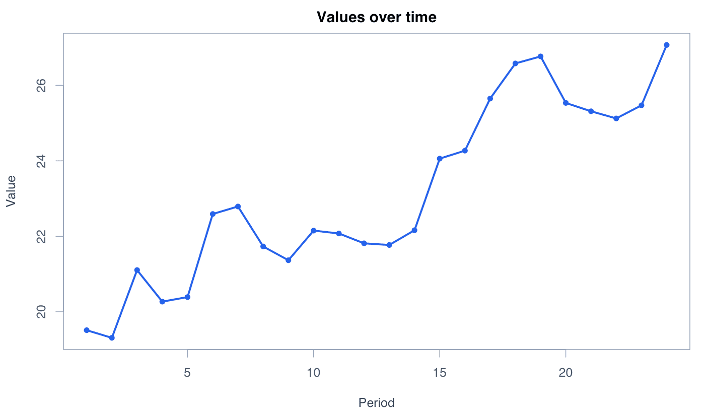
A line plot connects values in sequence, most often through time, to reveal trends, changes, cycles, and turning points.

Explore the detailed line plot guide →
Line Plot generated in R
Line Plot generated with the R code shown below.
RReproducible code
set.seed(123)
values <- cumsum(rnorm(24, 0.3, 1)) + 20
plot(seq_along(values), values, type = "o", pch = 16,
     lwd = 2.5, col = "#2563eb", xlab = "Period",
     ylab = "Value", main = "Values over time")
07

Pairs Plot

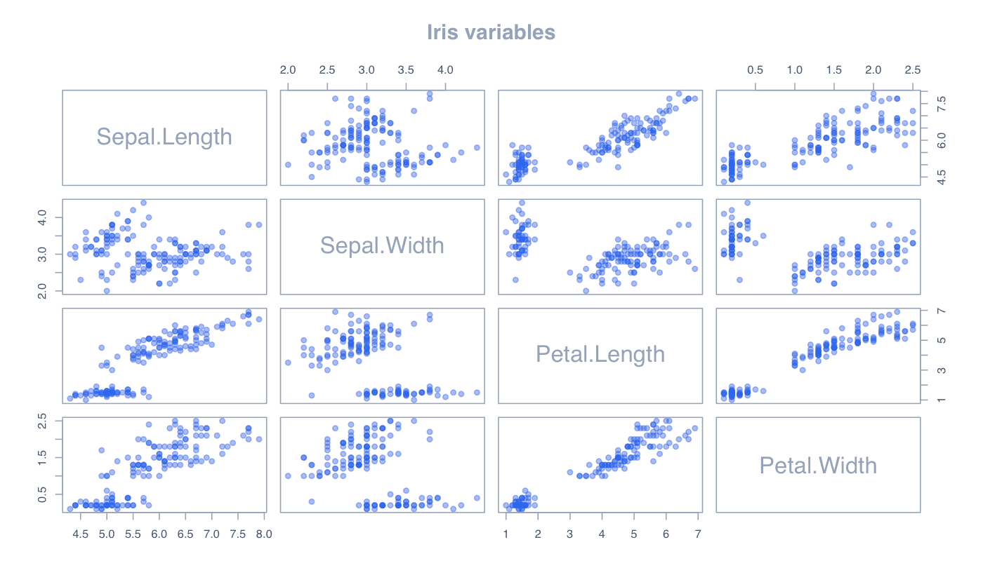
A pairs plot is a matrix of scatterplots showing every pairwise relationship among several numerical variables.

Explore the detailed pairs plot guide →
Pairs Plot generated in R
Pairs Plot generated with the R code shown below.
RReproducible code
pairs(iris[, 1:4], pch = 19,
      col = adjustcolor("#2563eb", 0.45),
      main = "Iris variables")
08

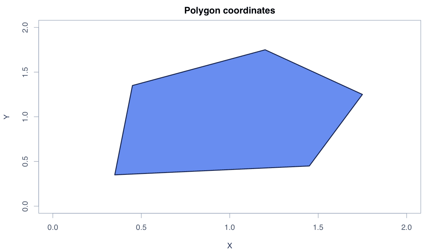
Polygon Plot

A polygon plot draws a closed shape from ordered x and y coordinates. It can highlight regions or add filled areas to an existing plot.

Explore the detailed polygon plot guide →
Polygon Plot generated in R
Polygon Plot generated with the R code shown below.
RReproducible code
plot(1, 1, type = "n", xlim = c(0, 2), ylim = c(0, 2),
     xlab = "X", ylab = "Y")
polygon(x = c(0.35, 1.45, 1.75, 1.2, 0.45),
        y = c(0.35, 0.45, 1.25, 1.75, 1.35),
        col = "#2563eb", border = "#172554", lwd = 2)
09

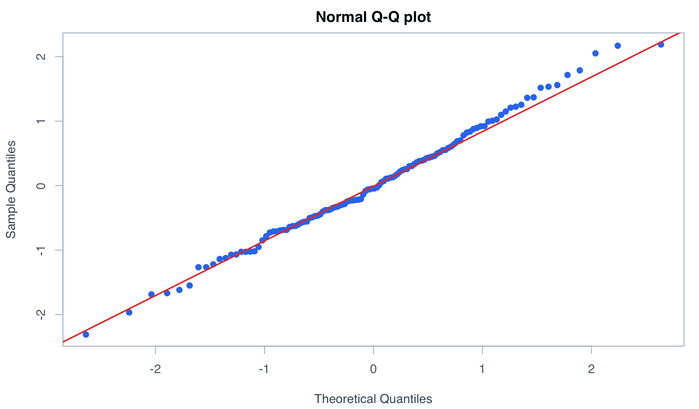
QQplot

A quantile–quantile plot compares observed quantiles with those of a reference distribution. Points close to the reference line indicate a similar distributional shape.

Explore the detailed qqplot guide →
QQplot generated in R
QQplot generated with the R code shown below.
RReproducible code
set.seed(123)
x <- rnorm(120)
qqnorm(x, pch = 19, col = "#2563eb")
qqline(x, col = "#dc2626", lwd = 2)
10

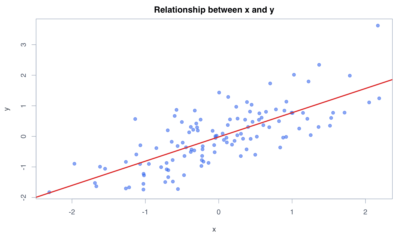
Scatterplot

A scatterplot places paired numerical observations on two axes to reveal the direction, form, strength, and unusual points in their relationship.

Explore the detailed scatterplot guide →
Scatterplot generated in R
Scatterplot generated with the R code shown below.
RReproducible code
set.seed(123)
x <- rnorm(120)
y <- 0.7 * x + rnorm(120, sd = 0.65)
plot(x, y, pch = 19, col = adjustcolor("#2563eb", 0.6))
abline(lm(y ~ x), col = "#dc2626", lwd = 2.5)
11

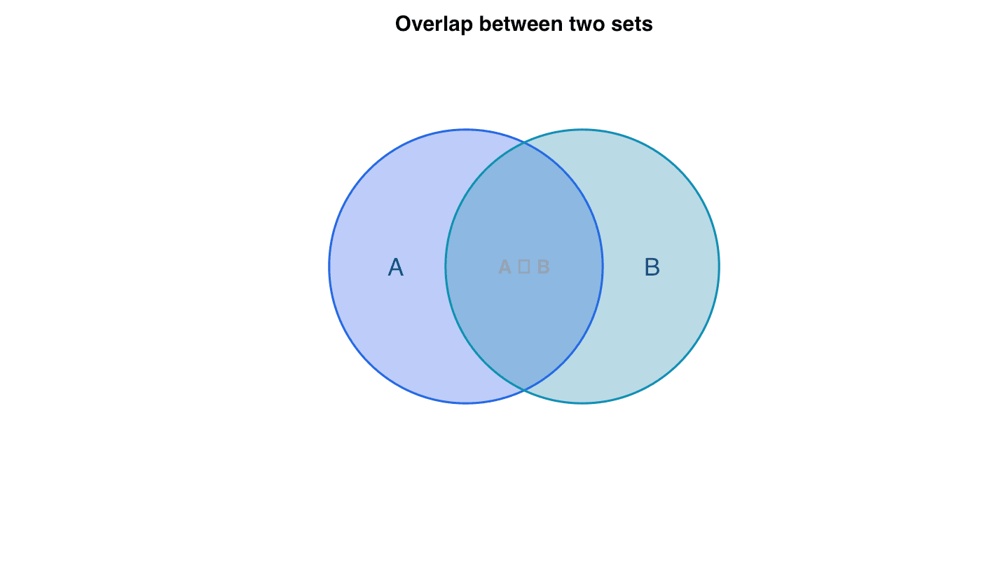
Venn Diagram

A Venn diagram uses overlapping shapes to display relationships between sets. Intersections represent elements shared by two or more sets.

Explore the detailed venn diagram guide →
Venn Diagram generated in R
Venn Diagram generated with the R code shown below.
RReproducible code
plot.new()
plot.window(xlim = c(0, 10), ylim = c(0, 7), asp = 1)
symbols(c(4, 6), c(3.5, 3.5), circles = c(2.35, 2.35),
        inches = FALSE, add = TRUE,
        bg = c(adjustcolor("#2563eb", 0.35),
               adjustcolor("#0891b2", 0.35)))
text(5, 3.5, "A ∩ B", font = 2)
12

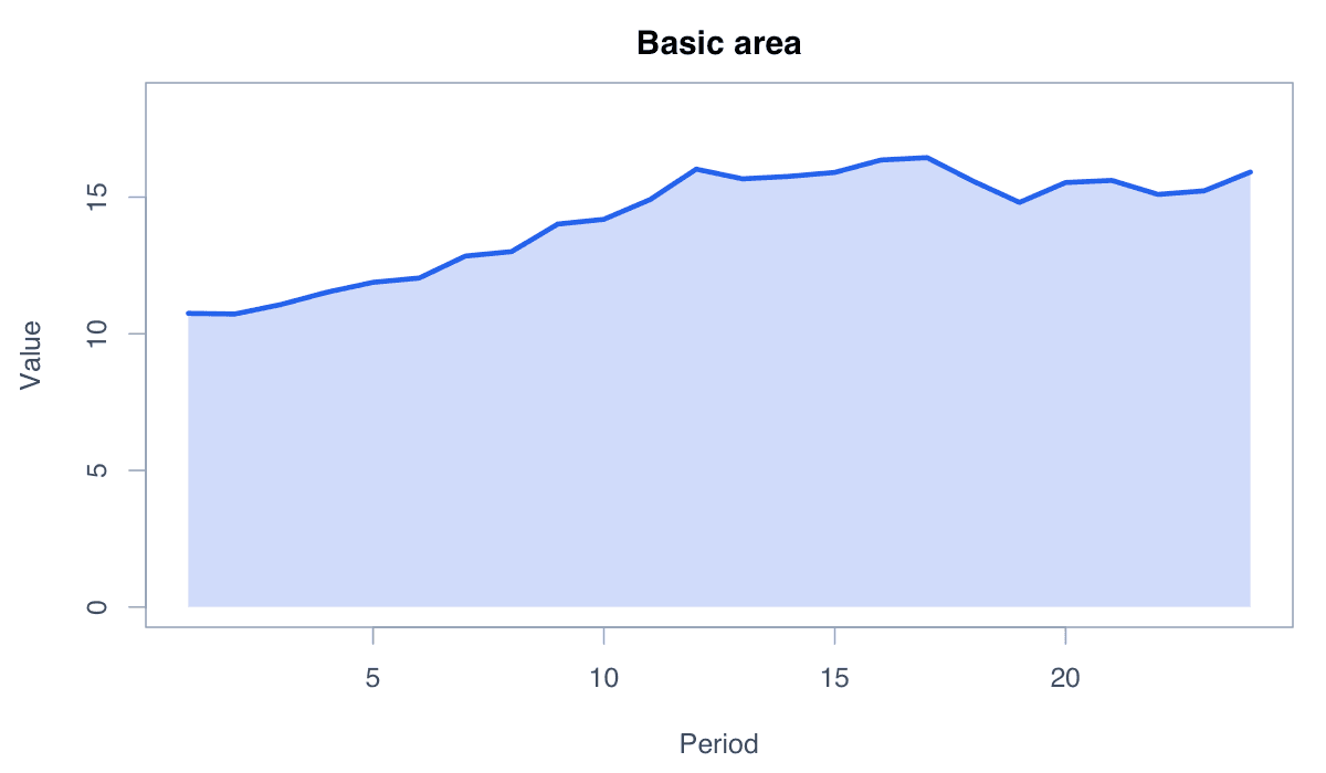
Area Chart

An area chart fills the space between a line and a baseline, emphasizing magnitude and accumulated change over an ordered axis.

Explore the detailed area chart guide →
Area Chart generated in R
Area Chart generated with the R code shown below.
RReproducible code
x <- 1:24
y <- cumsum(rnorm(24, .3, .5)) + 10
plot(x, y, type = "n")
polygon(c(x, rev(x)), c(y, rep(0, length(y))), col = "#bfdbfe", border = NA)
lines(x, y, col = "#2563eb", lwd = 3)
13

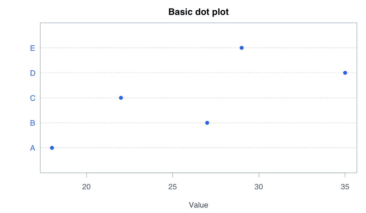
Dot Plot

A dot plot represents values by position on a common scale, offering a compact and precise alternative to bars.

Explore the detailed dot plot guide →
Dot Plot generated in R
Dot Plot generated with the R code shown below.
RReproducible code
values <- c(A = 18, B = 27, C = 22, D = 35, E = 29)
dotchart(values, pch = 19, col = "#2563eb", xlab = "Value")
14

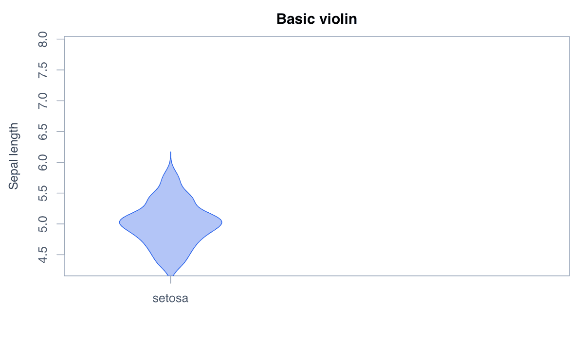
Violin Plot

A violin plot mirrors a density estimate to compare the complete shape, spread, and concentration of distributions.

Explore the detailed violin plot guide →
Violin Plot generated in R
Violin Plot generated with the R code shown below.
RReproducible code
library(ggplot2)
ggplot(iris, aes(Species, Sepal.Length, fill = Species)) +
  geom_violin(show.legend = FALSE) + theme_minimal()
15

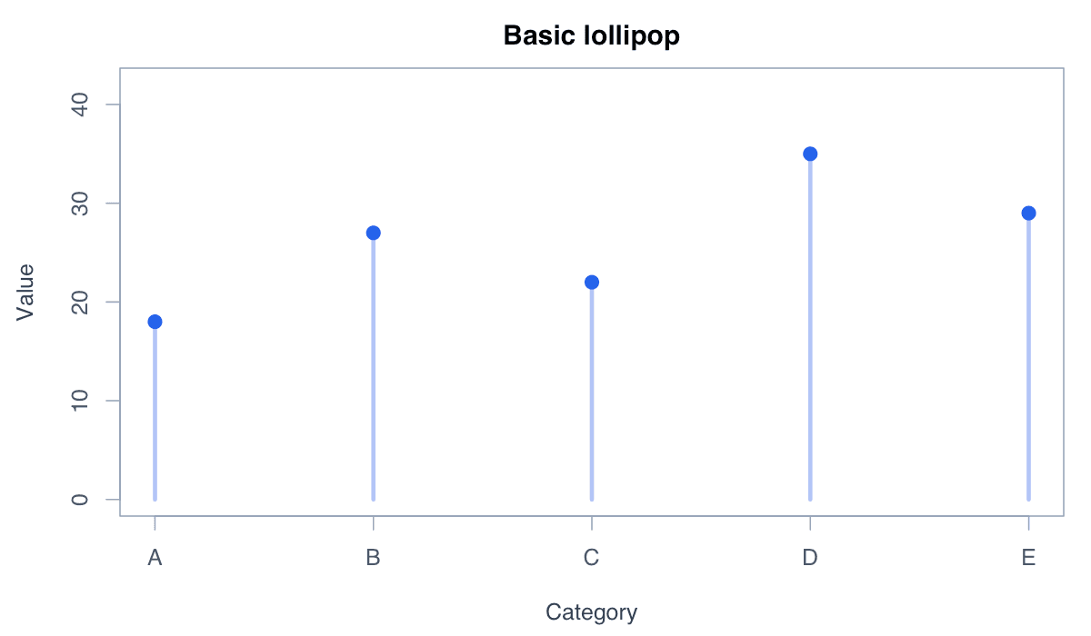
Lollipop Chart

A lollipop chart connects each category baseline to a marked value, producing a light and readable ranking display.

Explore the detailed lollipop chart guide →
Lollipop Chart generated in R
Lollipop Chart generated with the R code shown below.
RReproducible code
v <- c(18, 27, 22, 35, 29)
plot(v, type = "n", ylim = c(0, 40))
segments(seq_along(v), 0, seq_along(v), v, col = "#93c5fd", lwd = 3)
points(v, pch = 19, col = "#2563eb")
16

Pie and Donut Chart

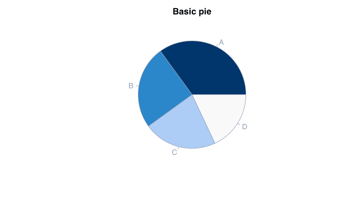
Pie and donut charts divide a circle into angular segments to communicate simple part-to-whole composition.

Explore the detailed pie and donut chart guide →
Pie and Donut Chart generated in R
Pie and Donut Chart generated with the R code shown below.
RReproducible code
values <- c(A = 35, B = 25, C = 22, D = 18)
pie(values, col = hcl.colors(4, "Blues 3"), main = "Composition")
17

Mosaic Plot

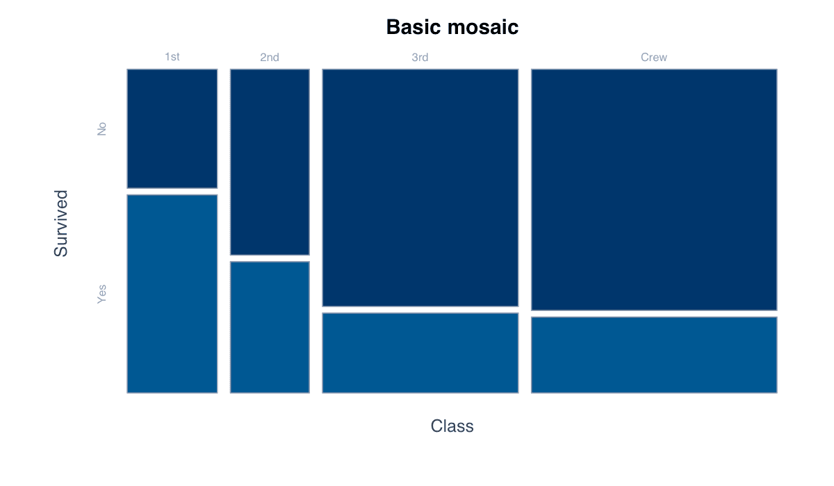
A mosaic plot divides a rectangle according to contingency-table frequencies to reveal associations between categorical variables.

Explore the detailed mosaic plot guide →
Mosaic Plot generated in R
Mosaic Plot generated with the R code shown below.
RReproducible code
tab <- xtabs(Freq ~ Class + Survived, data = as.data.frame(Titanic))
mosaicplot(tab, color = c("#bfdbfe", "#2563eb"), main = "Class and survival")
18

Contour Plot

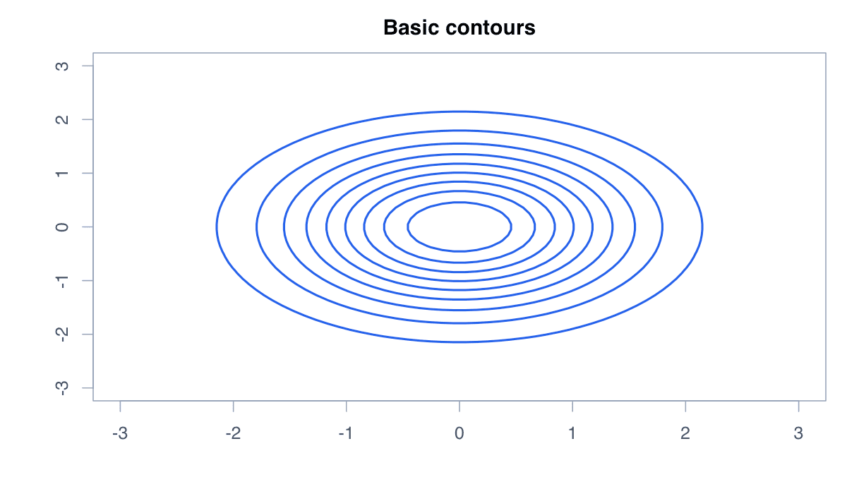
A contour plot connects locations with equal surface values, translating three-dimensional structure into two dimensions.

Explore the detailed contour plot guide →
Contour Plot generated in R
Contour Plot generated with the R code shown below.
RReproducible code
x <- seq(-3, 3, length = 60)
y <- x
z <- outer(x, y, function(a, b) exp(-(a^2 + b^2) / 2))
contour(x, y, z, col = "#2563eb", lwd = 2)
19

Radar Chart

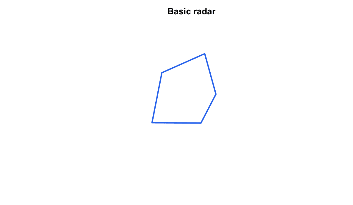
A radar chart places indicators on radial axes and joins their values into a multivariate profile.

Explore the detailed radar chart guide →
Radar Chart generated in R
Radar Chart generated with the R code shown below.
RReproducible code
values <- c(4, 7, 6, 8, 5)
angles <- seq(0, 2*pi, length.out = 6)
r <- c(values, values[1])
plot(cos(angles)*r, sin(angles)*r, type = "l", asp = 1, axes = FALSE)