R Graphics · Pie and Donut Chart

Communicating Simple Composition with Pie and Donut Charts in R

Create pie, labeled, percentage, exploded-style, donut, and ggplot2 composition charts.

6 examplesReproducible R code
Before you begin

Choose the variation that serves the analysis

Pie and donut charts encode shares as angles and areas. Reserve them for a few clearly different categories; bar charts are usually more precise when values are similar.

Examples
06
Levels
Beginner + Intermediate
01
Example 01Base RBeginner

Create a Basic Pie Chart

A pie chart divides a circle into slices proportional to category totals.
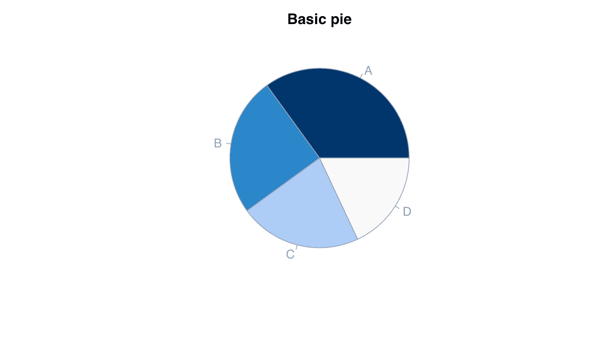
Create a Basic Pie Chart example generated in R
R-generated example output.

Run the code, inspect how the visual encoding changes, and adapt the labels, scales, and styling to the analytical question rather than treating the defaults as fixed.

RRun this code
v<-c(A=35,B=25,C=22,D=18);pie(v,col=c("#1d4ed8","#60a5fa","#93c5fd","#dbeafe"),main="Composition")
02
Example 02Base RBeginner

Add Category Labels

Direct slice labels identify categories without repeated legend lookup.
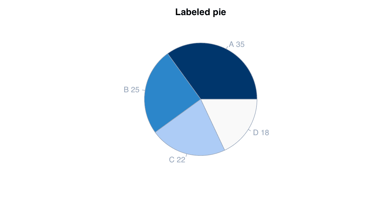
Add Category Labels example generated in R
R-generated example output.

Run the code, inspect how the visual encoding changes, and adapt the labels, scales, and styling to the analytical question rather than treating the defaults as fixed.

RRun this code
v<-c(A=35,B=25,C=22,D=18);pie(v,labels=paste(names(v),v),col=hcl.colors(4,"Blues 3"))
03
Example 03Base RBeginner

Display Percentage Shares

Percentage labels state the part-to-whole values explicitly.
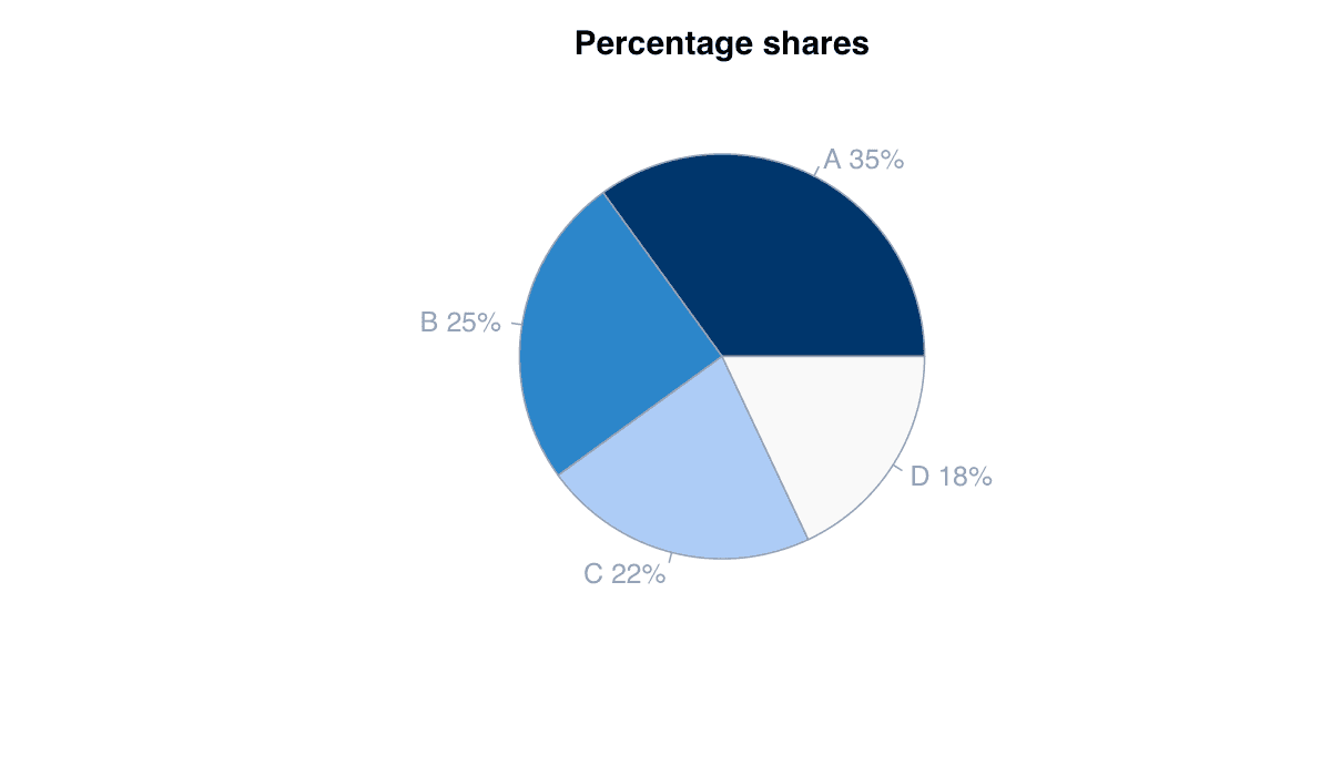
Display Percentage Shares example generated in R
R-generated example output.

Run the code, inspect how the visual encoding changes, and adapt the labels, scales, and styling to the analytical question rather than treating the defaults as fixed.

RRun this code
v<-c(A=35,B=25,C=22,D=18);labs<-paste0(names(v)," ",round(100*v/sum(v)),"%")
pie(v,labels=labs,col=hcl.colors(4,"Blues 3"))
04
Example 04Base RIntermediate

Control Slice Direction and Start

Clockwise ordering and start angle can place the most important slice predictably.
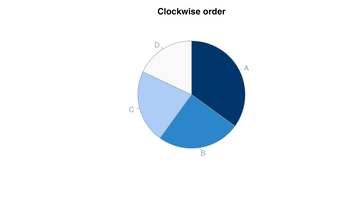
Control Slice Direction and Start example generated in R
R-generated example output.

Run the code, inspect how the visual encoding changes, and adapt the labels, scales, and styling to the analytical question rather than treating the defaults as fixed.

RRun this code
v<-sort(c(A=35,B=25,C=22,D=18),decreasing=TRUE);pie(v,clockwise=TRUE,init.angle=90,col=hcl.colors(4,"Blues 3"))
05
Example 05Base RIntermediate

Build a Donut Chart

A donut chart uses a central opening while retaining the same angular encoding as a pie.
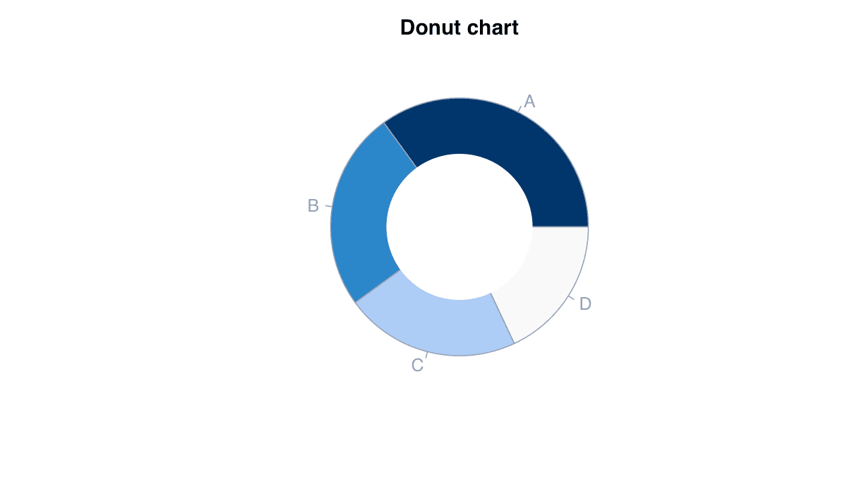
Build a Donut Chart example generated in R
R-generated example output.

Run the code, inspect how the visual encoding changes, and adapt the labels, scales, and styling to the analytical question rather than treating the defaults as fixed.

RRun this code
v<-c(A=35,B=25,C=22,D=18);pie(v,col=hcl.colors(4,"Blues 3"),border="white");symbols(0,0,circles=.45,inches=FALSE,add=TRUE,bg="white",fg="white")
06
Example 06ggplot2Intermediate

Create a Donut with ggplot2

A stacked bar transformed to polar coordinates produces a flexible donut chart.
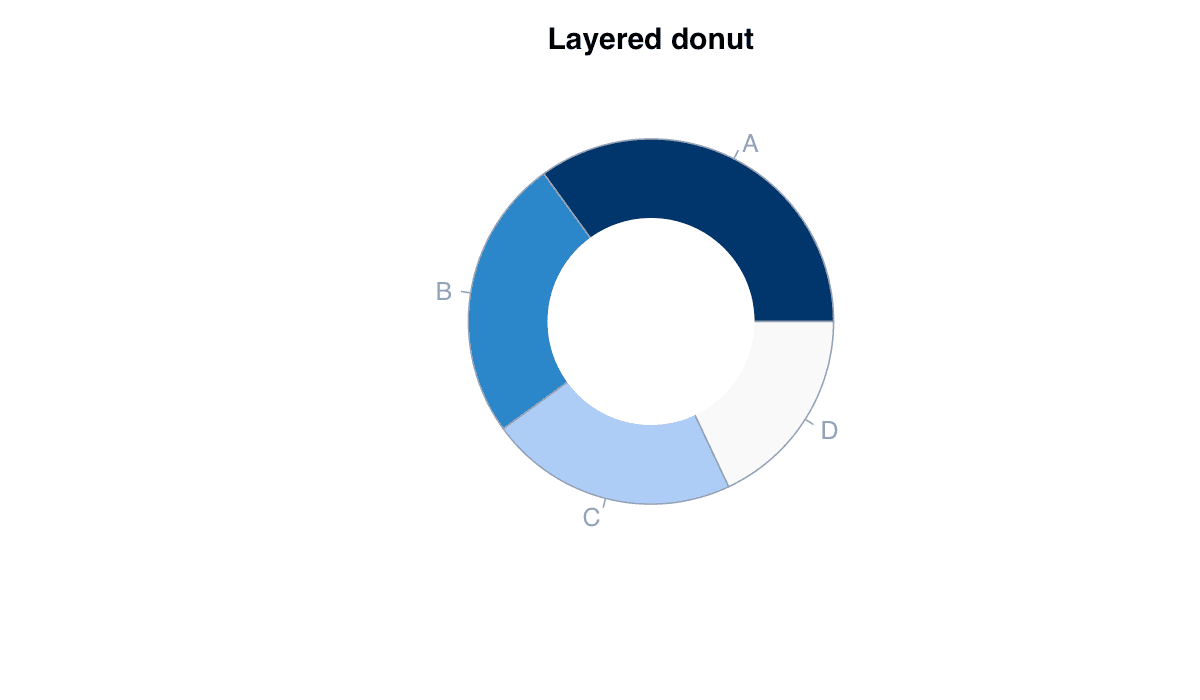
Create a Donut with ggplot2 example generated in R
R-generated example output.

Run the code, inspect how the visual encoding changes, and adapt the labels, scales, and styling to the analytical question rather than treating the defaults as fixed.

RRun this code
library(ggplot2)
d<-data.frame(group=LETTERS[1:4],value=c(35,25,22,18))
ggplot(d,aes(x=2,y=value,fill=group))+geom_col()+coord_polar(theta="y")+xlim(.5,2.5)+theme_void()