R Graphics · Mosaic Plot

Examining Categorical Associations with Mosaic Plots in R

Build basic, shaded, labeled, multiway, proportional, and model-based mosaic displays.

6 examplesReproducible R code
Before you begin

Choose the variation that serves the analysis

Mosaic plots divide a rectangle according to contingency-table frequencies. Tile areas show joint proportions and make associations between categorical variables visible.

Examples
06
Levels
Beginner + Intermediate
01
Example 01Base RBeginner

Create a Basic Mosaic Plot

A mosaic plot represents the cells of a contingency table as proportional rectangles.
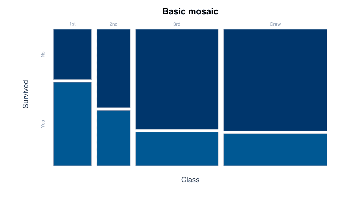
Create a Basic Mosaic Plot example generated in R
R-generated example output.

Run the code, inspect how the visual encoding changes, and adapt the labels, scales, and styling to the analytical question rather than treating the defaults as fixed.

RRun this code
tab<-table(Titanic[,"Class"],Titanic[,"Survived"]);mosaicplot(tab,color=c("#bfdbfe","#2563eb"),main="Class and survival")
02
Example 02Base RBeginner

Shade Association Residuals

Residual shading highlights cells that differ from independence expectations.
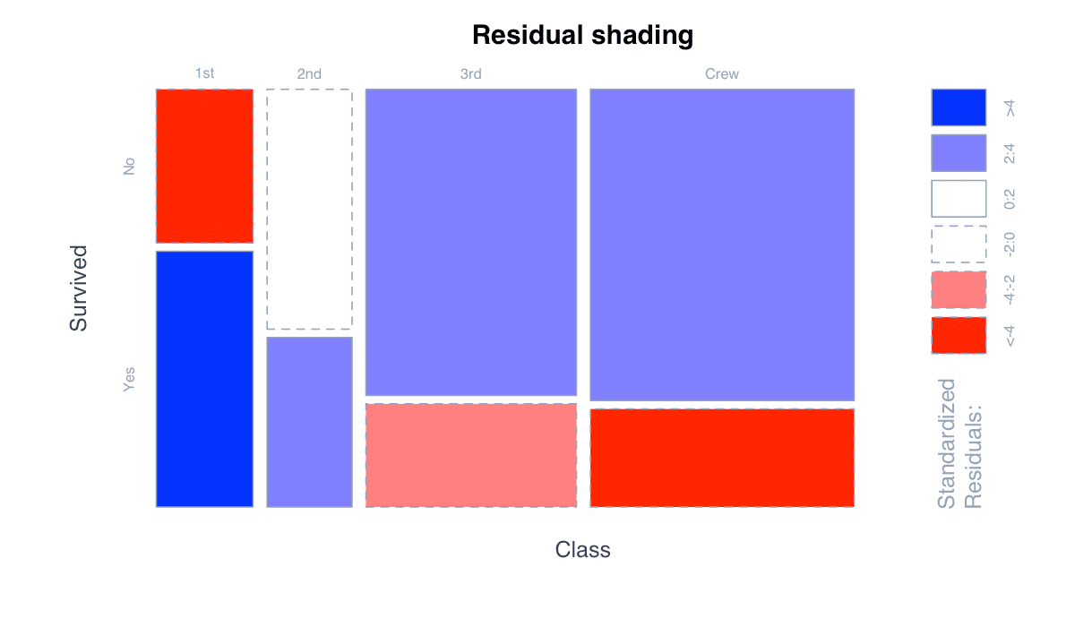
Shade Association Residuals example generated in R
R-generated example output.

Run the code, inspect how the visual encoding changes, and adapt the labels, scales, and styling to the analytical question rather than treating the defaults as fixed.

RRun this code
tab<-xtabs(Freq~Class+Survived,data=as.data.frame(Titanic));mosaicplot(tab,shade=TRUE,main="Departures from independence")
03
Example 03Base RBeginner

Improve Variable Labels

Clear labels identify the dimensions and category levels encoded by tile position.
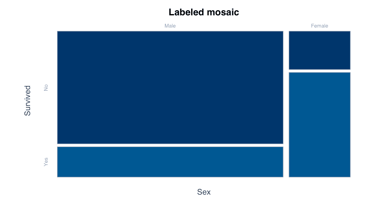
Improve Variable Labels example generated in R
R-generated example output.

Run the code, inspect how the visual encoding changes, and adapt the labels, scales, and styling to the analytical question rather than treating the defaults as fixed.

RRun this code
tab<-xtabs(Freq~Sex+Survived,data=as.data.frame(Titanic));mosaicplot(tab,color=c("#dbeafe","#1d4ed8"),xlab="Sex",ylab="Survival")
04
Example 04Base RIntermediate

Display Three Variables

A multiway mosaic recursively subdivides tiles to represent another categorical variable.
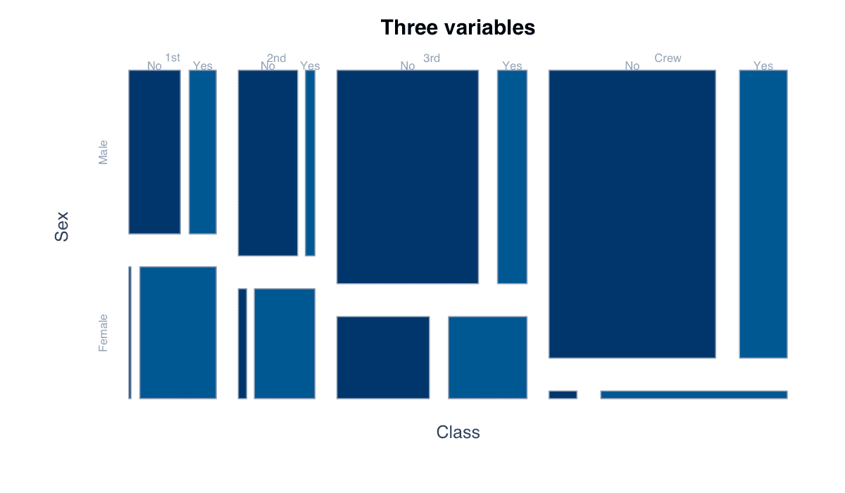
Display Three Variables example generated in R
R-generated example output.

Run the code, inspect how the visual encoding changes, and adapt the labels, scales, and styling to the analytical question rather than treating the defaults as fixed.

RRun this code
tab<-xtabs(Freq~Class+Sex+Survived,data=as.data.frame(Titanic));mosaicplot(tab,color=TRUE,main="Class, sex, and survival")
05
Example 05Base RIntermediate

Compare Conditional Proportions

Reordering table dimensions changes which conditional comparison is visually primary.
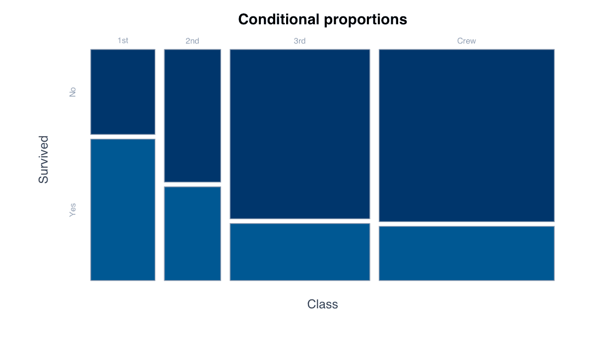
Compare Conditional Proportions example generated in R
R-generated example output.

Run the code, inspect how the visual encoding changes, and adapt the labels, scales, and styling to the analytical question rather than treating the defaults as fixed.

RRun this code
tab<-xtabs(Freq~Survived+Class,data=as.data.frame(Titanic));mosaicplot(tab,color=hcl.colors(4,"Blues 3"),main="Survival composition by class")
06
Example 06Base RIntermediate

Use a Custom Color Palette

A restrained palette can distinguish outcomes while keeping tile areas central.
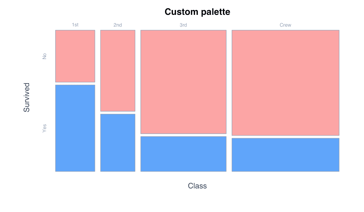
Use a Custom Color Palette example generated in R
R-generated example output.

Run the code, inspect how the visual encoding changes, and adapt the labels, scales, and styling to the analytical question rather than treating the defaults as fixed.

RRun this code
tab<-xtabs(Freq~Class+Survived,data=as.data.frame(Titanic));mosaicplot(tab,color=c("#fca5a5","#60a5fa"),border="white",main="Titanic survival")