R Graphics Ā· Barplot

Designing Clear Barplots in R

Practical patterns from a basic base-R chart to grouped, stacked, interactive, ordered, proportional, and uncertainty-aware barplots.

12 examplesReproducible R code
Before you begin

One chart family, several analytical purposes

Barplots compare quantities across discrete categories. The best variation depends on whether you need simple comparison, readable category names, subgroup composition, side-by-side comparison, or interactive exploration.

Examples
12
Levels
Beginner + Intermediate
01
Example 01Base RBeginner

Start with a Basic Barplot

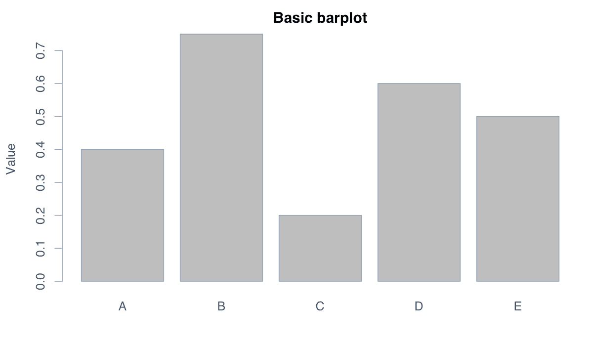
A basic barplot converts a numeric vector into rectangular bars whose heights are proportional to the supplied values.
Start with a Basic Barplot example generated in R
R-generated example output.

The base R barplot() function needs only a numeric vector. It returns the midpoint of each bar invisibly, which can also be reused when adding annotations.

RRun this code
values <- c(0.40, 0.75, 0.20, 0.60, 0.50)
barplot(values, main = "Basic barplot", ylab = "Value")
02
Example 02Base RBeginner

Use Color Effectively

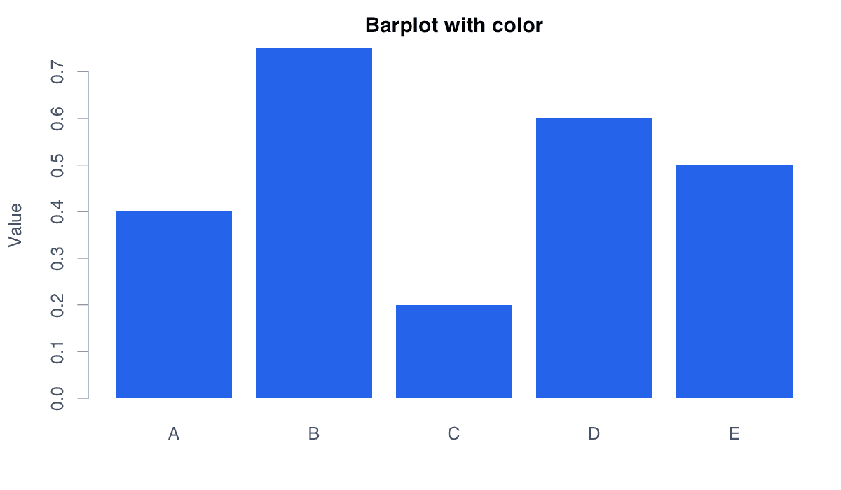
Color can distinguish bars, reinforce categories, or establish a consistent visual identity across related figures.
Use Color Effectively example generated in R
R-generated example output.

Use the col argument for the fill and border for the outline. A single restrained color is often clearer when all bars belong to one series.

RRun this code
values <- c(0.40, 0.75, 0.20, 0.60, 0.50)
barplot(values, col = "#2563eb", border = NA,
        main = "Barplot with color", ylab = "Value")
03
Example 03Base RBeginner

Switch to Horizontal Bars

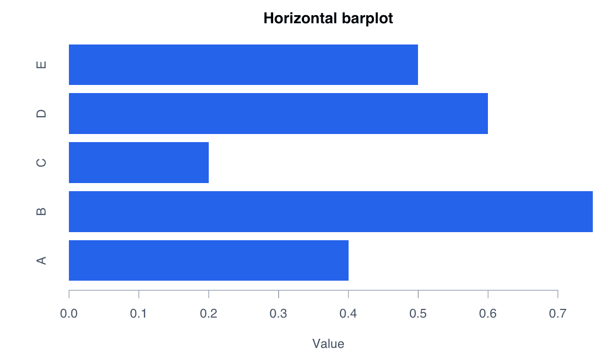
A horizontal barplot places categories on the vertical axis and measures values from left to right.
Switch to Horizontal Bars example generated in R
R-generated example output.

Horizontal bars are particularly effective when category names are long or when the ranking of categories is the main message.

RRun this code
values <- c(0.40, 0.75, 0.20, 0.60, 0.50)
barplot(values, horiz = TRUE, col = "#2563eb",
        border = NA, xlab = "Value")
04
Example 04Base RBeginner

Add Category Labels

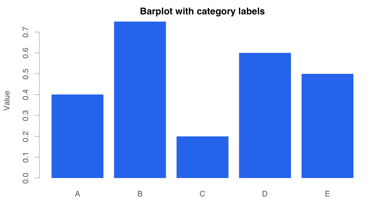
Category labels identify what each bar represents and turn an otherwise anonymous sequence into an interpretable comparison.
Add Category Labels example generated in R
R-generated example output.

The names.arg vector must have the same length and order as the values. Axis titles should state the measure and unit where relevant.

RRun this code
values <- c(0.40, 0.75, 0.20, 0.60, 0.50)
groups <- LETTERS[1:5]
barplot(values, names.arg = groups, col = "#2563eb",
        border = NA, ylab = "Value")
05
Example 05Base RBeginner

Build a Stacked Barplot

A stacked barplot divides every bar into segments, showing both the overall total and the contribution of each subgroup.
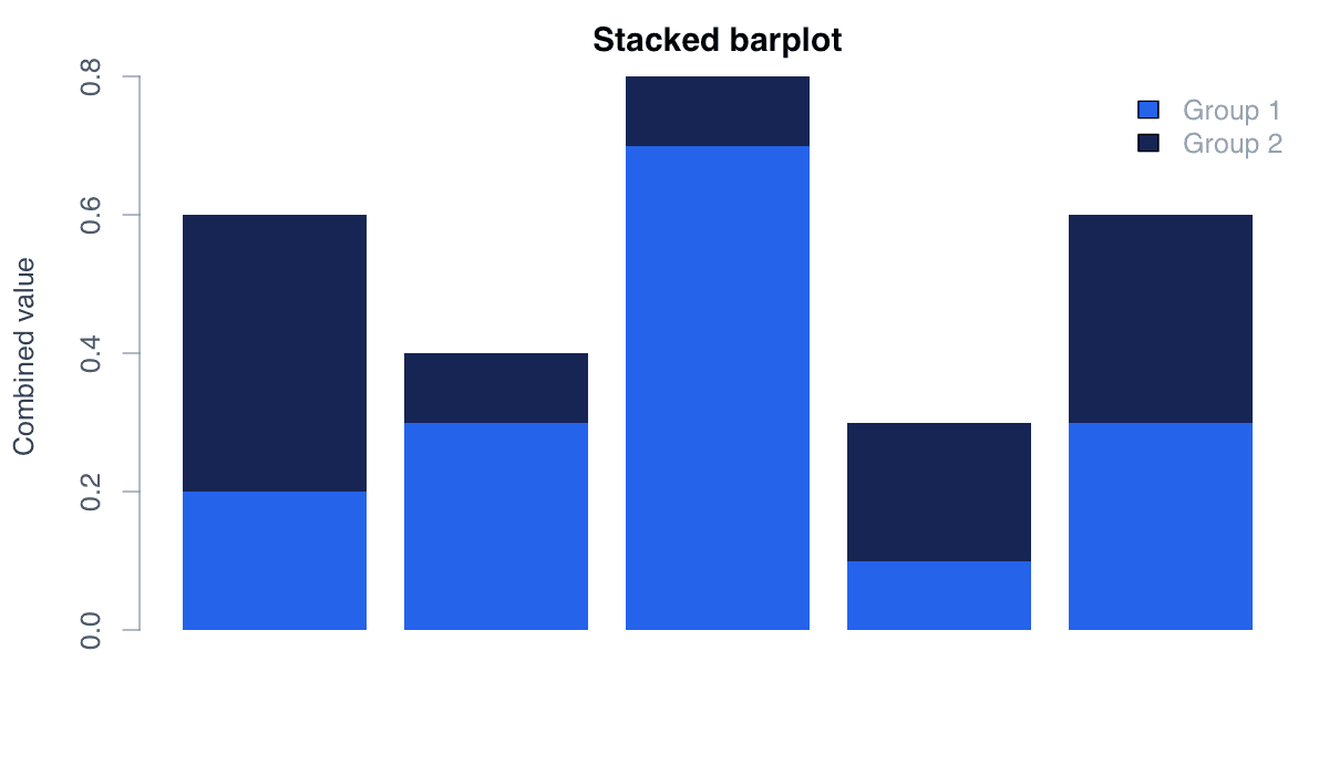
Build a Stacked Barplot example generated in R
R-generated example output.

Pass a matrix to barplot(). Each matrix row becomes a colored segment. A legend is essential because color carries the subgroup meaning.

RRun this code
data <- rbind(
  "Group 1" = c(0.2, 0.3, 0.7, 0.1, 0.3),
  "Group 2" = c(0.4, 0.1, 0.1, 0.2, 0.3)
)
barplot(data, col = c("#2563eb", "#172554"), border = NA)
legend("topright", legend = rownames(data),
       fill = c("#2563eb", "#172554"), bty = "n")
06
Example 06Base RBeginner

Compare Groups Side by Side

A grouped barplot places subgroup bars side by side, making direct comparisons within and across categories easier.
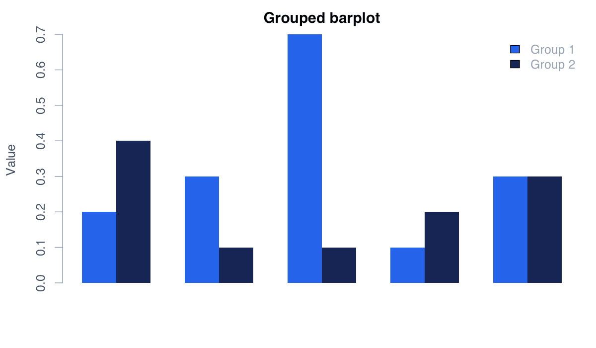
Compare Groups Side by Side example generated in R
R-generated example output.

Set beside = TRUE when passing a matrix. Grouped bars emphasize subgroup differences, whereas stacked bars emphasize composition and totals.

RRun this code
data <- rbind(
  "Group 1" = c(0.2, 0.3, 0.7, 0.1, 0.3),
  "Group 2" = c(0.4, 0.1, 0.1, 0.2, 0.3)
)
barplot(data, col = c("#2563eb", "#172554"),
        beside = TRUE, border = NA)
legend("topright", legend = rownames(data),
       fill = c("#2563eb", "#172554"), bty = "n")
07
Example 07ggplot2Beginner

Create a Barplot with ggplot2

ggplot2 creates barplots through layered components, separating the data, visual mappings, geometry, labels, and theme.
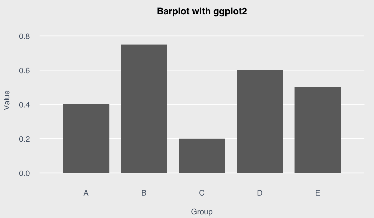
Create a Barplot with ggplot2 example generated in R
R-generated example output.

Use geom_col() when bar heights already exist in the data. The related geom_bar() function calculates category counts by default.

RRun this code
install.packages("ggplot2") # Run once
library(ggplot2)
data_ggp <- data.frame(
  group = LETTERS[1:5],
  value = c(0.40, 0.75, 0.20, 0.60, 0.50)
)
ggplot(data_ggp, aes(x = group, y = value)) +
  geom_col(fill = "#2563eb") +
  labs(title = "Barplot with ggplot2", x = "Group", y = "Value") +
  theme_minimal()
08
Example 08plotlyBeginner

Make a Barplot Interactive with plotly

A plotly barplot is interactive: viewers can inspect values with tooltips, zoom, pan, and use the chart toolbar.
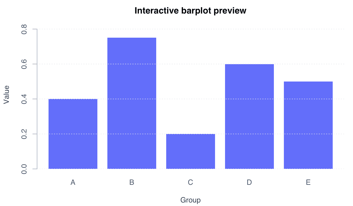
Make a Barplot Interactive with plotly example generated in R
R-generated example output.

plot_ly() creates an HTML widget rather than a static base-R image. The preview illustrates the initial chart; running the code enables interaction.

RRun this code
install.packages("plotly") # Run once
library(plotly)
group <- LETTERS[1:5]
values <- c(0.40, 0.75, 0.20, 0.60, 0.50)
plot_ly(x = group, y = values, type = "bar",
        marker = list(color = "#636efa")) %>%
  layout(title = "Interactive barplot",
         xaxis = list(title = "Group"),
         yaxis = list(title = "Value"))
09
Example 09Base RIntermediate

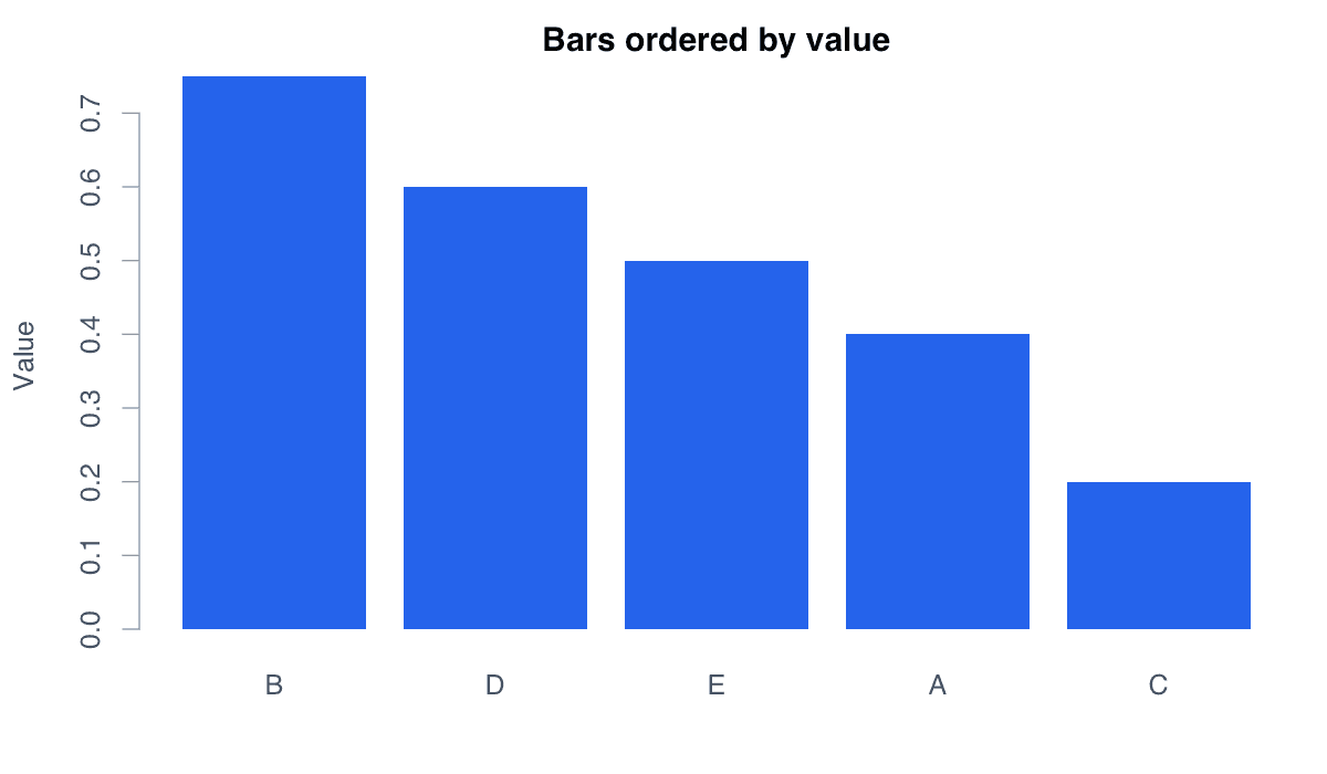
Order Bars by Value

An ordered barplot arranges categories by magnitude so rankings and large differences are immediately visible.
Order Bars by Value example generated in R
R-generated example output.

Sort the named values before plotting. Decreasing order is useful for rankings, while increasing order can support progressive comparisons.

RRun this code
values <- c(A = 0.40, B = 0.75, C = 0.20, D = 0.60, E = 0.50)
ordered_values <- sort(values, decreasing = TRUE)
barplot(ordered_values, col = "#2563eb", border = NA,
        main = "Bars ordered by value", ylab = "Value")
10
Example 10Base RIntermediate

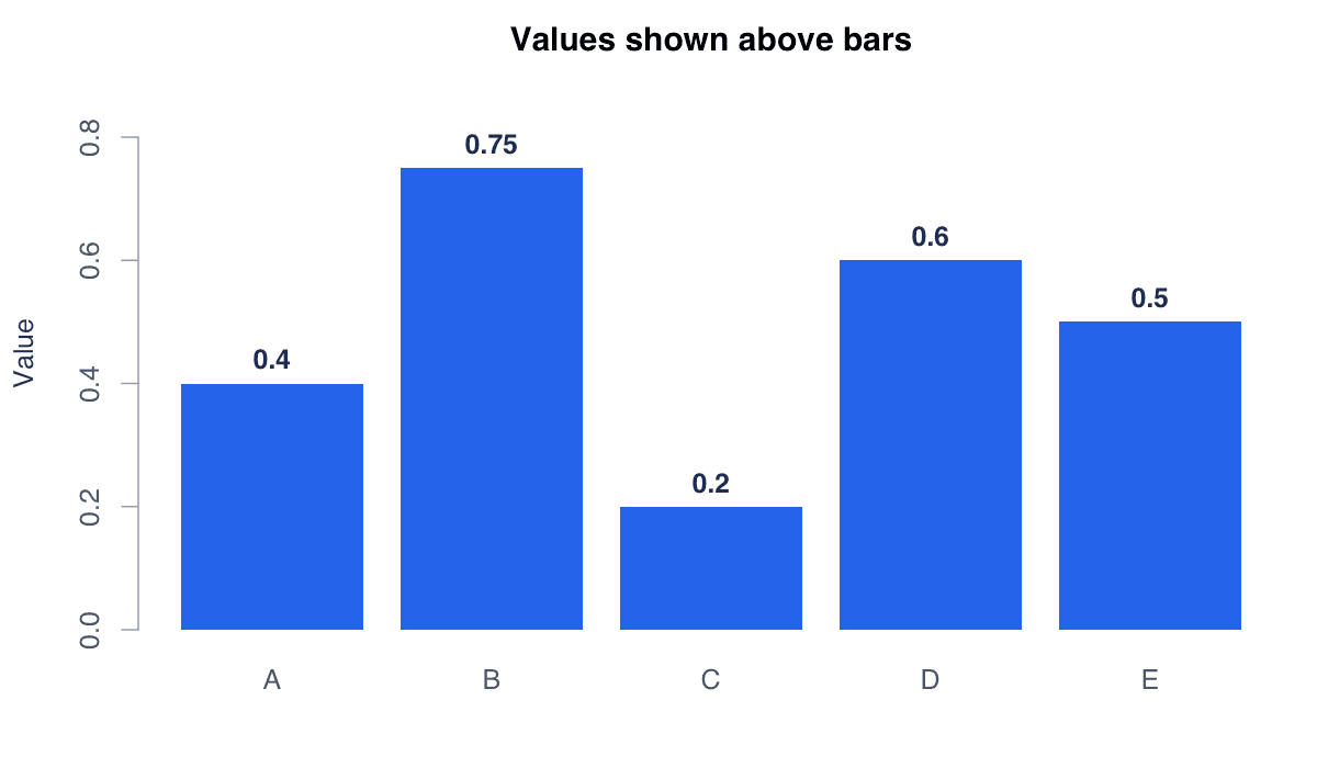
Display Values Above the Bars

Direct value labels make exact quantities available without requiring readers to estimate them from the axis.
Display Values Above the Bars example generated in R
R-generated example output.

Save the bar midpoints returned by barplot(), then pass those x positions to text(). Expand the y-axis limit to leave room above the bars.

RRun this code
values <- c(A = 0.40, B = 0.75, C = 0.20, D = 0.60, E = 0.50)
midpoints <- barplot(values, col = "#2563eb", border = NA,
                    ylim = c(0, 0.9))
text(midpoints, values + 0.04, labels = values,
     font = 2, col = "#172554")
11
Example 11Base RIntermediate

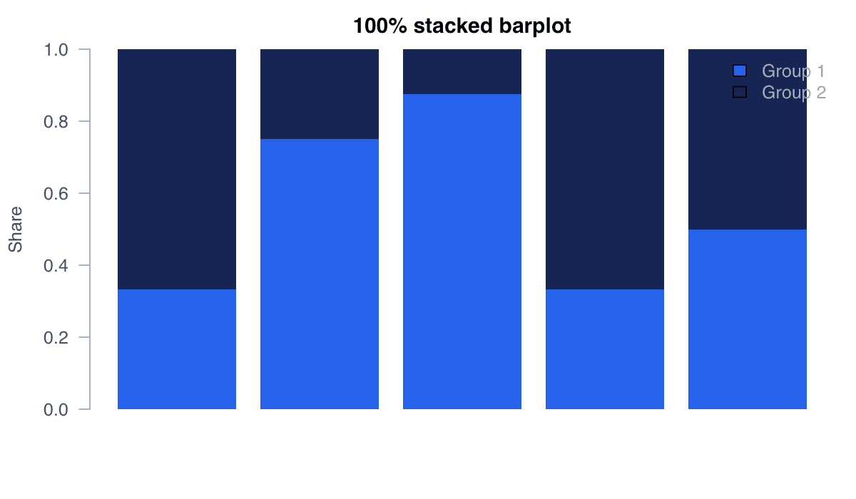
Create a 100% Stacked Barplot

A 100% stacked barplot converts every bar to the same total and compares the proportional composition of subgroups.
Create a 100% Stacked Barplot example generated in R
R-generated example output.

Divide each matrix column by its total before plotting. This emphasizes relative shares but intentionally removes differences in absolute totals.

RRun this code
data <- rbind(
  "Group 1" = c(0.2, 0.3, 0.7, 0.1, 0.3),
  "Group 2" = c(0.4, 0.1, 0.1, 0.2, 0.3)
)
proportions <- sweep(data, 2, colSums(data), "/")
barplot(proportions, col = c("#2563eb", "#172554"),
        border = NA, ylab = "Share")
legend("topright", legend = rownames(proportions),
       fill = c("#2563eb", "#172554"), bty = "n")
12
Example 12Base RIntermediate

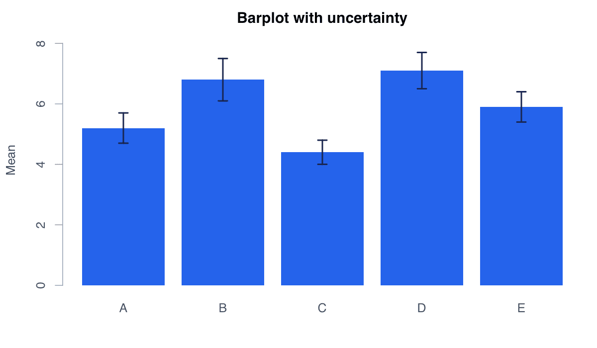
Add Error Bars

Error bars add uncertainty information—such as standard errors or confidence intervals—to summary values shown by bars.
Add Error Bars example generated in R
R-generated example output.

Draw the bars first, retain their midpoints, and add capped arrows from the lower to upper limits. Always state what the intervals represent.

RRun this code
means <- c(A = 5.2, B = 6.8, C = 4.4, D = 7.1, E = 5.9)
errors <- c(0.5, 0.7, 0.4, 0.6, 0.5)
midpoints <- barplot(means, col = "#2563eb", border = NA,
                    ylim = c(0, 8.3), ylab = "Mean")
arrows(midpoints, means - errors, midpoints, means + errors,
       angle = 90, code = 3, length = 0.06, lwd = 2)