R Graphics · Lollipop Chart

Ranking Categories with Lollipop Charts in R

Create vertical, horizontal, ordered, highlighted, grouped, and ggplot2 lollipop charts.

6 examplesReproducible R code
Before you begin

Choose the variation that serves the analysis

Lollipop charts combine a thin stem with a value marker. They use less ink than bars and work well for ranked positive values, though bars remain clearer for part-to-whole comparisons.

Examples
06
Levels
Beginner + Intermediate
01
Example 01Base RBeginner

Create a Basic Lollipop Chart

A lollipop chart connects each category baseline to a marked value.
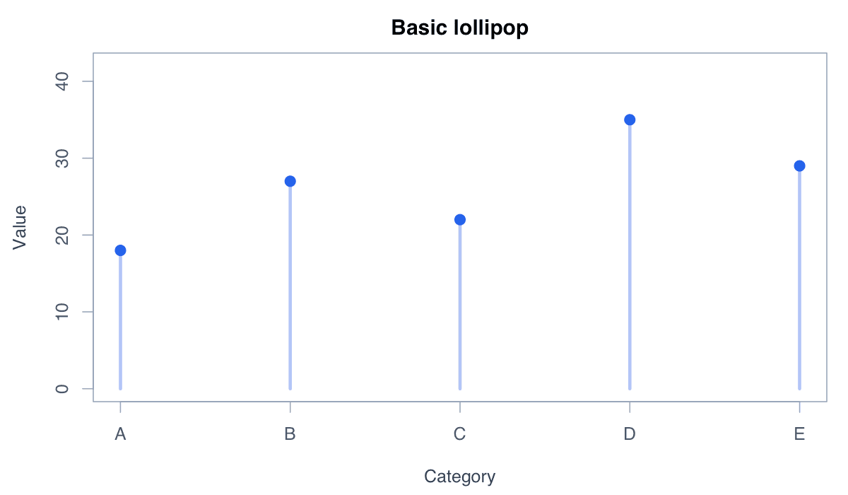
Create a Basic Lollipop Chart example generated in R
R-generated example output.

Run the code, inspect how the visual encoding changes, and adapt the labels, scales, and styling to the analytical question rather than treating the defaults as fixed.

RRun this code
v<-c(18,27,22,35,29);plot(v,type="n",xaxt="n",xlab="Category",ylab="Value",ylim=c(0,40));segments(1:5,0,1:5,v,col="#93c5fd",lwd=3);points(1:5,v,pch=19,col="#2563eb",cex=1.4);axis(1,1:5,LETTERS[1:5])
02
Example 02Base RBeginner

Use a Horizontal Layout

Horizontal stems leave more room for category names.
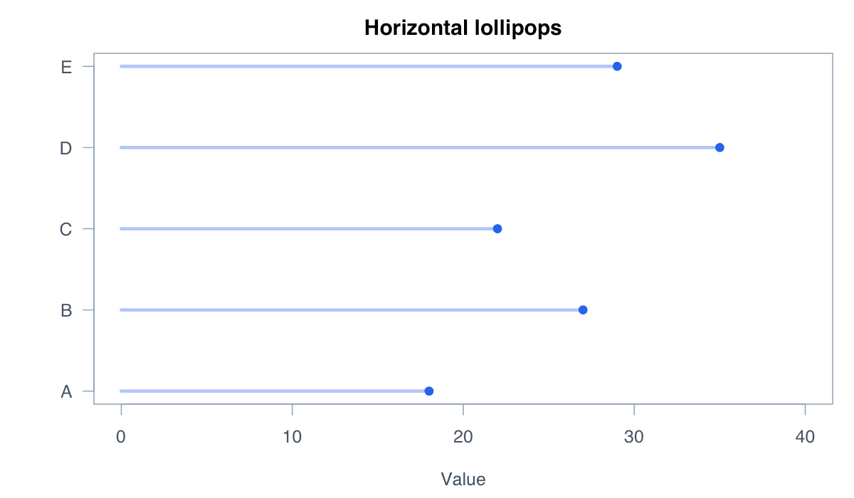
Use a Horizontal Layout example generated in R
R-generated example output.

Run the code, inspect how the visual encoding changes, and adapt the labels, scales, and styling to the analytical question rather than treating the defaults as fixed.

RRun this code
v<-c(A=18,B=27,C=22,D=35,E=29);y<-seq_along(v);plot(v,y,type="n",yaxt="n",xlim=c(0,40),xlab="Value",ylab="");segments(0,y,v,y,col="#93c5fd",lwd=3);points(v,y,pch=19,col="#2563eb");axis(2,y,names(v),las=1)
03
Example 03Base RBeginner

Order Lollipops by Value

Sorting makes rank and gaps immediately visible.
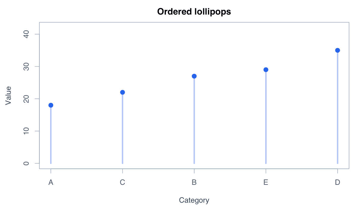
Order Lollipops by Value example generated in R
R-generated example output.

Run the code, inspect how the visual encoding changes, and adapt the labels, scales, and styling to the analytical question rather than treating the defaults as fixed.

RRun this code
v<-sort(c(A=18,B=27,C=22,D=35,E=29));y<-seq_along(v);plot(v,y,type="n",yaxt="n",xlim=c(0,40));segments(0,y,v,y,col="#93c5fd",lwd=3);points(v,y,pch=19,col="#2563eb");axis(2,y,names(v),las=1)
04
Example 04Base RIntermediate

Highlight One Category

A contrasting marker directs attention to a focal category without overwhelming the chart.
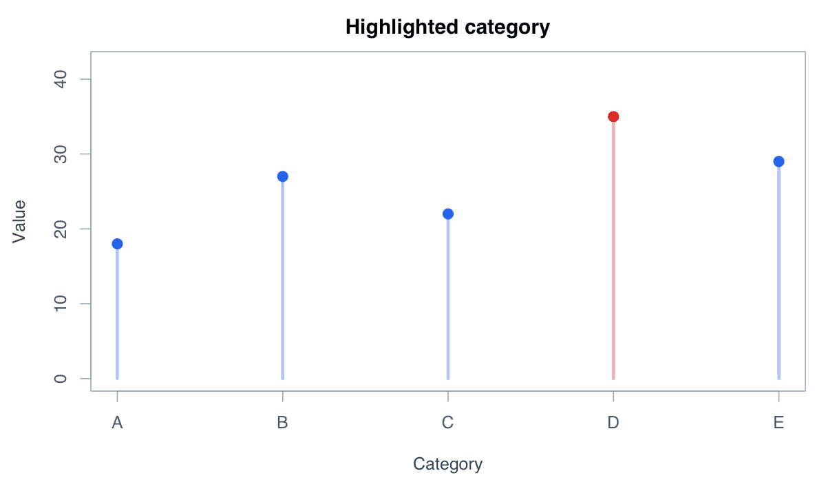
Highlight One Category example generated in R
R-generated example output.

Run the code, inspect how the visual encoding changes, and adapt the labels, scales, and styling to the analytical question rather than treating the defaults as fixed.

RRun this code
v<-c(A=18,B=27,C=22,D=35,E=29);cols<-ifelse(names(v)=="D","#dc2626","#2563eb");plot(v,type="n",xaxt="n",ylim=c(0,40));segments(1:5,0,1:5,v,col=adjustcolor(cols,.45),lwd=3);points(v,pch=19,col=cols,cex=1.4);axis(1,1:5,names(v))
05
Example 05Base RIntermediate

Add Direct Value Labels

Direct labels provide exact values without requiring axis estimation.
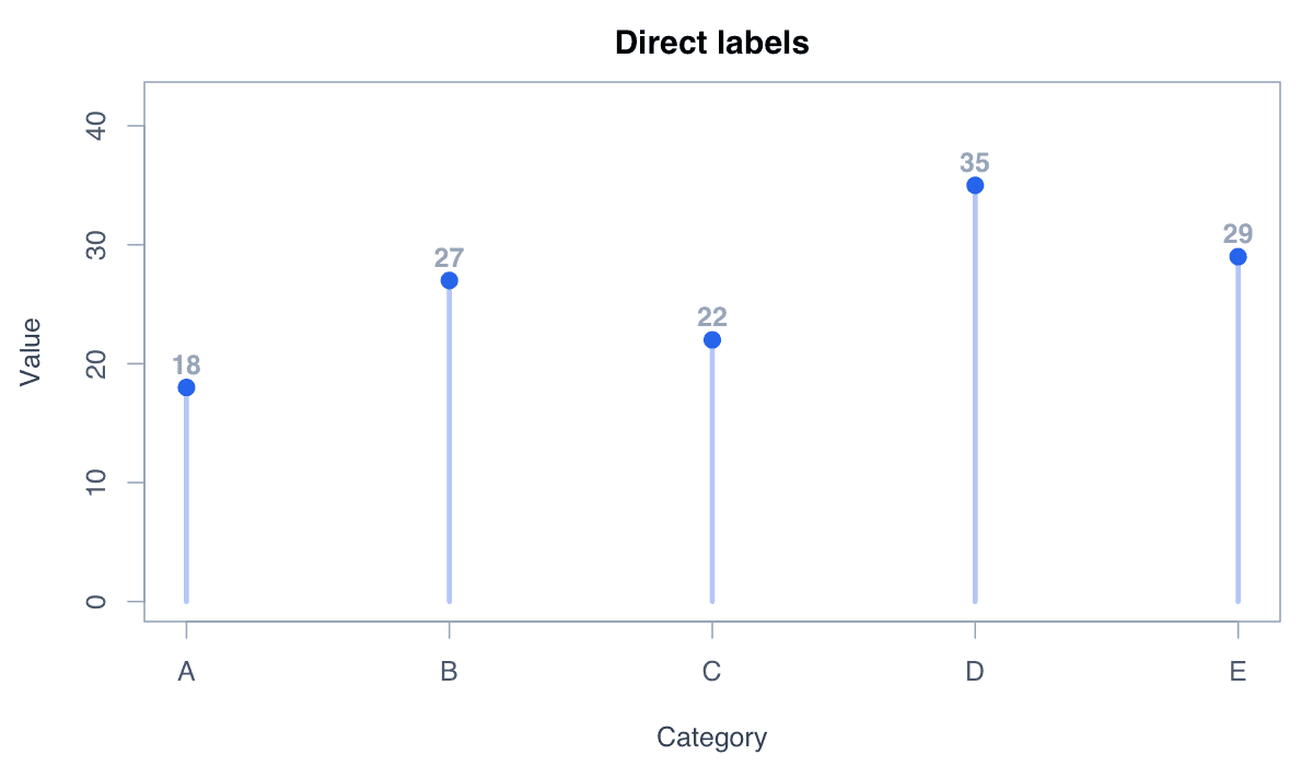
Add Direct Value Labels example generated in R
R-generated example output.

Run the code, inspect how the visual encoding changes, and adapt the labels, scales, and styling to the analytical question rather than treating the defaults as fixed.

RRun this code
v<-c(A=18,B=27,C=22,D=35,E=29);plot(v,type="n",xaxt="n",ylim=c(0,40));segments(1:5,0,1:5,v,col="#93c5fd",lwd=3);points(v,pch=19,col="#2563eb");text(1:5,v+2,v,font=2);axis(1,1:5,names(v))
06
Example 06ggplot2Intermediate

Create a Lollipop Chart with ggplot2

ggplot2 builds stems and markers as separate, customizable layers.
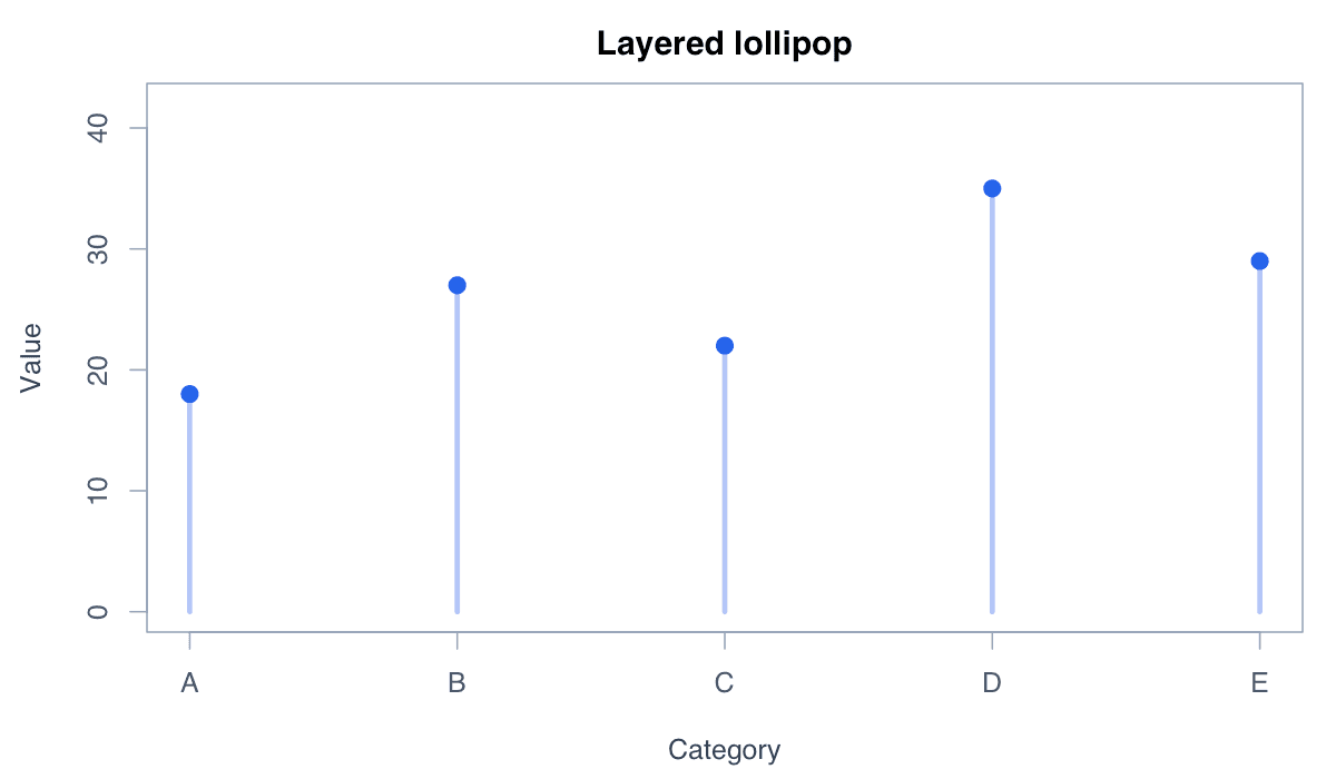
Create a Lollipop Chart with ggplot2 example generated in R
R-generated example output.

Run the code, inspect how the visual encoding changes, and adapt the labels, scales, and styling to the analytical question rather than treating the defaults as fixed.

RRun this code
library(ggplot2)
d<-data.frame(group=LETTERS[1:5],value=c(18,27,22,35,29))
ggplot(d,aes(group,value))+geom_segment(aes(xend=group,y=0,yend=value),color="#93c5fd",linewidth=1.2)+geom_point(color="#2563eb",size=4)+theme_minimal()