R Graphics · Pairs Plot

Comparing Many Variables with Pairs Plots in R

Use matrix scatterplots, groups, correlations, custom panels, transformations, and selected variables.

6 examplesReproducible R code
Before you begin

Choose the variation that serves the analysis

Pairs plots show every pairwise relationship in a numeric data set. They support rapid multivariate screening for association, nonlinearity, clusters, and unusual observations.

Examples
06
Levels
Beginner + Intermediate
01
Example 01Base RBeginner

Create a Basic Pairs Plot

A pairs plot creates a scatterplot for every pair of numeric variables.
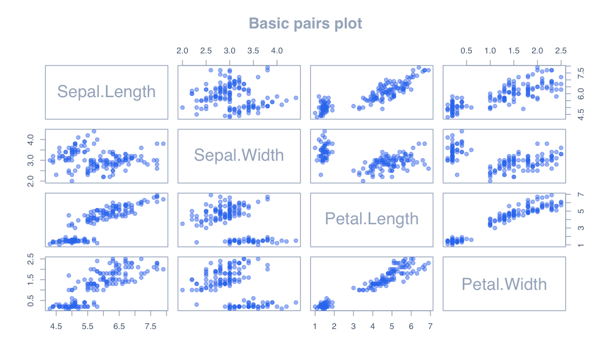
Create a Basic Pairs Plot example generated in R
R-generated example output.

Start with a small, relevant variable set; too many columns produce tiny panels and cognitive overload.

RRun this code
pairs(iris[, 1:4], pch = 19,
      col = adjustcolor("#2563eb", .45), main = "Iris measurements")
02
Example 02Base RBeginner

Color Observations by Group

Group colors reveal clusters and differences across every pairwise relationship.
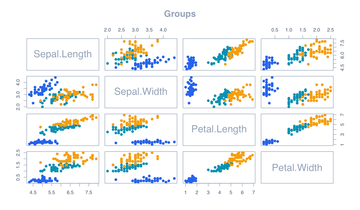
Color Observations by Group example generated in R
R-generated example output.

Map factor levels to a restrained palette and add a legend outside or within an unused panel.

RRun this code
cols <- c("#2563eb", "#0891b2", "#f59e0b")[iris$Species]
pairs(iris[, 1:4], pch = 19, col = adjustcolor(cols, .6))
03
Example 03Base RBeginner

Display Correlations Above the Diagonal

Correlation coefficients summarize linear association alongside the raw scatterplots.
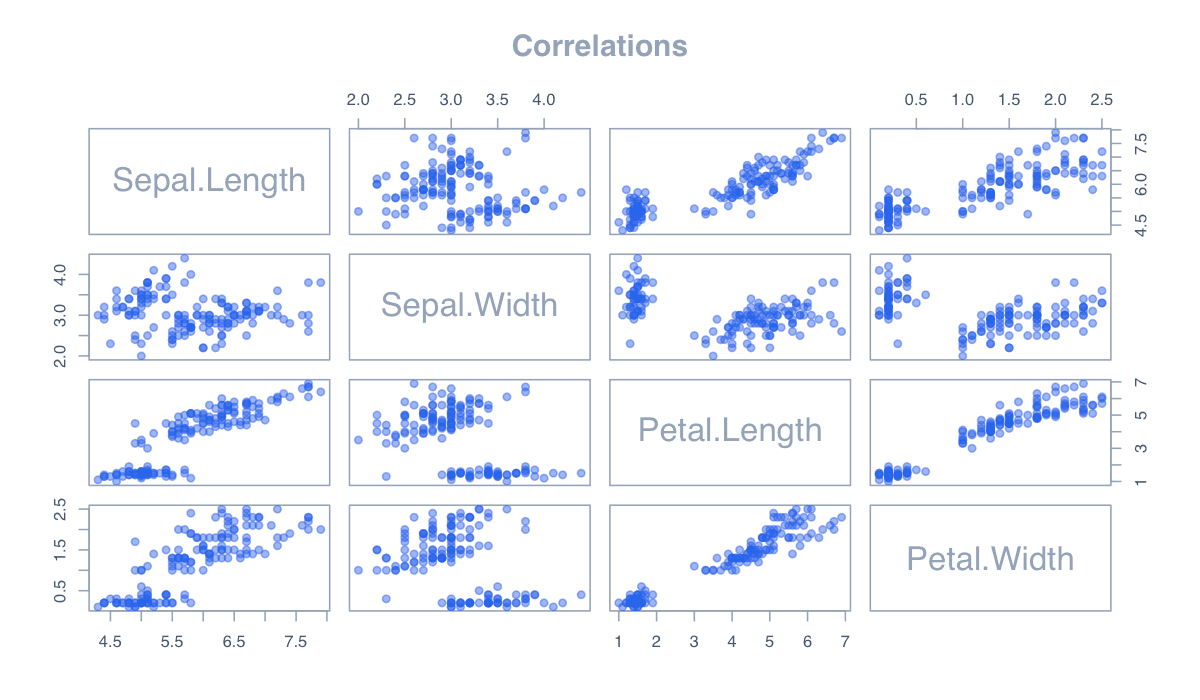
Display Correlations Above the Diagonal example generated in R
R-generated example output.

A custom upper panel can print coefficients while the lower panels preserve the observations.

RRun this code
panel.cor <- function(x, y, ...) {
  usr <- par("usr"); on.exit(par(usr)); par(usr = c(0, 1, 0, 1))
  text(.5, .5, format(cor(x, y), digits = 2), cex = 1.4)
}
pairs(iris[, 1:4], upper.panel = panel.cor, pch = 19, col = "#2563eb")
04
Example 04Base RIntermediate

Add Smooth Relationships

Smooth curves reveal nonlinear pairwise patterns that a coefficient may miss.
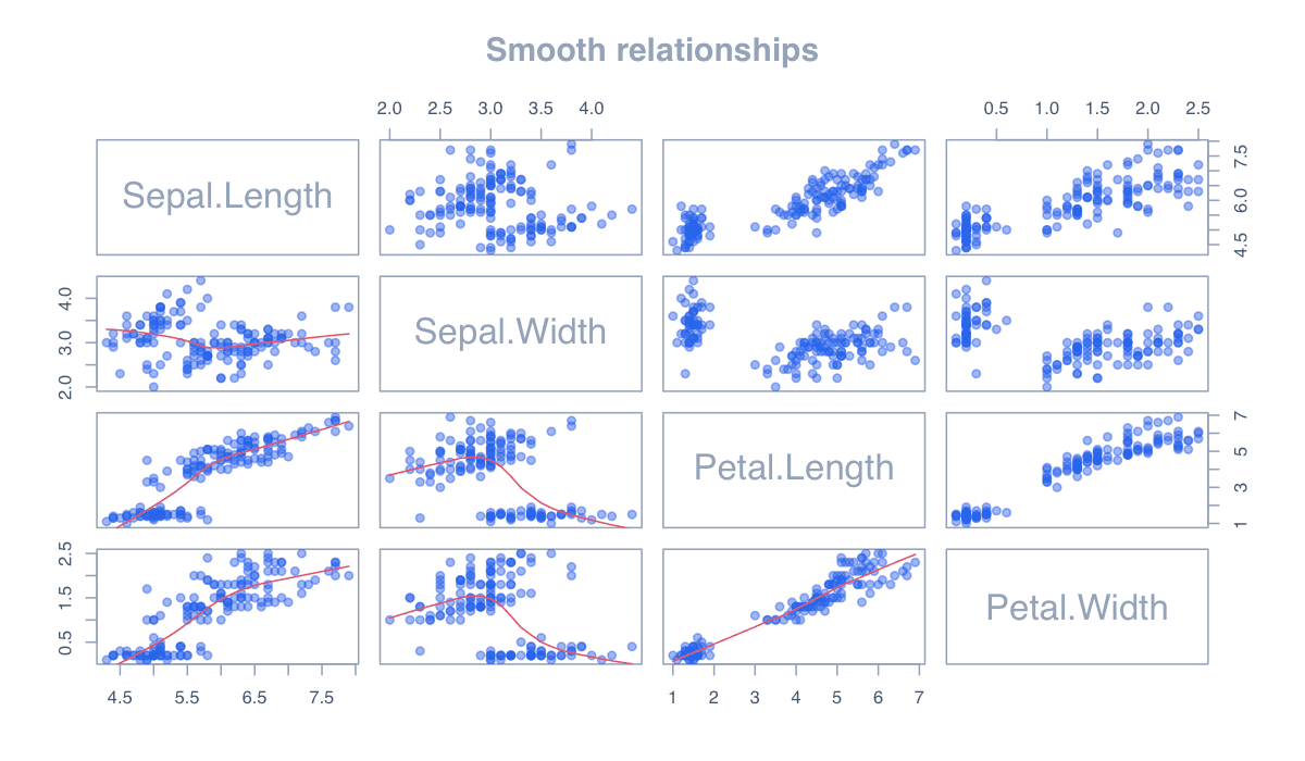
Add Smooth Relationships example generated in R
R-generated example output.

panel.smooth adds a lowess curve to each scatterplot while retaining the original points.

RRun this code
pairs(mtcars[, c("mpg", "disp", "hp", "wt")],
      lower.panel = panel.smooth, pch = 19,
      col = adjustcolor("#2563eb", .5))
05
Example 05Base RIntermediate

Place Histograms on the Diagonal

Diagonal histograms add the marginal distribution of every variable.
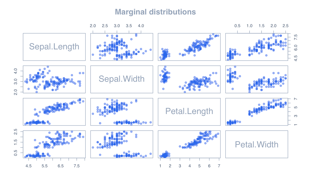
Place Histograms on the Diagonal example generated in R
R-generated example output.

Custom diagonal panels make the display more informative without changing the pairwise panels.

RRun this code
panel.hist <- function(x, ...) {
  usr <- par("usr"); on.exit(par(usr)); par(usr = c(usr[1:2], 0, 1.5))
  h <- hist(x, plot = FALSE); rect(h$breaks[-length(h$breaks)], 0, h$breaks[-1], h$counts/max(h$counts), col = "#93c5fd")
}
pairs(iris[, 1:4], diag.panel = panel.hist, pch = 19)
06
Example 06Base RIntermediate

Focus on Selected Variables

A focused matrix keeps only variables relevant to the analytical question.
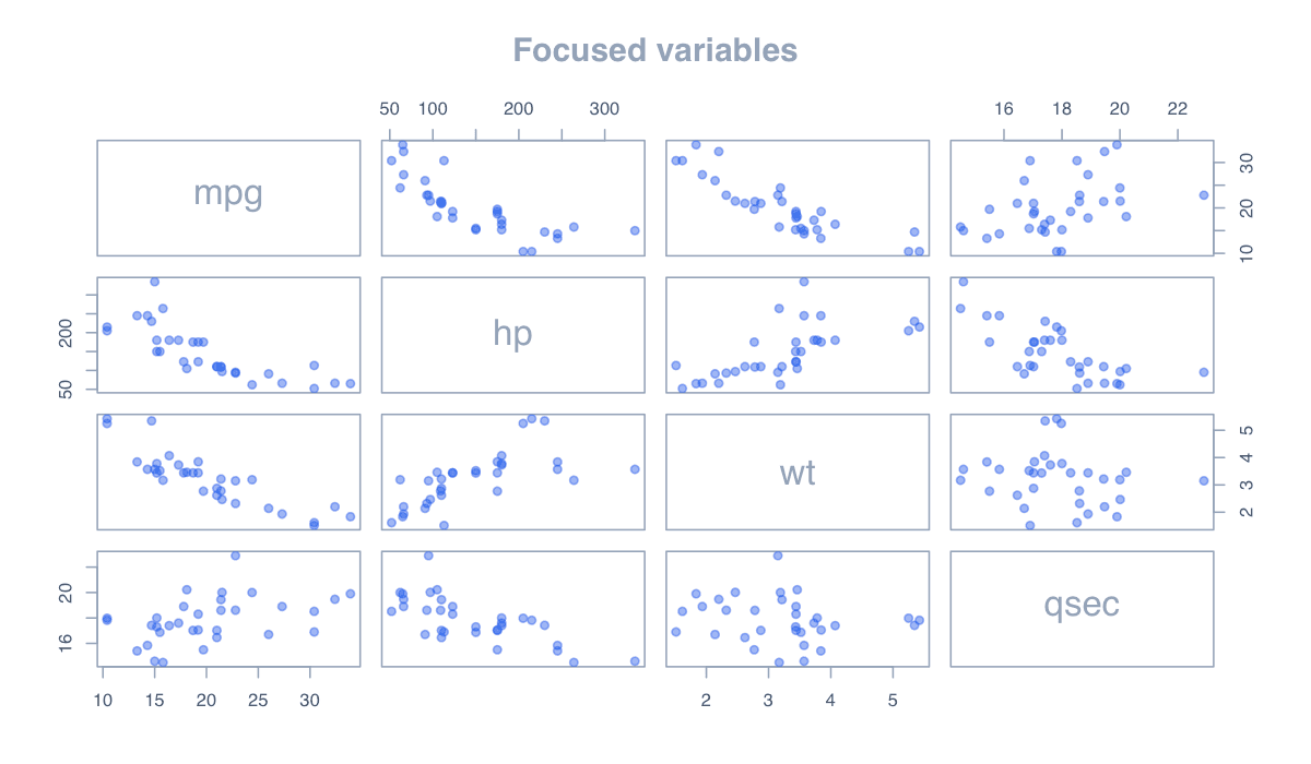
Focus on Selected Variables example generated in R
R-generated example output.

Selection is often the strongest design improvement: fewer panels allow larger marks, labels, and patterns.

RRun this code
vars <- mtcars[, c("mpg", "hp", "wt", "qsec")]
pairs(vars, pch = 21, bg = "#60a5fa", col = "white",
      main = "Performance and efficiency")