R Graphics · Boxplot

Understanding Distributions with Boxplots in R

Practical patterns for reading and designing boxplots, from a single distribution to grouped comparisons, raw-data overlays, and interactive charts.

14 examplesReproducible R code
Before you begin

A compact view of an entire distribution

Boxplots reveal center, spread, asymmetry, and potential outliers without displaying every value. Their real strength appears when several groups share a common scale and can be compared side by side.

Examples
14
Levels
Beginner + Intermediate
01
Example 01Base RBeginner

Begin with a Basic Boxplot

A boxplot summarizes a numeric distribution through its median, quartiles, whiskers, and potential outliers.
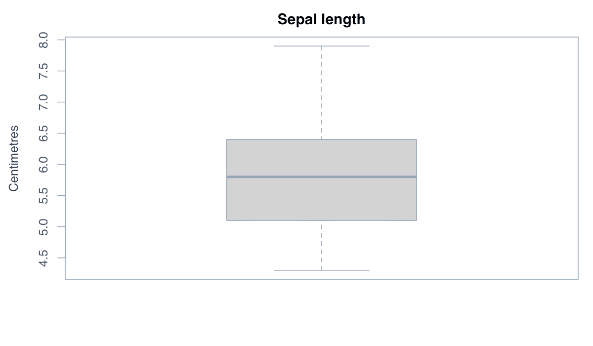
Begin with a Basic Boxplot example generated in R
R-generated example output.

The box spans the interquartile range, the central line marks the median, and the whiskers extend to the most extreme values within 1.5 times the interquartile range.

RRun this code
boxplot(iris$Sepal.Length,
        main = "Sepal length",
        ylab = "Centimetres")
02
Example 02Base RBeginner

Turn the Boxplot Horizontally

A horizontal boxplot presents the distribution from left to right and can make long labels easier to read.
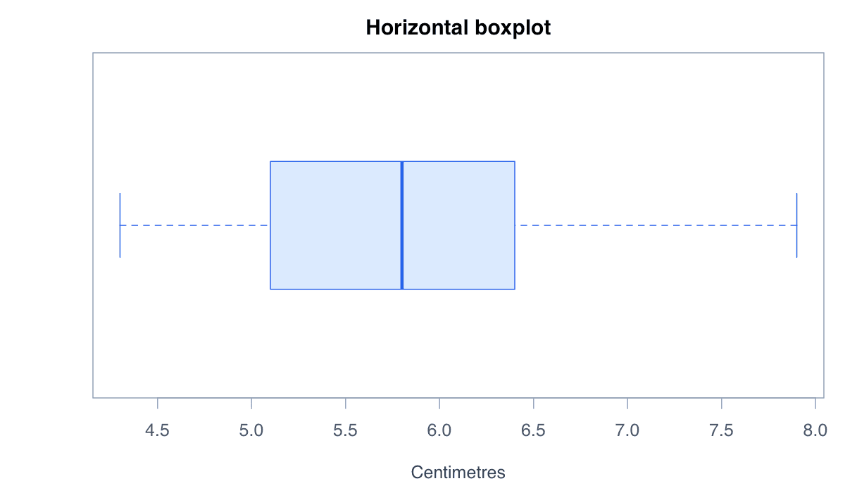
Turn the Boxplot Horizontally example generated in R
R-generated example output.

Set horizontal = TRUE and replace the y-axis label with an x-axis label. The statistical summary is unchanged; only its orientation differs.

RRun this code
boxplot(iris$Sepal.Length, horizontal = TRUE,
        col = "#dbeafe", border = "#2563eb",
        main = "Horizontal boxplot", xlab = "Centimetres")
03
Example 03Base RBeginner

Apply a Clear Color Palette

Purposeful fill and border colors can distinguish distributions while preserving the boxplot's statistical structure.
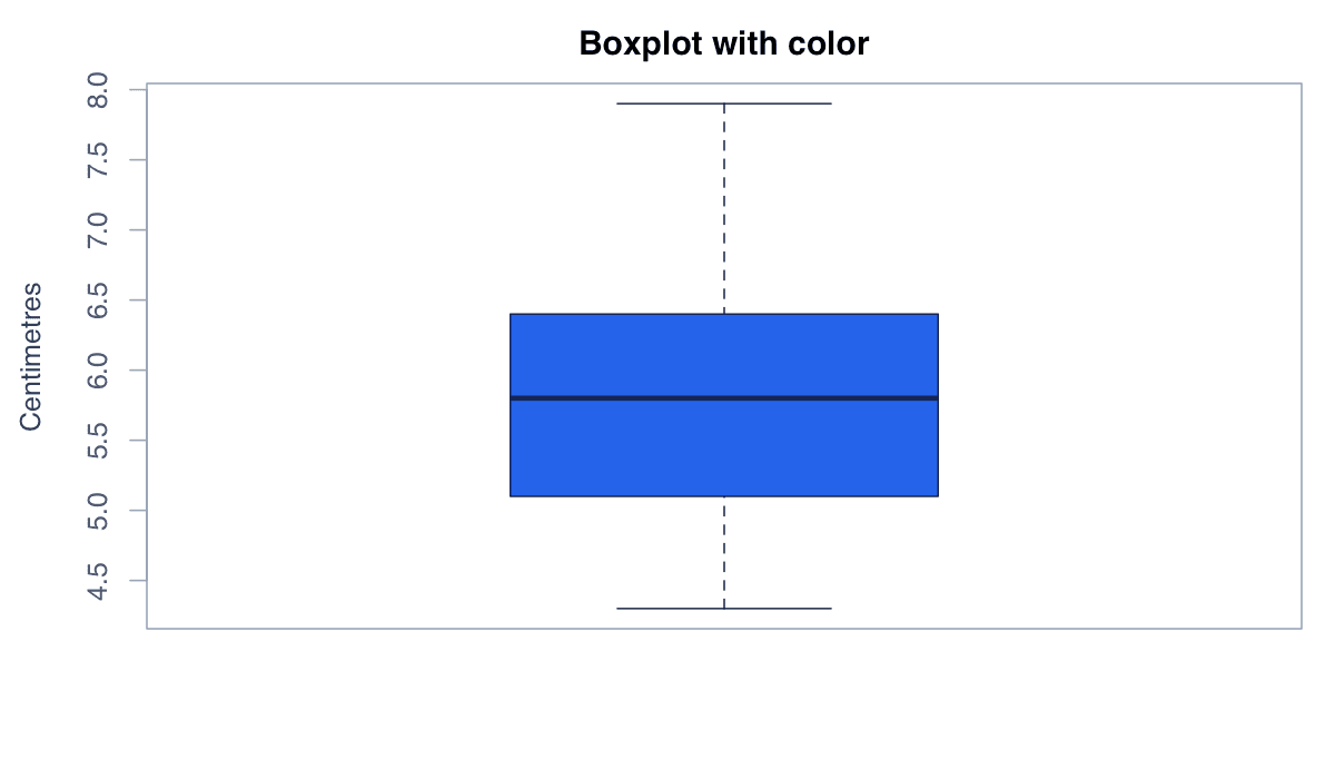
Apply a Clear Color Palette example generated in R
R-generated example output.

Use col for the box fill and border for its outline. Restrained colors keep the median, whiskers, and outliers visually prominent.

RRun this code
boxplot(iris$Sepal.Length,
        col = "#2563eb", border = "#172554",
        main = "Boxplot with color", ylab = "Centimetres")
04
Example 04Base RBeginner

Compare Distributions by Group

Grouped boxplots place several distributions on a common scale so their centers, spreads, and outliers can be compared directly.
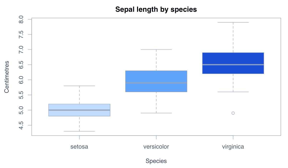
Compare Distributions by Group example generated in R
R-generated example output.

Formula notation separates the response variable on the left from the grouping variable on the right. Here, sepal length is compared across three iris species.

RRun this code
boxplot(Sepal.Length ~ Species, data = iris,
        col = c("#bfdbfe", "#60a5fa", "#1d4ed8"),
        main = "Sepal length by species",
        xlab = "Species", ylab = "Centimetres")
05
Example 05Base RBeginner

Add Notches Around the Median

A notched boxplot adds an approximate confidence interval around each median to support a cautious visual comparison.
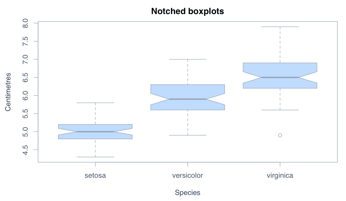
Add Notches Around the Median example generated in R
R-generated example output.

Set notch = TRUE. Non-overlapping notches suggest that two medians may differ, but the graphic is an exploratory aid rather than a substitute for formal inference.

RRun this code
boxplot(Sepal.Length ~ Species, data = iris,
        notch = TRUE, col = "#bfdbfe",
        main = "Notched boxplots",
        xlab = "Species", ylab = "Centimetres")
06
Example 06Base RBeginner

Show Relative Sample Sizes

Variable-width boxplots scale each box according to the square root of its group's sample size.
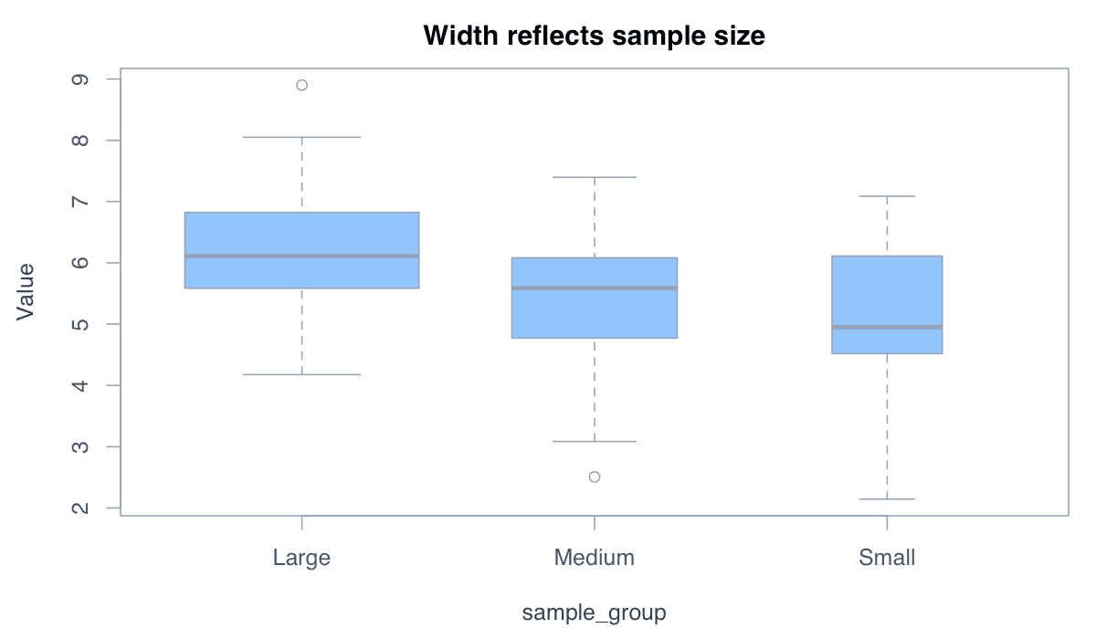
Show Relative Sample Sizes example generated in R
R-generated example output.

Set varwidth = TRUE when groups contain different numbers of observations. Width then adds useful sample-size context without changing the quartiles.

RRun this code
set.seed(42)
group <- rep(c("Small", "Medium", "Large"), c(20, 45, 90))
value <- rnorm(length(group), rep(c(4.8, 5.5, 6.2), c(20, 45, 90)))
boxplot(value ~ group, varwidth = TRUE, col = "#93c5fd",
        main = "Width reflects sample size", ylab = "Value")
07
Example 07Base RBeginner

Style and Interpret Outliers

Points beyond the whiskers are potential outliers identified by the boxplot rule, not automatically errors or observations to remove.
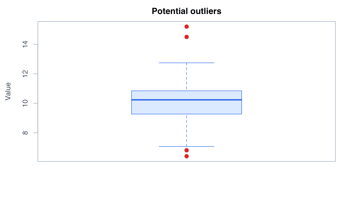
Style and Interpret Outliers example generated in R
R-generated example output.

The outpch, outcol, and outcex arguments control their appearance. Investigate unusual observations in context before making any analytical decision.

RRun this code
set.seed(42)
values <- c(rnorm(80, 10, 1.2), 14.5, 15.2)
boxplot(values, col = "#dbeafe", border = "#2563eb",
        outpch = 19, outcol = "#dc2626", outcex = 1.2,
        main = "Potential outliers", ylab = "Value")
08
Example 08Base RIntermediate

Overlay the Individual Observations

A jittered overlay combines the distribution summary with the raw observations that produced it.
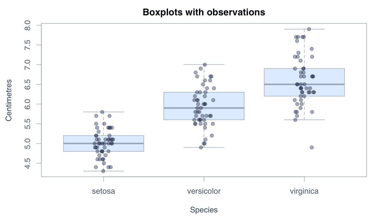
Overlay the Individual Observations example generated in R
R-generated example output.

Draw the boxplot first, then add stripchart() with jitter. This is especially informative for small and medium samples where the data density remains readable.

RRun this code
boxplot(Sepal.Length ~ Species, data = iris,
        col = "#dbeafe", outline = FALSE,
        main = "Boxplots with observations", ylab = "Centimetres")
stripchart(Sepal.Length ~ Species, data = iris,
           vertical = TRUE, method = "jitter", add = TRUE,
           pch = 19, col = adjustcolor("#172554", 0.45))
09
Example 09Base RIntermediate

Compare Several Numeric Variables

Side-by-side boxplots can summarize multiple numeric variables when they share compatible units and scales.
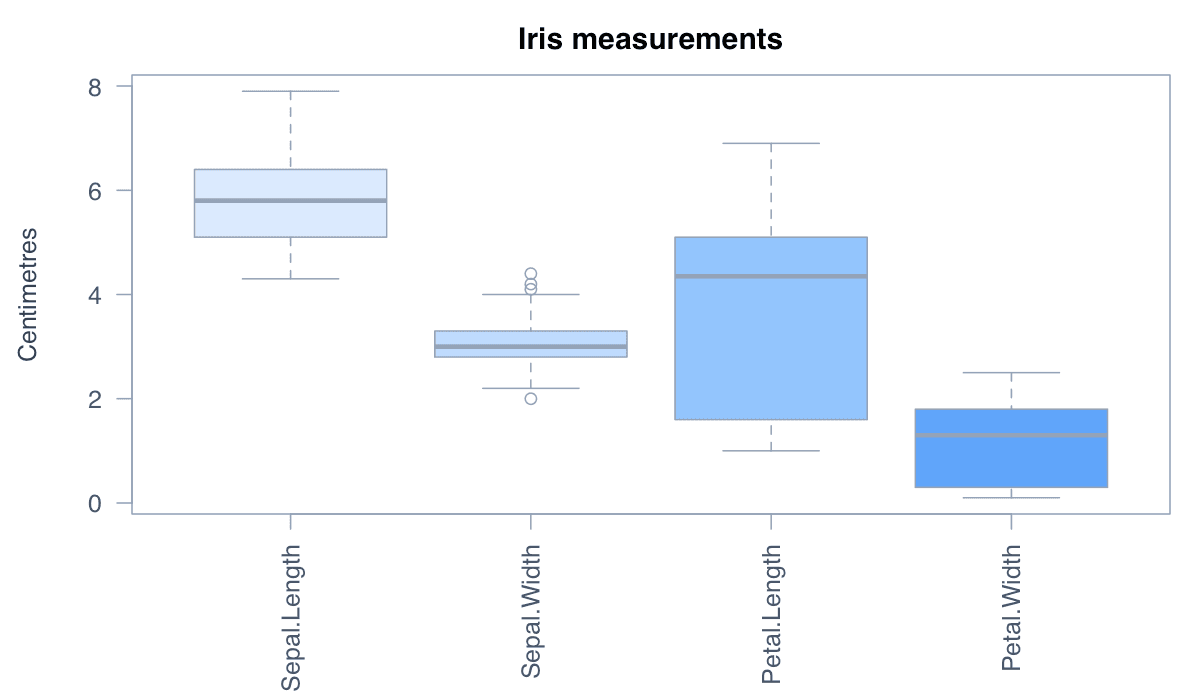
Compare Several Numeric Variables example generated in R
R-generated example output.

Passing a numeric data frame creates one box for each column. Standardize variables first when their units or magnitudes are not directly comparable.

RRun this code
boxplot(iris[1:4],
        col = c("#dbeafe", "#bfdbfe", "#93c5fd", "#60a5fa"),
        main = "Iris measurements",
        ylab = "Centimetres", las = 2)
10
Example 10Base RIntermediate

Use a Logarithmic Scale for Skewed Data

A logarithmic axis can make highly skewed positive distributions easier to compare by compressing large values.
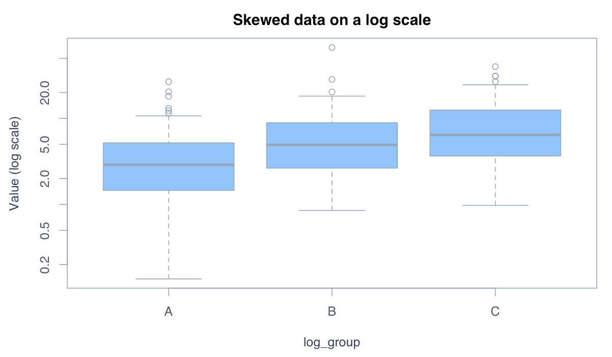
Use a Logarithmic Scale for Skewed Data example generated in R
R-generated example output.

Set log = "y" for a vertical boxplot. Because logarithms are undefined for zero and negative values, verify the data before applying this transformation.

RRun this code
set.seed(42)
group <- rep(c("A", "B", "C"), each = 60)
value <- rlnorm(180, meanlog = rep(c(1, 1.5, 2), each = 60))
boxplot(value ~ group, log = "y", col = "#93c5fd",
        main = "Skewed data on a log scale", ylab = "Value (log scale)")
11
Example 11Base RIntermediate

Order Groups by Their Median

Reordering categories by a summary statistic reveals rankings and patterns that alphabetical ordering may conceal.
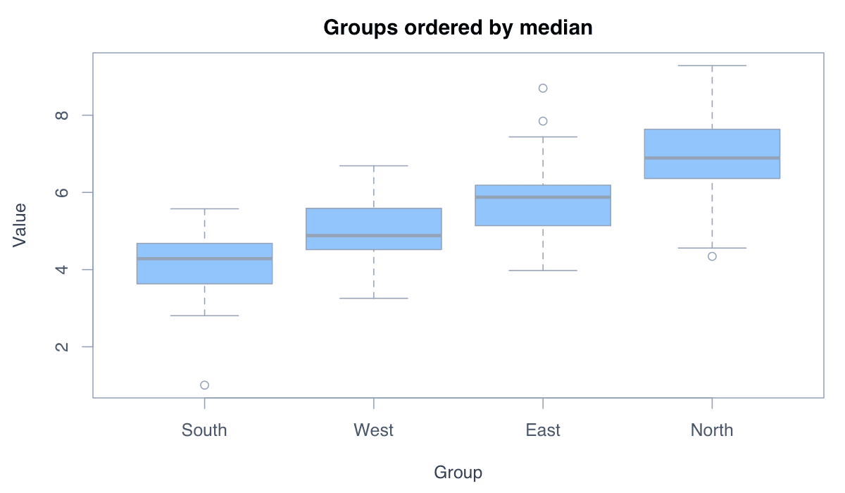
Order Groups by Their Median example generated in R
R-generated example output.

Use reorder() inside the formula to arrange groups by their median. This is useful when a chart contains many categories.

RRun this code
set.seed(42)
data <- data.frame(
  group = rep(c("North", "South", "East", "West"), each = 45),
  value = rnorm(180, rep(c(7, 4, 6, 5), each = 45))
)
boxplot(value ~ reorder(group, value, median), data = data,
        col = "#93c5fd", xlab = "Group ordered by median",
        ylab = "Value")
12
Example 12Base RIntermediate

Add Group Means to the Summary

Mean markers supplement the median line and can expose asymmetry when the two measures of center differ.
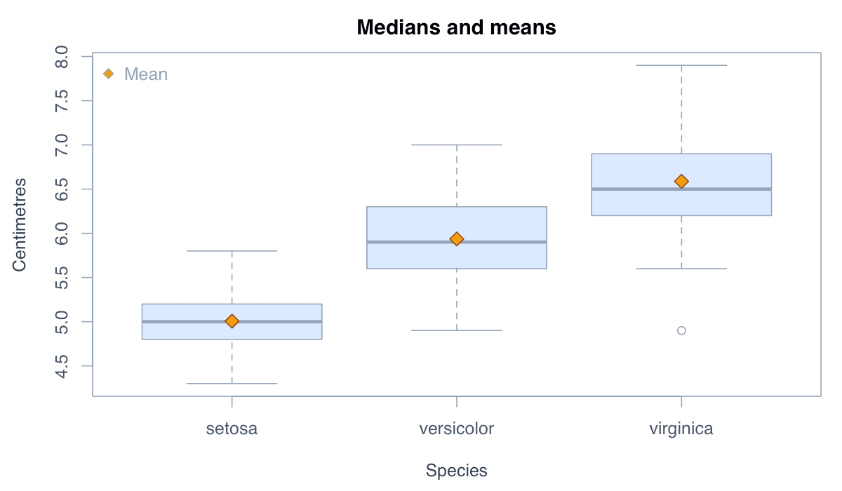
Add Group Means to the Summary example generated in R
R-generated example output.

Calculate group means with tapply(), then add them at the corresponding box positions. Use a distinct symbol and explain it in a legend.

RRun this code
boxplot(Sepal.Length ~ Species, data = iris,
        col = "#dbeafe", main = "Medians and means",
        ylab = "Centimetres")
means <- tapply(iris$Sepal.Length, iris$Species, mean)
points(seq_along(means), means, pch = 23,
       bg = "#f59e0b", col = "#92400e", cex = 1.4)
legend("topleft", "Mean", pch = 23, pt.bg = "#f59e0b", bty = "n")
13
Example 13ggplot2Intermediate

Build a Boxplot with ggplot2

ggplot2 constructs boxplots as layers, making it straightforward to map variables to position, fill, and other visual properties.
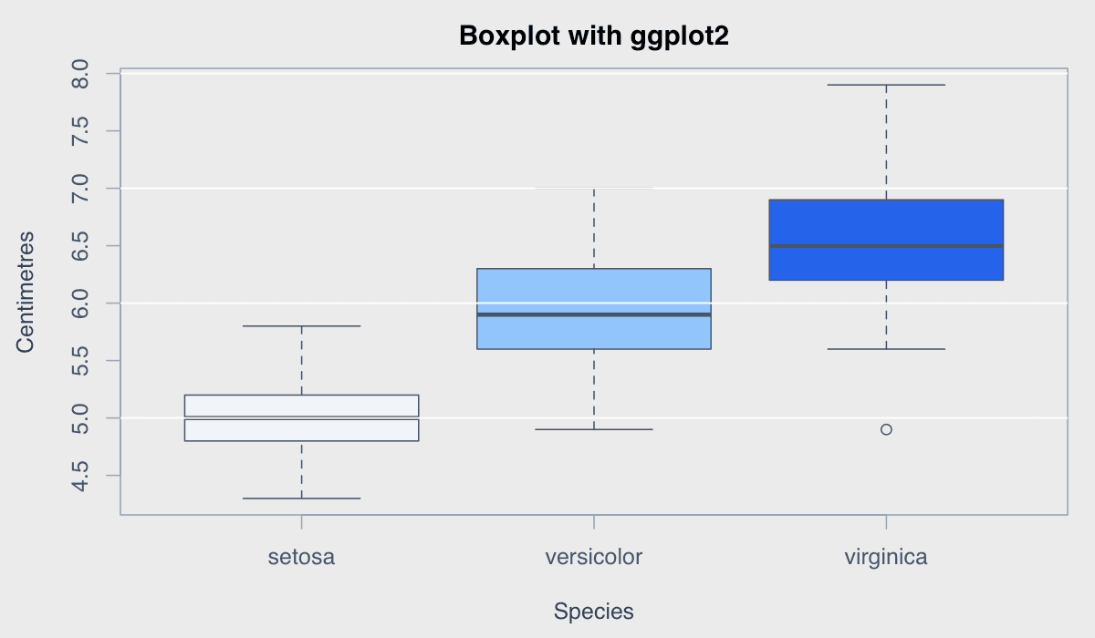
Build a Boxplot with ggplot2 example generated in R
R-generated example output.

geom_boxplot() calculates the five-number summary automatically. Add geom_jitter() when you also want readers to see the underlying observations.

RRun this code
install.packages("ggplot2") # Run once
library(ggplot2)
ggplot(iris, aes(x = Species, y = Sepal.Length, fill = Species)) +
  geom_boxplot(width = 0.65, show.legend = FALSE) +
  labs(title = "Sepal length by species",
       x = "Species", y = "Centimetres") +
  theme_minimal()
14
Example 14plotlyIntermediate

Create an Interactive Boxplot with plotly

A plotly boxplot adds hover details, zooming, panning, and optional display of individual observations.
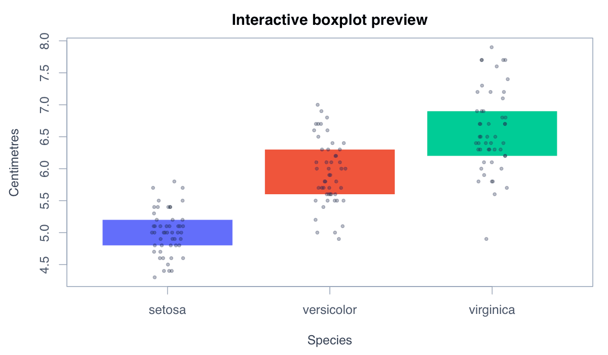
Create an Interactive Boxplot with plotly example generated in R
R-generated example output.

plot_ly() produces an interactive HTML widget. Setting boxpoints = "all" reveals each observation alongside the statistical summary.

RRun this code
install.packages("plotly") # Run once
library(plotly)
plot_ly(iris, x = ~Species, y = ~Sepal.Length,
        color = ~Species, type = "box",
        boxpoints = "all", jitter = 0.3, pointpos = 0) %>%
  layout(title = "Interactive boxplot",
         xaxis = list(title = "Species"),
         yaxis = list(title = "Centimetres"))