Draw a Basic Violin Plot
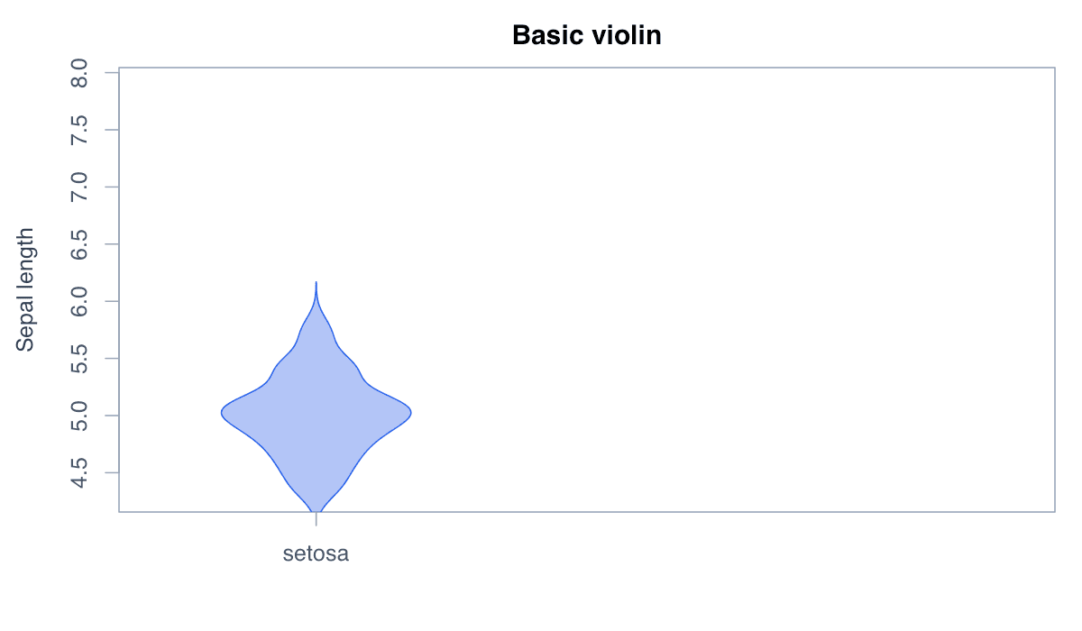
A violin plot mirrors a density curve to show the full distribution shape.
R Graphics · Violin Plot
Build single, grouped, split-style, box-overlay, point-overlay, and ggplot2 violins.
Violin plots mirror a density estimate around a central axis. They reveal distributional shape while retaining the compact group-comparison role of a boxplot.
A violin plot mirrors a density curve to show the full distribution shape.

Run the code, inspect how the visual encoding changes, and adapt the labels, scales, and styling to the analytical question rather than treating the defaults as fixed.
x<-iris$Sepal.Length;d<-density(x);w<-d$y/max(d$y)*.4
plot(1,type="n",xlim=c(.4,1.6),ylim=range(d$x),xaxt="n",xlab="",ylab="Sepal length")
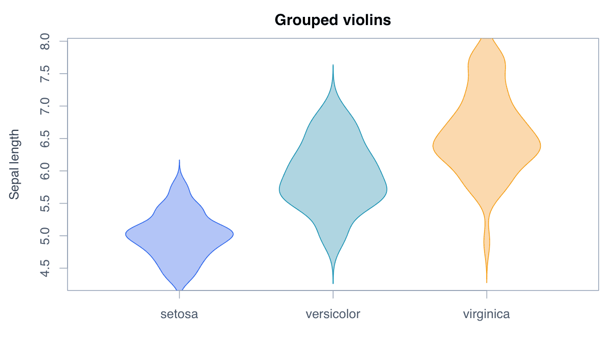
polygon(c(1-w,rev(1+w)),c(d$x,rev(d$x)),col="#93c5fd",border="#2563eb")Grouped violins expose differences in modality, spread, and center across categories.
Run the code, inspect how the visual encoding changes, and adapt the labels, scales, and styling to the analytical question rather than treating the defaults as fixed.
groups<-split(iris$Sepal.Length,iris$Species);plot(1,type="n",xlim=c(.5,3.5),ylim=range(iris$Sepal.Length),xaxt="n")
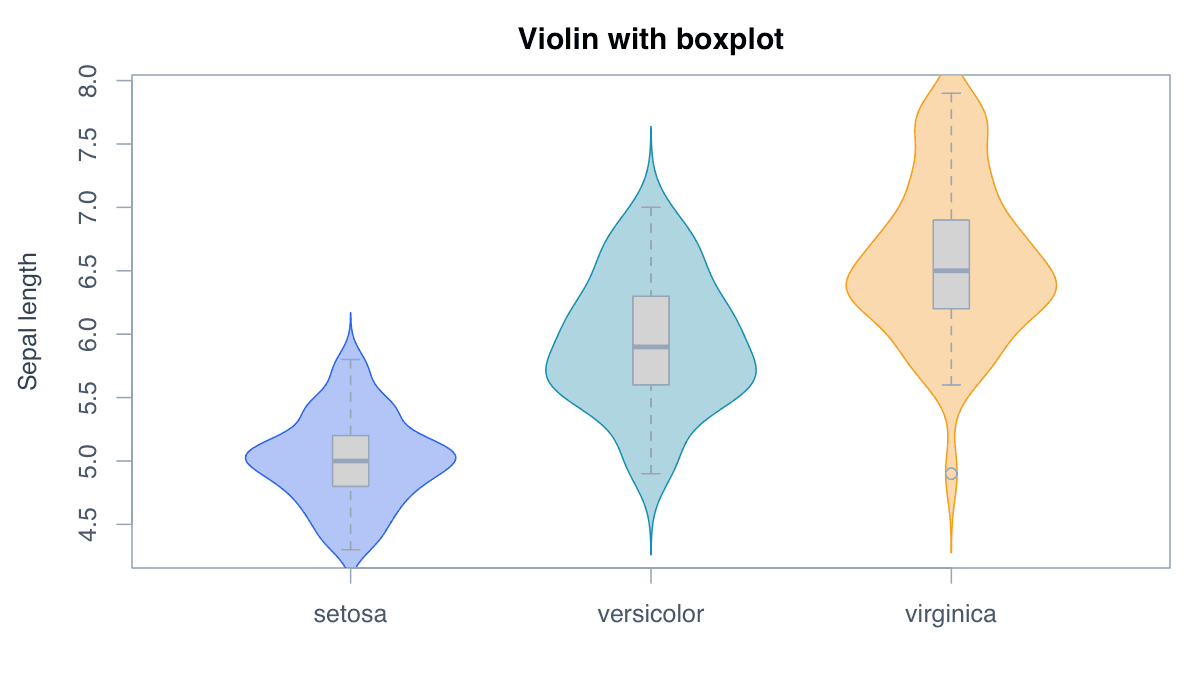
for(i in 1:3){d<-density(groups[[i]]);w<-d$y/max(d$y)*.35;polygon(c(i-w,rev(i+w)),c(d$x,rev(d$x)),col=adjustcolor(c("#2563eb","#0891b2","#f59e0b")[i],.45))};axis(1,1:3,names(groups))A narrow boxplot adds the median and quartiles to the density shape.
Run the code, inspect how the visual encoding changes, and adapt the labels, scales, and styling to the analytical question rather than treating the defaults as fixed.
library(ggplot2)
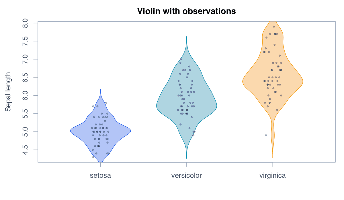
ggplot(iris,aes(Species,Sepal.Length,fill=Species))+geom_violin(show.legend=FALSE)+geom_boxplot(width=.12,fill="white",show.legend=FALSE)+theme_minimal()Jittered points reconnect the smoothed violin to the underlying sample.
Run the code, inspect how the visual encoding changes, and adapt the labels, scales, and styling to the analytical question rather than treating the defaults as fixed.
library(ggplot2)
ggplot(iris,aes(Species,Sepal.Length,fill=Species))+geom_violin(alpha=.5)+geom_jitter(width=.08,size=1,alpha=.5)+theme_minimal()Trimmed and untrimmed violins differ in whether the shape extends beyond observed extremes.
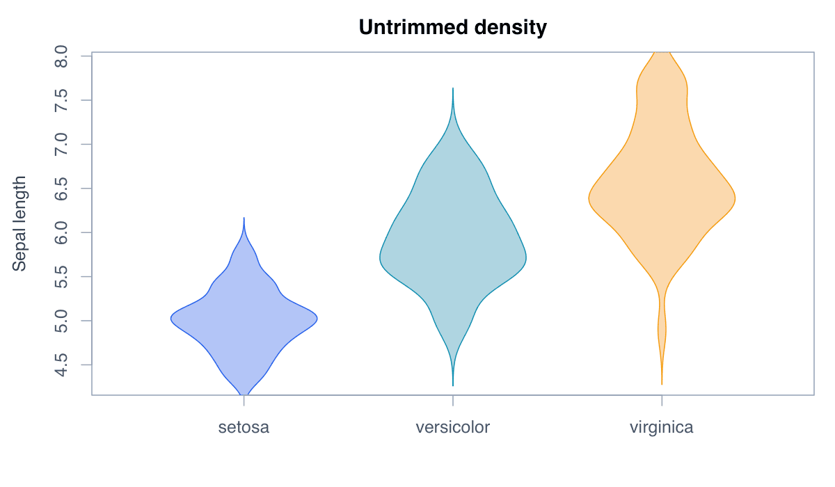
Run the code, inspect how the visual encoding changes, and adapt the labels, scales, and styling to the analytical question rather than treating the defaults as fixed.
library(ggplot2)
ggplot(iris,aes(Species,Sepal.Length,fill=Species))+geom_violin(trim=FALSE,show.legend=FALSE)+theme_minimal()Horizontal violins accommodate long category labels and emphasize the value scale.
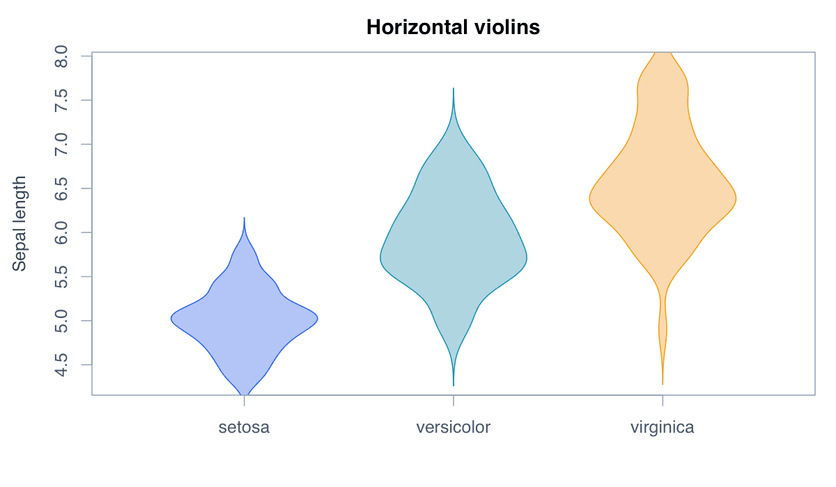
Run the code, inspect how the visual encoding changes, and adapt the labels, scales, and styling to the analytical question rather than treating the defaults as fixed.
library(ggplot2)
ggplot(iris,aes(Species,Sepal.Length,fill=Species))+geom_violin(show.legend=FALSE)+coord_flip()+theme_minimal()