Create a Basic Heatmap
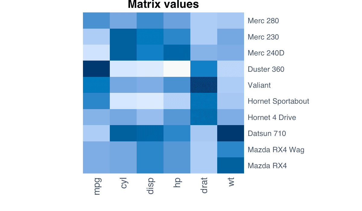
A basic heatmap maps every matrix cell to a color.
R Graphics · Heatmap
Learn how color scales, annotations, clustering, labels, and normalization turn matrices into interpretable heatmaps.
Heatmaps encode numeric matrices with color. Careful ordering and scaling can expose blocks, gradients, correlations, and clusters that are difficult to detect numerically.
A basic heatmap maps every matrix cell to a color.

Use image() for a direct matrix display and choose a sequential palette for values that progress from low to high.
m <- as.matrix(mtcars[1:10, 1:6])
image(t(m[nrow(m):1, ]), axes = FALSE,
col = colorRampPalette(c("#eff6ff", "#2563eb", "#172554"))(40))A correlation heatmap displays the strength and direction of pairwise linear relationships.
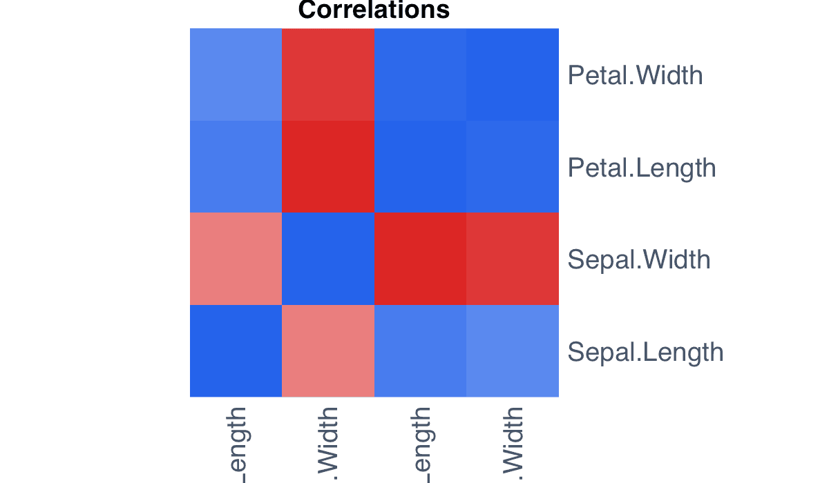
A diverging palette centered on zero distinguishes negative, neutral, and positive correlations.
m <- cor(mtcars)
heatmap(m, Rowv = NA, Colv = NA, scale = "none",
col = colorRampPalette(c("#dc2626", "white", "#2563eb"))(50))Labels identify the observations and variables represented by each cell.
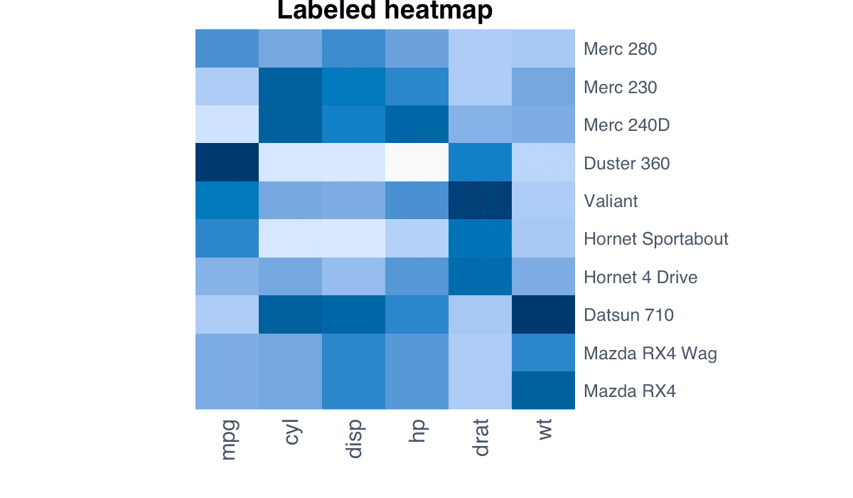
Keep labels short and rotate or reduce them when the matrix is large so the color pattern remains dominant.
m <- as.matrix(mtcars[1:8, 1:5])
heatmap(m, Rowv = NA, Colv = NA, scale = "column",
labRow = rownames(m), labCol = colnames(m),
col = hcl.colors(30, "Blues 3"))A clustered heatmap reorders rows and columns using hierarchical clustering.
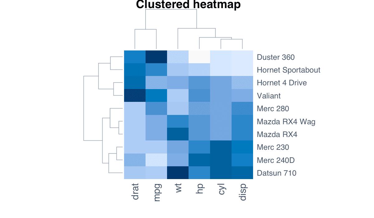
The dendrograms show which profiles are similar, while the reordered matrix reveals coherent blocks.
m <- as.matrix(scale(mtcars[, 1:7]))
heatmap(m, scale = "none",
col = colorRampPalette(c("#dc2626", "white", "#2563eb"))(50))Standardization prevents variables with large numeric ranges from dominating the colors.
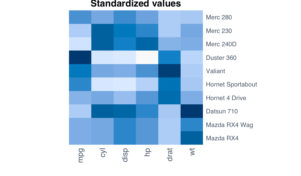
scale() expresses every column in standard-deviation units, making relative high and low values comparable.
m <- scale(mtcars[1:12, 1:7])
heatmap(m, Rowv = NA, Colv = NA, scale = "none",
col = hcl.colors(40, "Blue-Red 3"))Cell annotations combine color-based pattern recognition with exact numerical values.
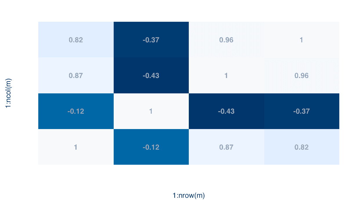
Use text() over an image plot for small matrices. For large matrices, labels quickly become cluttered.
m <- round(cor(iris[, 1:4]), 2)
image(1:4, 1:4, m, col = hcl.colors(30, "Blues 3"), axes = FALSE)
axis(1, 1:4, colnames(m)); axis(2, 1:4, rownames(m))
text(row(m), col(m), labels = m, font = 2)