Draw a Basic Line Plot
A line plot connects observations in their natural order.
R Graphics · Line Plot
Build clear sequences, multiple series, markers, confidence bands, trends, and ggplot2 time plots.
Line plots connect ordered observations and are especially effective for time series. A line implies continuity, so the order and spacing of the horizontal axis must be meaningful.
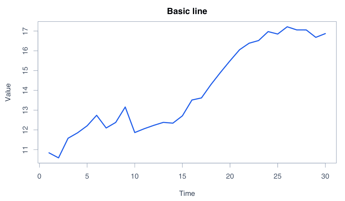
A line plot connects observations in their natural order.

type = "l" draws the line, while lwd and col control its visual emphasis.
values <- cumsum(c(2, -1, 3, 1, -2, 4, 2))
plot(values, type = "l", lwd = 3, col = "#2563eb",
xlab = "Period", ylab = "Value")Markers expose the individual values that the line connects.
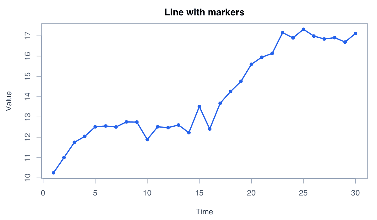
type = "o" overlays points and lines, which is useful when the series is short or observations are irregular.
plot(AirPassengers[1:24], type = "o", pch = 16,
col = "#2563eb", xlab = "Time", ylab = "Passengers")Several lines on shared axes reveal similarities, gaps, and crossings.
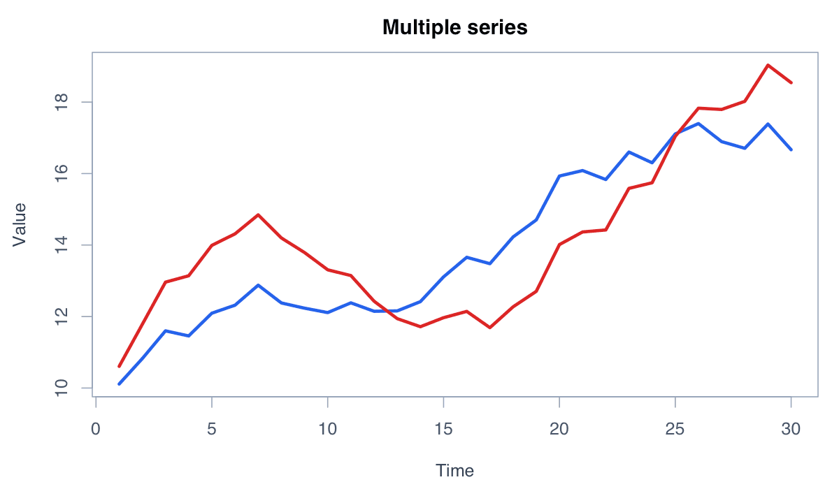
Use matplot() for columns of aligned data and provide a legend with both color and line-type cues.
x <- 1:12
y <- cbind(A = cumsum(rnorm(12)), B = cumsum(rnorm(12)))
matplot(x, y, type = "l", lwd = 2, lty = 1,
col = c("#2563eb", "#dc2626"), xlab = "Month", ylab = "Index")
legend("topleft", colnames(y), col = c("#2563eb", "#dc2626"), lwd = 2, bty = "n")A smoother emphasizes the broad movement beneath short-term variation.
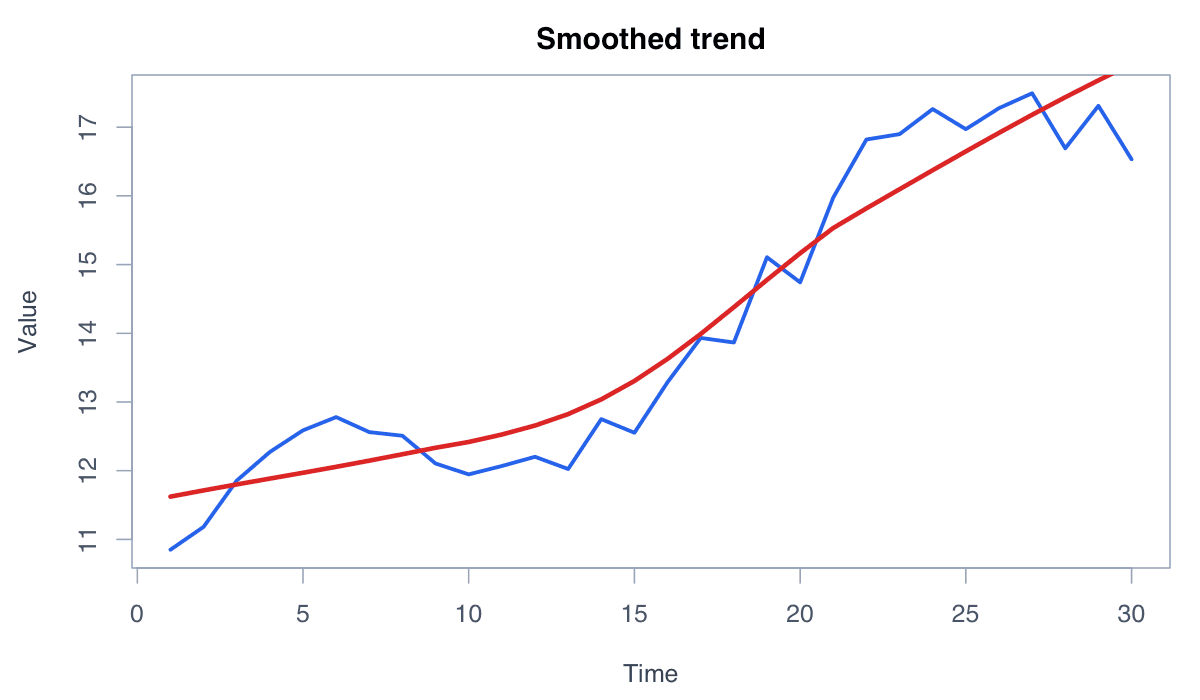
lowess() provides a flexible exploratory trend. Avoid presenting the smooth as observed data.
y <- as.numeric(Nile)
plot(y, type = "l", col = "#94a3b8", ylab = "Flow")
lines(lowess(seq_along(y), y, f = .2), col = "#dc2626", lwd = 3)A shaded band displays a range around a central line, such as a confidence interval.
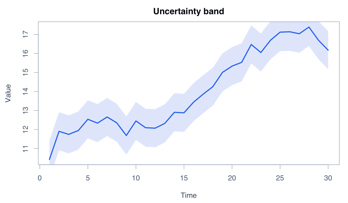
Draw the polygon first and the central estimate afterward so the line remains visible.
x <- 1:30; y <- 10 + .3*x + sin(x/3); se <- 1 + .02*x
plot(x, y, type = "n", ylim = range(y-se, y+se), xlab = "Time", ylab = "Estimate")
polygon(c(x, rev(x)), c(y-se, rev(y+se)), col = adjustcolor("#2563eb", .2), border = NA)
lines(x, y, col = "#2563eb", lwd = 3)ggplot2 maps time, value, and group variables to layered lines.
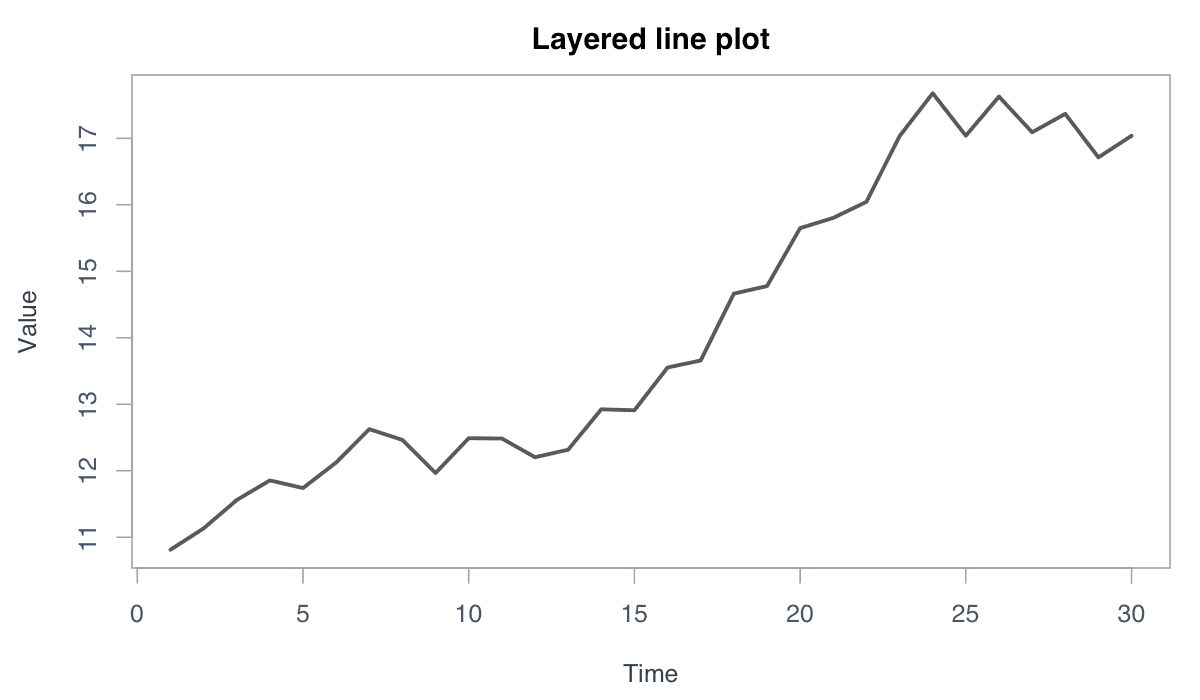
geom_line() works naturally with tidy data and makes grouped series, themes, and annotations easy to extend.
library(ggplot2)
data <- data.frame(time = 1:24, value = as.numeric(AirPassengers[1:24]))
ggplot(data, aes(time, value)) +
geom_line(color = "#2563eb", linewidth = 1) +
geom_point(color = "#172554") + theme_minimal()