Draw a Basic Density Curve
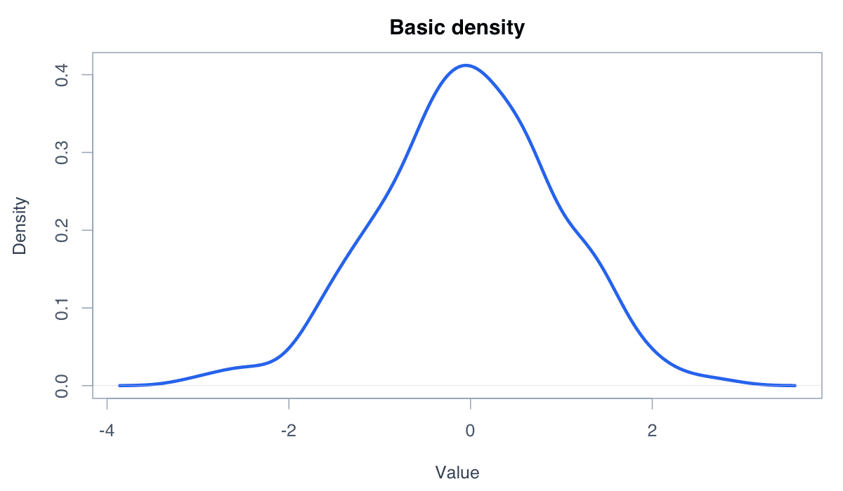
A density curve is a smoothed estimate of where observations are concentrated.
R Graphics · Density Plot
Move from a basic kernel-density estimate to grouped, filled, bandwidth-adjusted, and ggplot2 density graphics.
Density plots estimate the shape of a continuous distribution. Their smooth curves make peaks, spread, skewness, and group differences easier to see than a table of values.
A density curve is a smoothed estimate of where observations are concentrated.

density() calculates the estimate and plot() displays it. The total area under the curve equals one.
set.seed(42)
x <- rnorm(200)
plot(density(x), lwd = 3, col = "#2563eb",
main = "Basic density plot", xlab = "Value")A translucent fill emphasizes the overall shape without hiding the curve boundary.
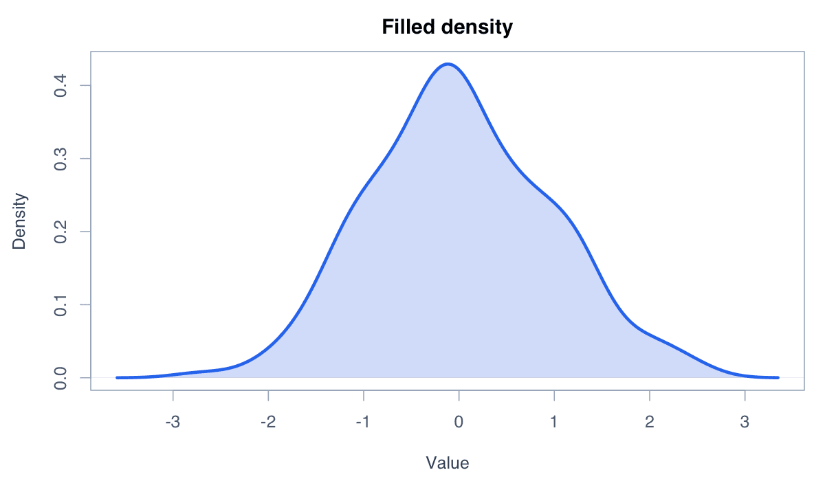
Draw the estimate first, use polygon() for the fill, and redraw the line on top for a crisp edge.
d <- density(rnorm(200))
plot(d, type = "n", main = "Filled density")
polygon(d, col = adjustcolor("#2563eb", .25), border = NA)
lines(d, col = "#2563eb", lwd = 3)Bandwidth controls how strongly the density estimate is smoothed.
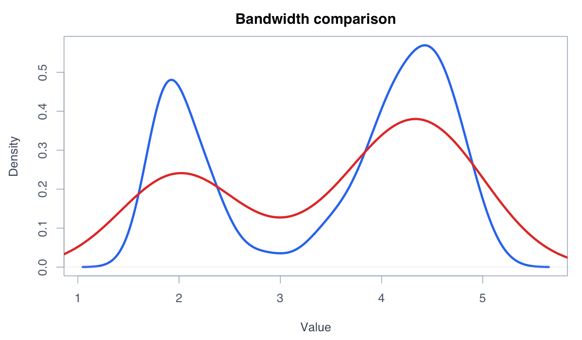
Small bandwidths reveal local detail but may be noisy; large bandwidths produce a simpler, smoother shape.
x <- faithful$eruptions
plot(density(x, adjust = .5), col = "#2563eb", lwd = 2)
lines(density(x, adjust = 1.5), col = "#dc2626", lwd = 2)
legend("topright", c("Less smooth", "More smooth"),
col = c("#2563eb", "#dc2626"), lwd = 2, bty = "n")Overlaid density curves compare distributional shapes across categories.
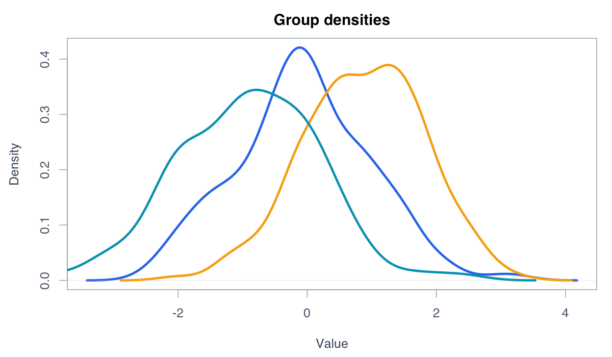
Use a shared axis and distinct colors. Transparency or direct labels help avoid ambiguity where curves overlap.
cols <- c("#2563eb", "#0891b2", "#f59e0b")
sp <- levels(iris$Species)
plot(density(iris$Sepal.Length[iris$Species == sp[1]]),
xlim = range(iris$Sepal.Length), col = cols[1], lwd = 2)
for (i in 2:3) lines(density(iris$Sepal.Length[iris$Species == sp[i]]),
col = cols[i], lwd = 2)
legend("topright", sp, col = cols, lwd = 2, bty = "n")A rug plot displays individual observations along the axis beneath the density curve.
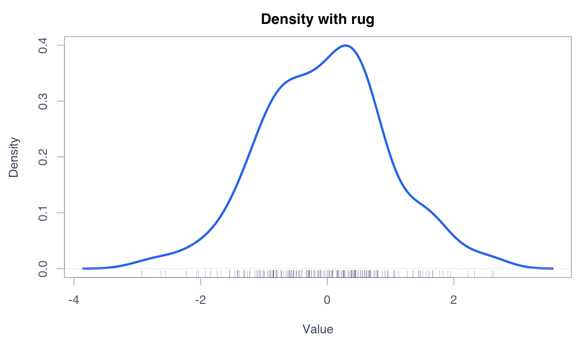
rug() reconnects the smooth estimate to the sample and can reveal gaps or clusters hidden by smoothing.
x <- faithful$waiting
plot(density(x), col = "#2563eb", lwd = 3,
main = "Density with observed values")
rug(x, col = adjustcolor("#172554", .45))ggplot2 maps grouping and fill aesthetics to layered density curves.
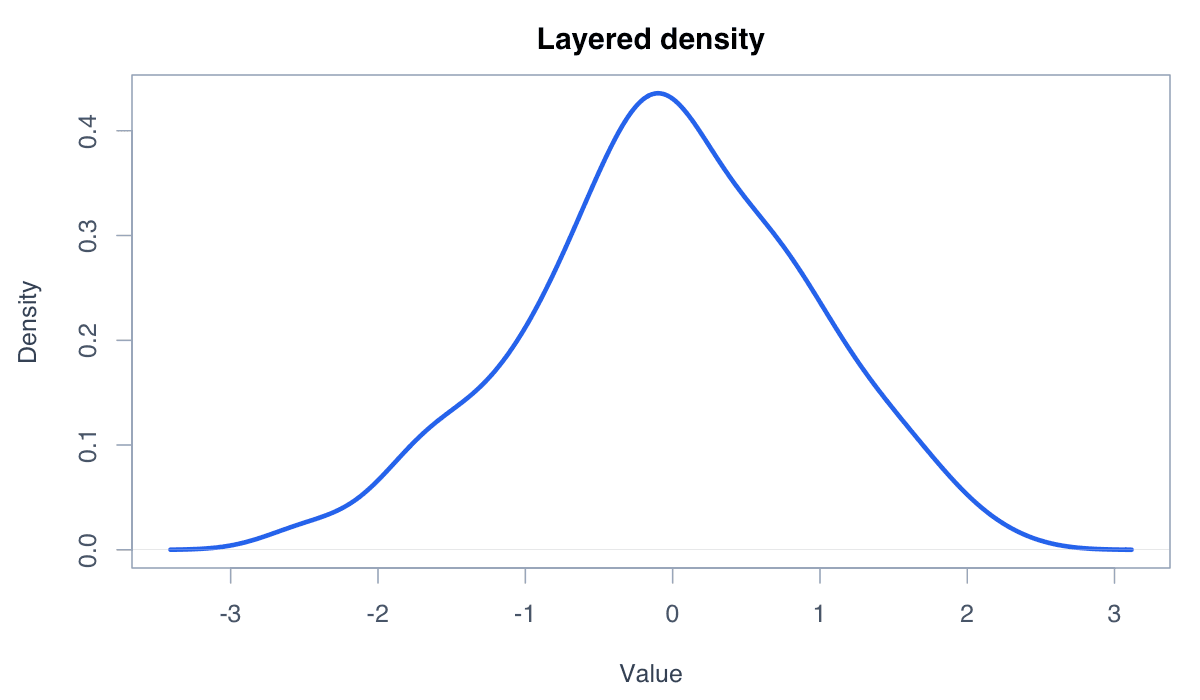
geom_density() supports transparent group fills and integrates with a consistent grammar for labels and themes.
library(ggplot2)
ggplot(iris, aes(Sepal.Length, fill = Species)) +
geom_density(alpha = .3) +
labs(title = "Sepal-length distributions", x = "Centimetres") +
theme_minimal()