Build a Basic Histogram
A histogram counts observations within adjacent numeric intervals.
R Graphics · Histogram
Explore bin selection, density scaling, group comparison, reference curves, and ggplot2 styling.
Histograms divide a continuous scale into intervals. Their appearance depends on bin width, so responsible interpretation requires trying meaningful alternatives rather than accepting a default blindly.
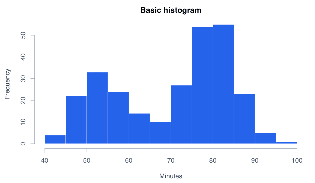
A histogram counts observations within adjacent numeric intervals.

hist() chooses reasonable breaks automatically, while col and border improve visual separation.
hist(faithful$waiting, col = "#2563eb", border = "white",
main = "Waiting times", xlab = "Minutes")Changing the bins changes how much detail the histogram reveals.
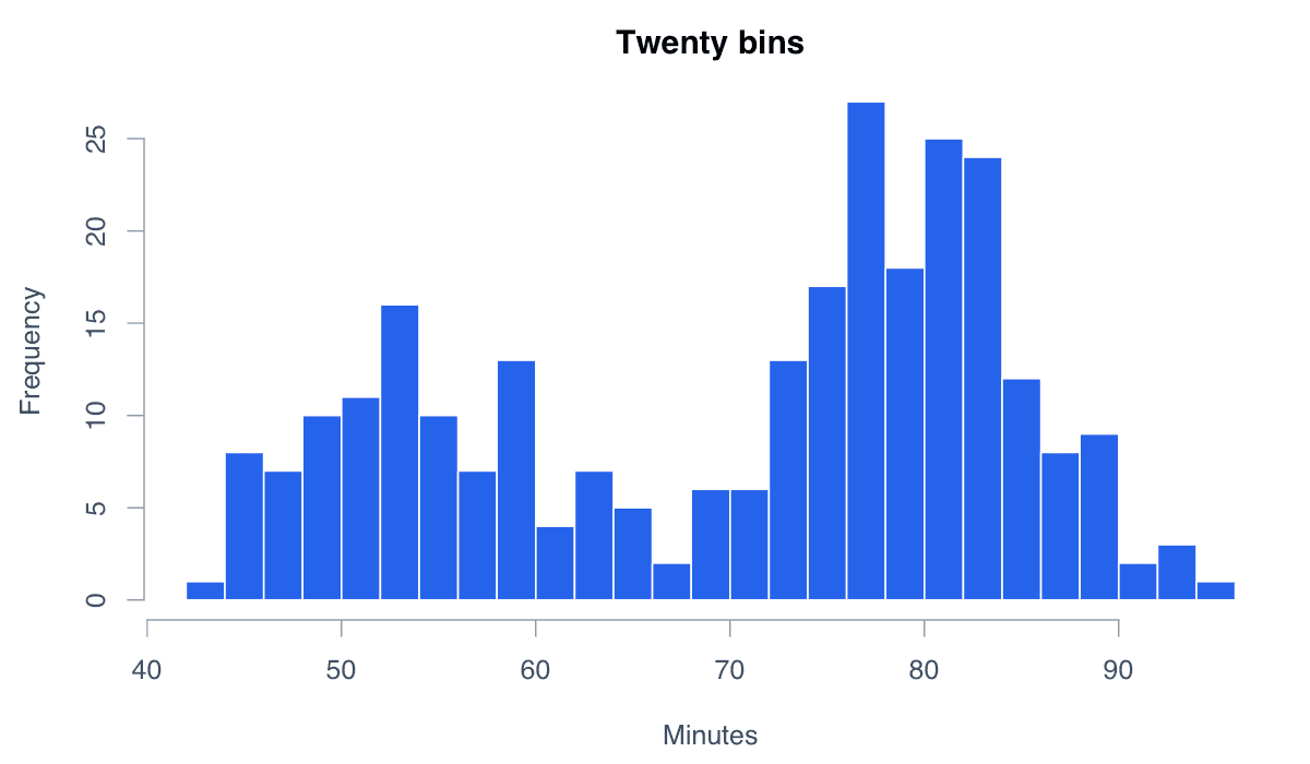
Too few bins hide structure; too many emphasize random variation. Compare several defensible choices.
hist(faithful$waiting, breaks = 20, col = "#60a5fa",
border = "white", main = "Twenty bins", xlab = "Minutes")Density scaling makes the total bar area equal to one.
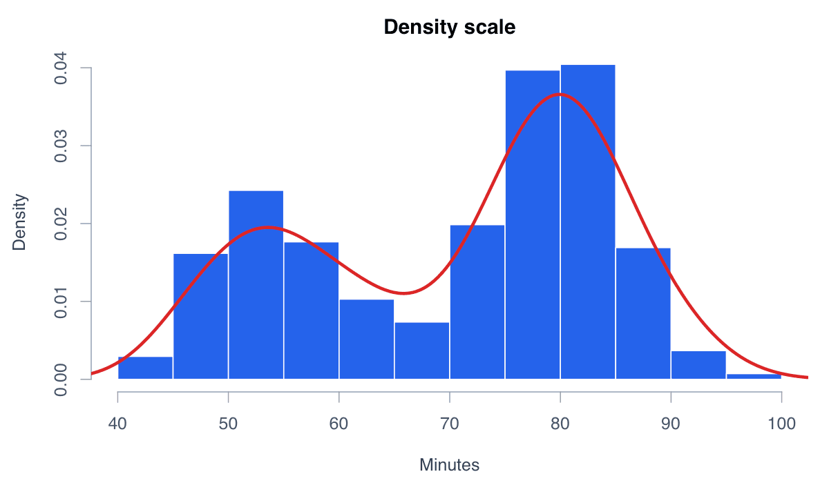
Set probability = TRUE when comparing the histogram with a probability-density curve.
x <- faithful$waiting
hist(x, probability = TRUE, col = "#bfdbfe", border = "white")
lines(density(x), col = "#dc2626", lwd = 3)Transparent overlapping histograms compare two distributions on common bins.
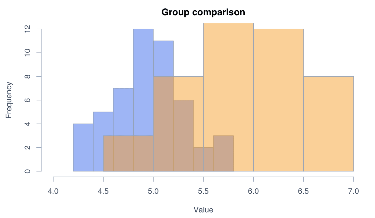
Use identical breaks and transparency. For substantial overlap, separate panels or density curves may be clearer.
a <- iris$Sepal.Length[iris$Species == "setosa"]
b <- iris$Sepal.Length[iris$Species == "versicolor"]
breaks <- seq(4, 7.2, .3)
hist(a, breaks, col = adjustcolor("#2563eb", .5), xlim = c(4, 7.2))
hist(b, breaks, col = adjustcolor("#f59e0b", .5), add = TRUE)A cumulative histogram shows how many observations fall at or below each boundary.
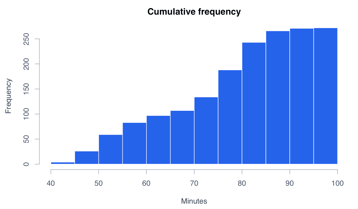
Calculate histogram counts without plotting, accumulate them with cumsum(), then draw the resulting bars.
h <- hist(faithful$waiting, plot = FALSE)
h$counts <- cumsum(h$counts)
plot(h, col = "#2563eb", border = "white",
main = "Cumulative frequency", ylab = "Cumulative count")ggplot2 separates binning, aesthetics, labels, and themes into reusable layers.
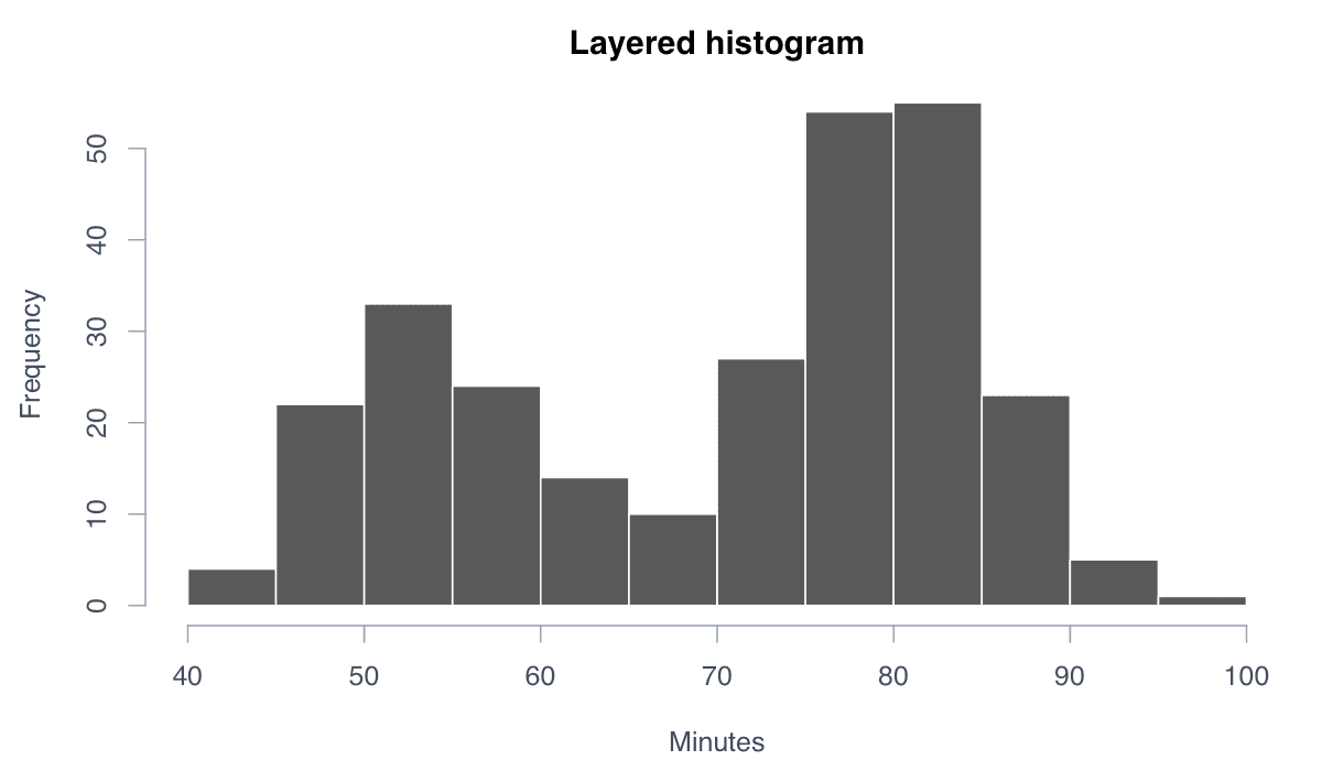
Specify binwidth explicitly so the analytical choice is visible and reproducible.
library(ggplot2)
ggplot(faithful, aes(waiting)) +
geom_histogram(binwidth = 5, fill = "#2563eb", color = "white") +
labs(title = "Waiting-time distribution", x = "Minutes", y = "Count") +
theme_minimal()