Create a Basic Scatterplot
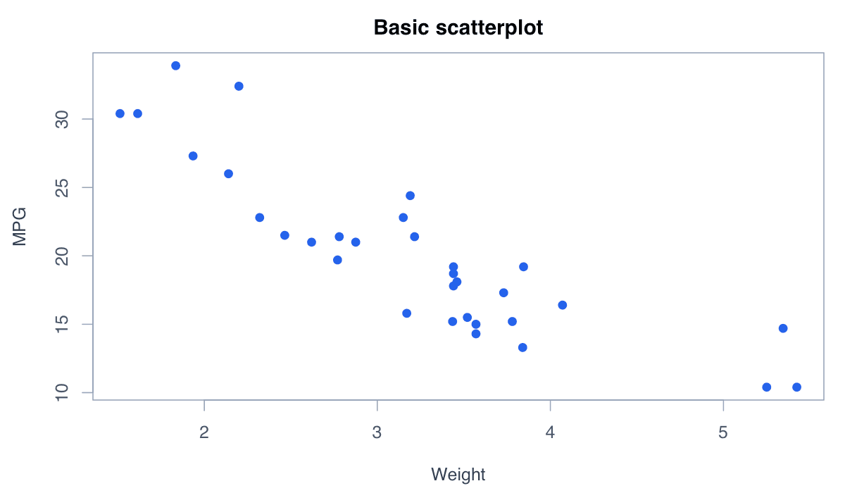
A scatterplot places one quantitative variable on each axis.
R Graphics Ā· Scatterplot
Explore associations, fitted lines, groups, size encodings, nonlinear smoothers, and marginal information.
Scatterplots show paired numerical observations. They reveal direction, strength, form, clusters, and unusual points, making them an essential first step before modeling a relationship.
A scatterplot places one quantitative variable on each axis.

Choose variables deliberately and label both axes with their units so the relationship is interpretable.
plot(mtcars$wt, mtcars$mpg, pch = 19, col = "#2563eb",
xlab = "Weight (1000 lb)", ylab = "Miles per gallon")A fitted line summarizes the average linear relationship between two variables.
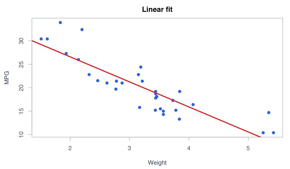
abline() draws the fitted model, but the points remain essential for identifying nonlinearity and influential observations.
plot(mtcars$wt, mtcars$mpg, pch = 19, col = "#2563eb")
model <- lm(mpg ~ wt, data = mtcars)
abline(model, col = "#dc2626", lwd = 3)Color can expose subgroup clusters and group-specific relationships.
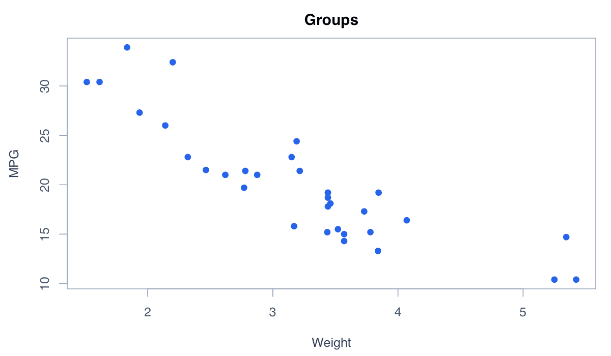
Map factor levels to a small palette and include a legend. Do not rely on color alone when accessibility is critical.
cols <- c("#2563eb", "#0891b2", "#f59e0b")[iris$Species]
plot(iris$Sepal.Length, iris$Petal.Length, pch = 19, col = cols)
legend("topleft", levels(iris$Species), col = c("#2563eb", "#0891b2", "#f59e0b"), pch = 19, bty = "n")A bubble plot varies point size to display an additional quantitative variable.
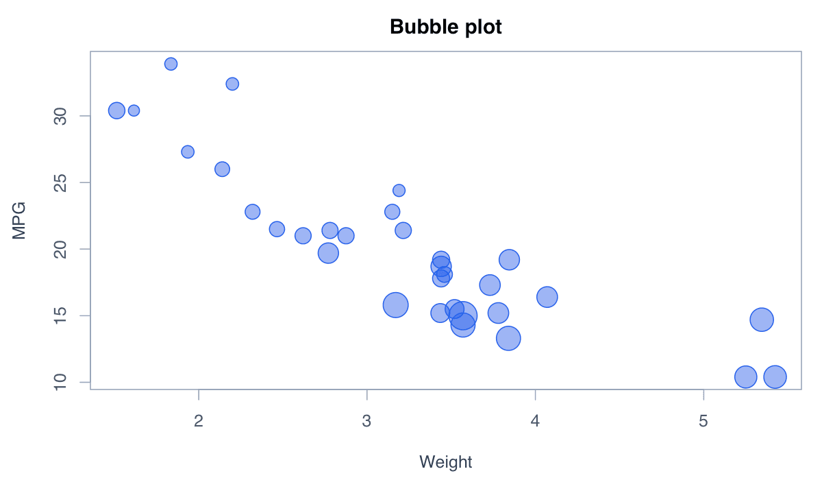
Scale areasānot radiiāproportionally and keep the size range moderate so small values remain visible.
sizes <- sqrt(mtcars$hp / pi) / 3
plot(mtcars$wt, mtcars$mpg, pch = 21, bg = adjustcolor("#2563eb",.55),
cex = sizes, xlab = "Weight", ylab = "MPG")A smooth curve summarizes relationships that are not well represented by a straight line.
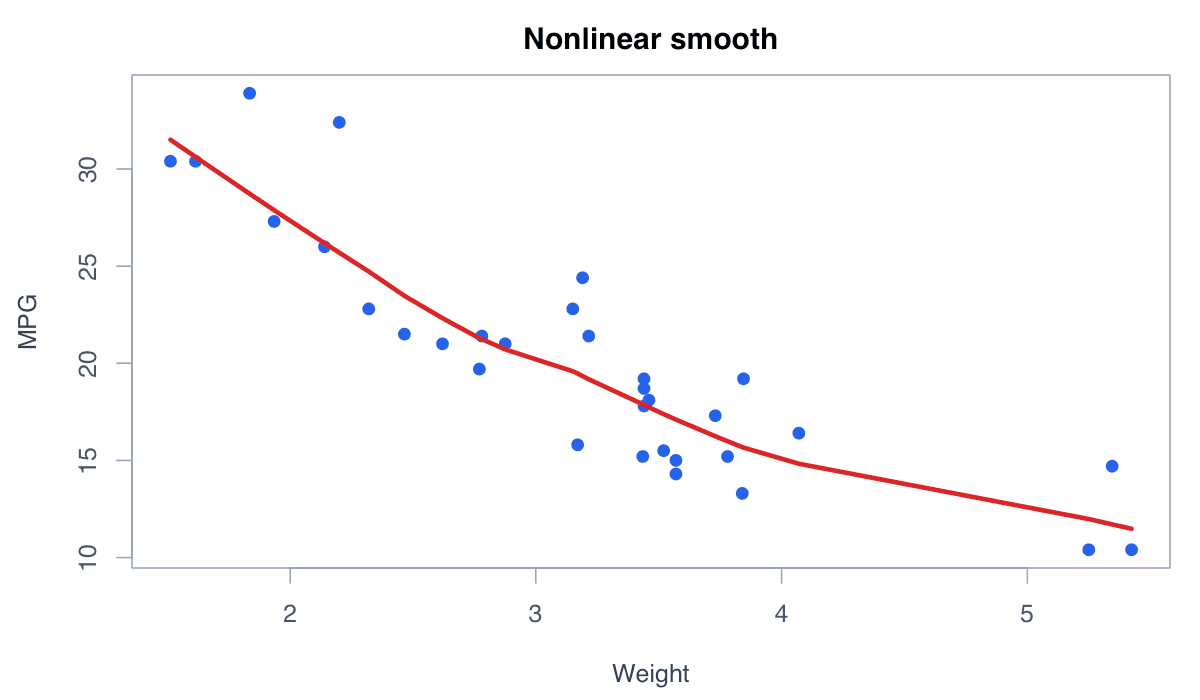
lowess() is exploratory; its flexibility should be chosen with care and reported when used analytically.
x <- cars$speed; y <- cars$dist
plot(x, y, pch = 19, col = adjustcolor("#2563eb",.5))
lines(lowess(x, y), col = "#dc2626", lwd = 3)ggplot2 combines visual mappings, points, fitted models, labels, and themes in layers.
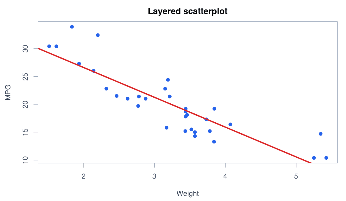
geom_smooth(method = "lm") adds a fitted line and confidence band while keeping the mapping reproducible.
library(ggplot2)
ggplot(mtcars, aes(wt, mpg)) +
geom_point(color = "#2563eb", size = 2.5) +
geom_smooth(method = "lm", color = "#dc2626") +
labs(x = "Weight", y = "Miles per gallon") + theme_minimal()