R Graphics · QQ Plot

Assessing Distributional Fit with QQ Plots in R

Diagnose normality, heavy tails, skewness, group differences, alternative distributions, and simulated envelopes.

6 examplesReproducible R code
Before you begin

Choose the variation that serves the analysis

Quantile–quantile plots compare ordered sample values with theoretical or observed quantiles. Shape matters more than isolated points: systematic curvature identifies departures from the reference distribution.

Examples
06
Levels
Beginner + Intermediate
01
Example 01Base RBeginner

Create a Normal QQ Plot

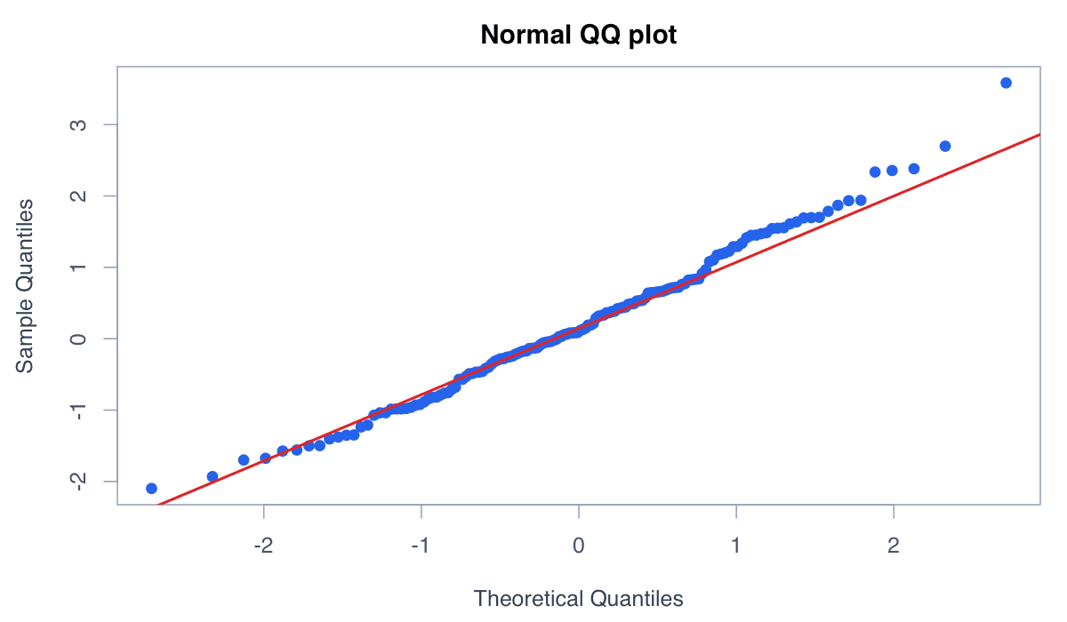
A normal QQ plot compares sample quantiles with theoretical normal quantiles.
Create a Normal QQ Plot example generated in R
R-generated example output.

Points near the reference line indicate an approximately normal shape, subject to ordinary sampling variation.

RRun this code
x <- rnorm(150)
qqnorm(x, pch = 19, col = "#2563eb")
qqline(x, col = "#dc2626", lwd = 2)
02
Example 02Base RBeginner

Recognize Heavy Tails

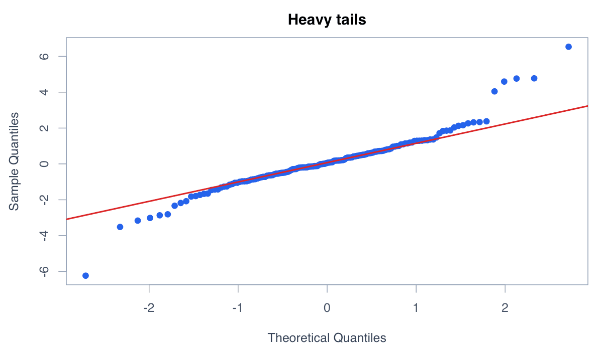
Heavy-tailed data depart from the line in opposite directions at both extremes.
Recognize Heavy Tails example generated in R
R-generated example output.

The S-shaped pattern indicates more extreme observations than the normal reference predicts.

RRun this code
x <- rt(180, df = 3)
qqnorm(x, pch = 19, col = adjustcolor("#2563eb",.6))
qqline(x, col = "#dc2626", lwd = 2)
03
Example 03Base RBeginner

Identify Skewness

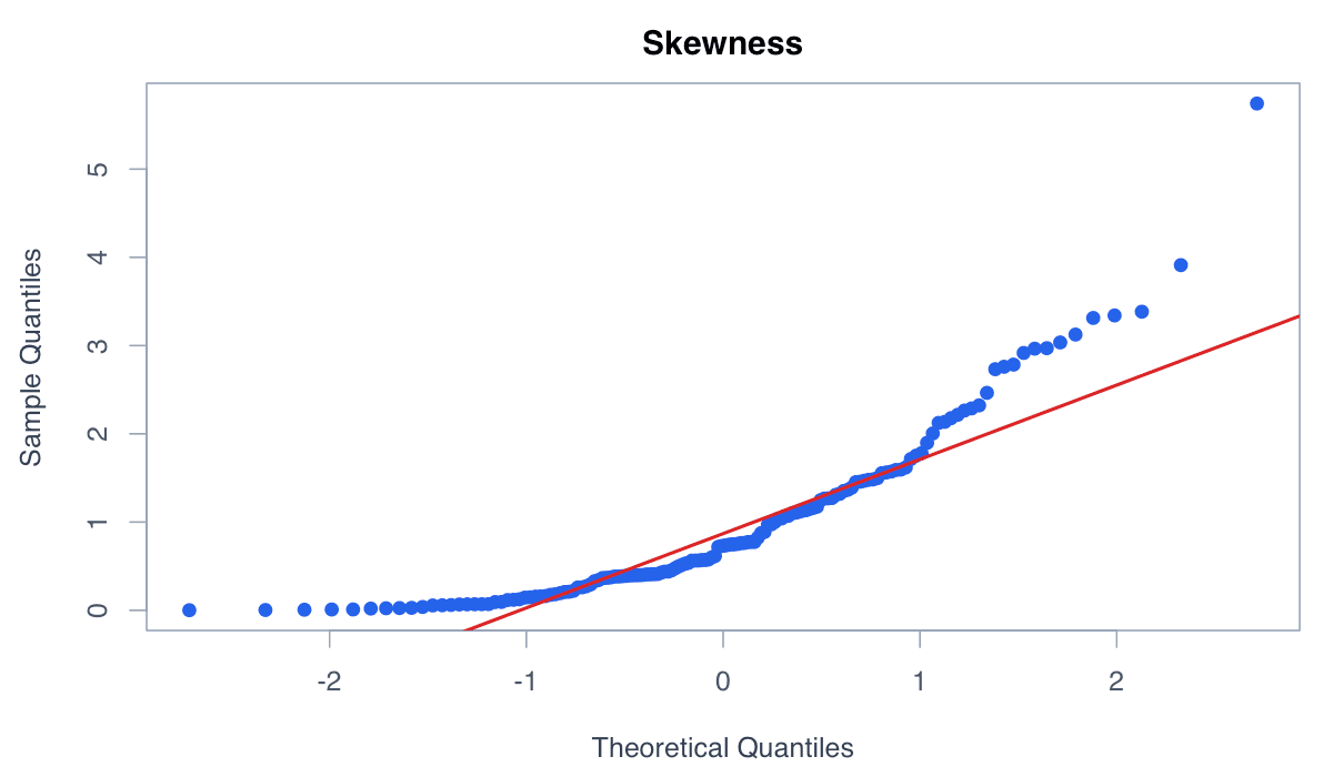
Skewed distributions create systematic curvature rather than random scatter around the line.
Identify Skewness example generated in R
R-generated example output.

A long upper tail typically bends the largest sample quantiles above the normal reference.

RRun this code
x <- rexp(180)
qqnorm(x, pch = 19, col = "#2563eb")
qqline(x, col = "#dc2626", lwd = 2)
04
Example 04Base RIntermediate

Compare Two Samples

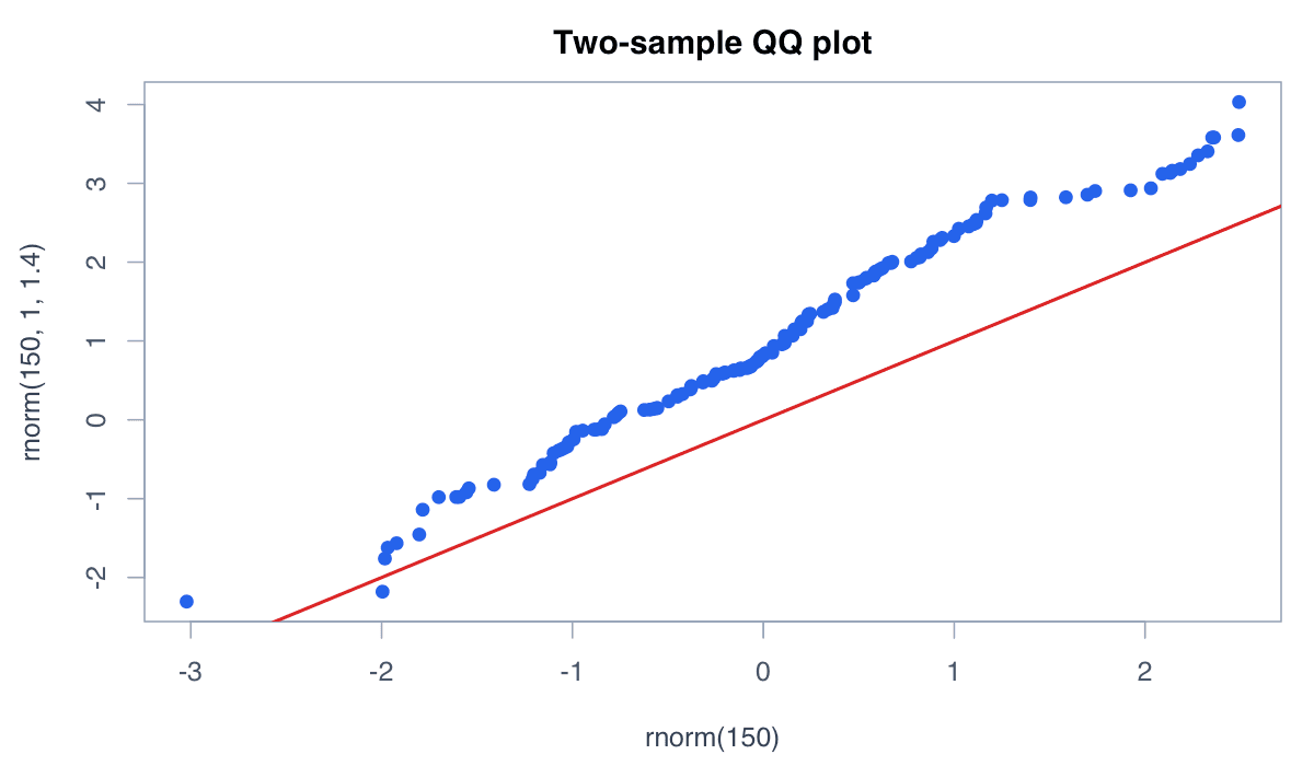
A two-sample QQ plot compares the quantiles of two observed distributions.
Compare Two Samples example generated in R
R-generated example output.

qqplot() reveals whether samples differ mainly in location, scale, or overall shape.

RRun this code
a <- rnorm(150, 0, 1); b <- rnorm(150, 1, 1.4)
qqplot(a, b, pch = 19, col = "#2563eb",
       xlab = "Sample A quantiles", ylab = "Sample B quantiles")
abline(0, 1, col = "#dc2626", lwd = 2)
05
Example 05Base RIntermediate

Use an Exponential Reference

QQ plots can assess distributions other than the normal.
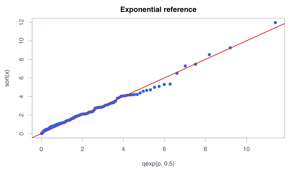
Use an Exponential Reference example generated in R
R-generated example output.

Supply theoretical quantiles from the chosen distribution and compare them with sorted sample values.

RRun this code
x <- rexp(150, rate = .5)
p <- ppoints(length(x))
plot(qexp(p, rate = .5), sort(x), pch = 19, col = "#2563eb",
     xlab = "Theoretical exponential quantiles", ylab = "Observed quantiles")
abline(0, 1, col = "#dc2626", lwd = 2)
06
Example 06Base RIntermediate

Add a Simulation Envelope

A simulation envelope shows the range of QQ patterns expected from repeated reference samples.
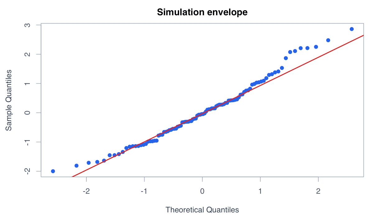
Add a Simulation Envelope example generated in R
R-generated example output.

The band helps distinguish meaningful departures from ordinary sample-to-sample variation.

RRun this code
set.seed(42); x <- rnorm(100); p <- ppoints(100); theo <- qnorm(p)
sims <- replicate(200, sort(rnorm(100)))
plot(theo, sort(x), pch = 19, col = "#2563eb")
lines(theo, apply(sims,1,quantile,.025), col = "#94a3b8")
lines(theo, apply(sims,1,quantile,.975), col = "#94a3b8")