R Graphics · Dot Plot

Comparing Values Clearly with Dot Plots in R

Use categorical dots, Cleveland plots, grouped dots, distributions, confidence intervals, and ggplot2.

6 examplesReproducible R code
Before you begin

Choose the variation that serves the analysis

Dot plots replace bars with position along a common scale. They are compact, precise, and particularly effective for rankings and comparisons across many categories.

Examples
06
Levels
Beginner + Intermediate
01
Example 01Base RBeginner

Create a Basic Dot Plot

A dot plot displays labeled values along one quantitative axis.
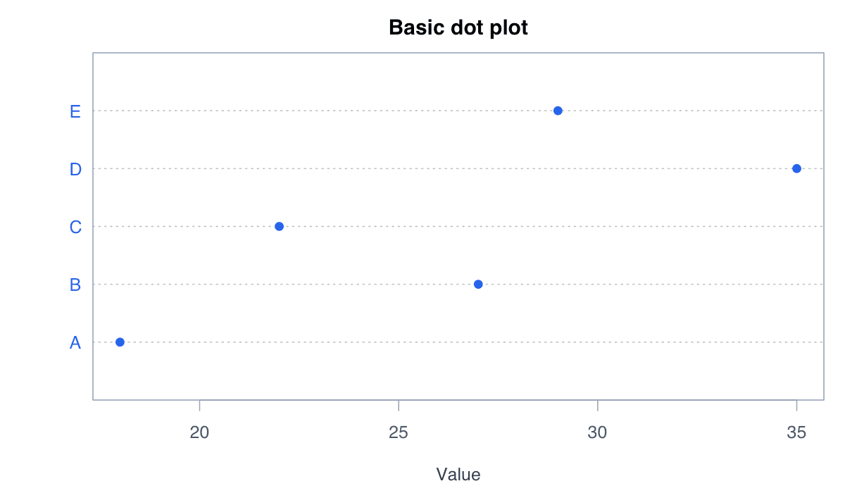
Create a Basic Dot Plot example generated in R
R-generated example output.

Run the code, inspect how the visual encoding changes, and adapt the labels, scales, and styling to the analytical question rather than treating the defaults as fixed.

RRun this code
values<-c(A=18,B=27,C=22,D=35,E=29)
dotchart(values,pch=19,col="#2563eb",xlab="Value")
02
Example 02Base RBeginner

Order Categories by Value

Ordering dots reveals rank and magnitude more clearly than alphabetical order.
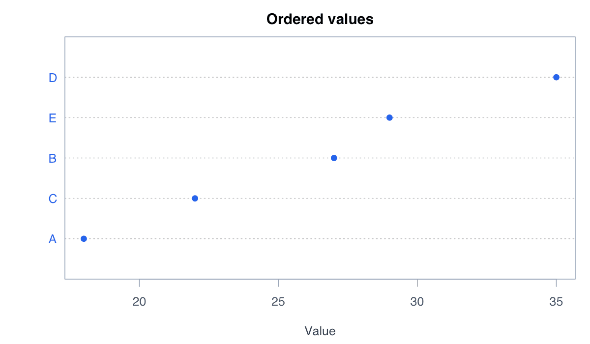
Order Categories by Value example generated in R
R-generated example output.

Run the code, inspect how the visual encoding changes, and adapt the labels, scales, and styling to the analytical question rather than treating the defaults as fixed.

RRun this code
values<-sort(c(A=18,B=27,C=22,D=35,E=29))
dotchart(values,pch=19,col="#2563eb",xlab="Value")
03
Example 03Base RBeginner

Compare Grouped Dots

Grouped dots place related estimates on the same scale for direct comparison.
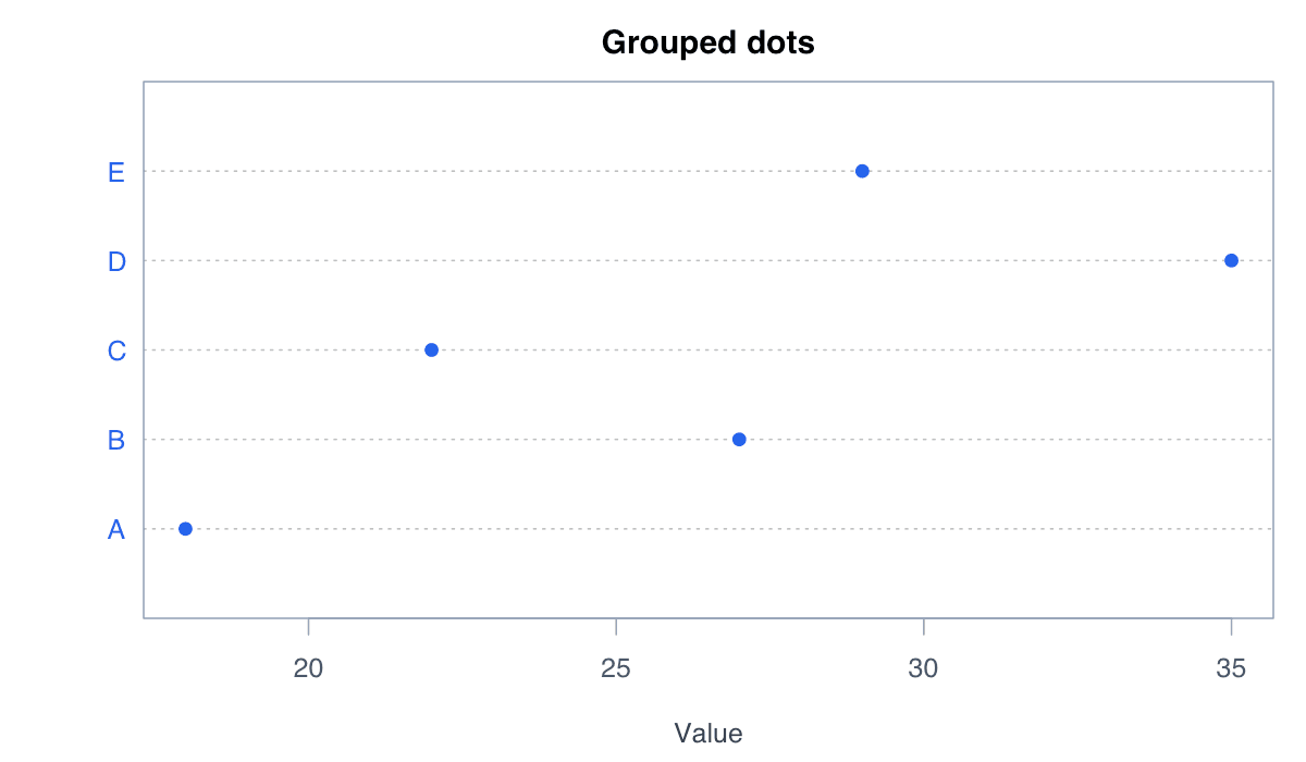
Compare Grouped Dots example generated in R
R-generated example output.

Run the code, inspect how the visual encoding changes, and adapt the labels, scales, and styling to the analytical question rather than treating the defaults as fixed.

RRun this code
m<-cbind(First=c(20,28,24,31),Second=c(24,25,29,35));rownames(m)<-LETTERS[1:4]
dotchart(m,pch=c(19,17),color=c("#2563eb","#f59e0b"),xlab="Score")
04
Example 04Base RIntermediate

Show a One-Dimensional Distribution

Stacked dots reveal repeated or closely spaced observations without binning into bars.
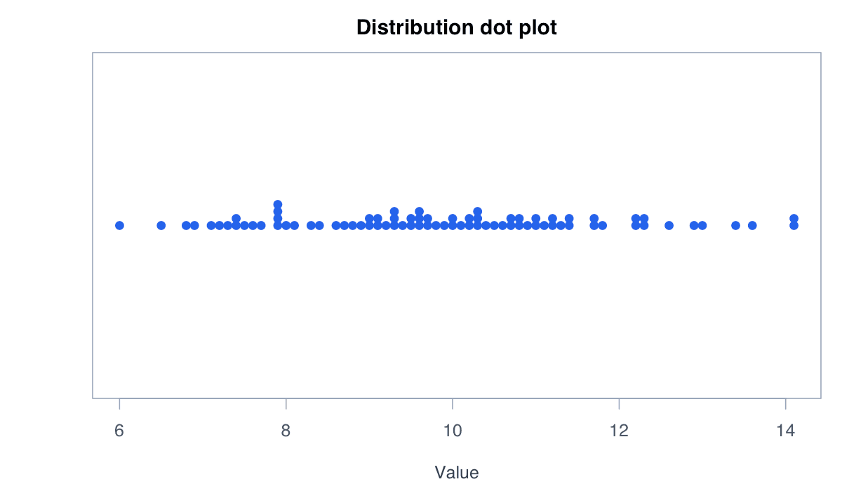
Show a One-Dimensional Distribution example generated in R
R-generated example output.

Run the code, inspect how the visual encoding changes, and adapt the labels, scales, and styling to the analytical question rather than treating the defaults as fixed.

RRun this code
x<-round(rnorm(80,10,2),1)
stripchart(x,method="stack",pch=19,col="#2563eb",xlab="Value")
05
Example 05Base RIntermediate

Add Confidence Intervals

Dots with horizontal intervals display estimates and their uncertainty together.
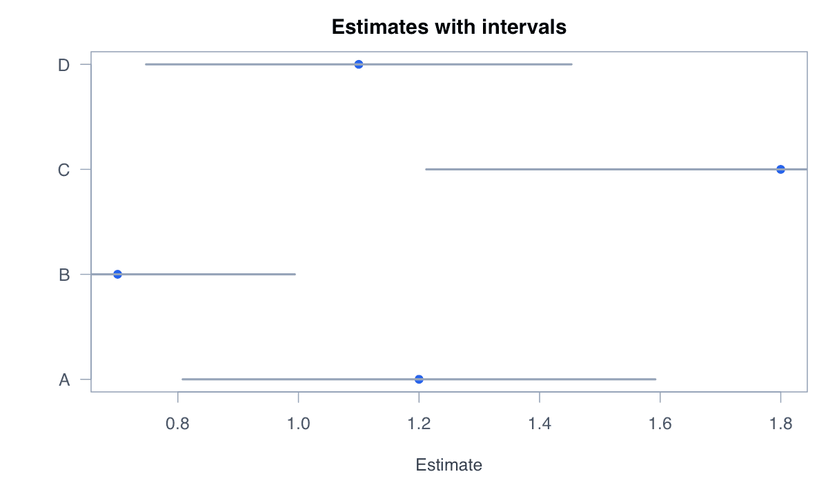
Add Confidence Intervals example generated in R
R-generated example output.

Run the code, inspect how the visual encoding changes, and adapt the labels, scales, and styling to the analytical question rather than treating the defaults as fixed.

RRun this code
est<-c(1.2,.7,1.8,1.1);se<-c(.2,.15,.3,.18);y<-1:4
plot(est,y,pch=19,col="#2563eb",yaxt="n",xlab="Estimate",ylab="")
axis(2,y,LETTERS[1:4],las=1);segments(est-1.96*se,y,est+1.96*se,y,lwd=2,col="#172554")
06
Example 06ggplot2Intermediate

Create a Dot Plot with ggplot2

ggplot2 supports categorical dot charts with flexible ordering and themes.
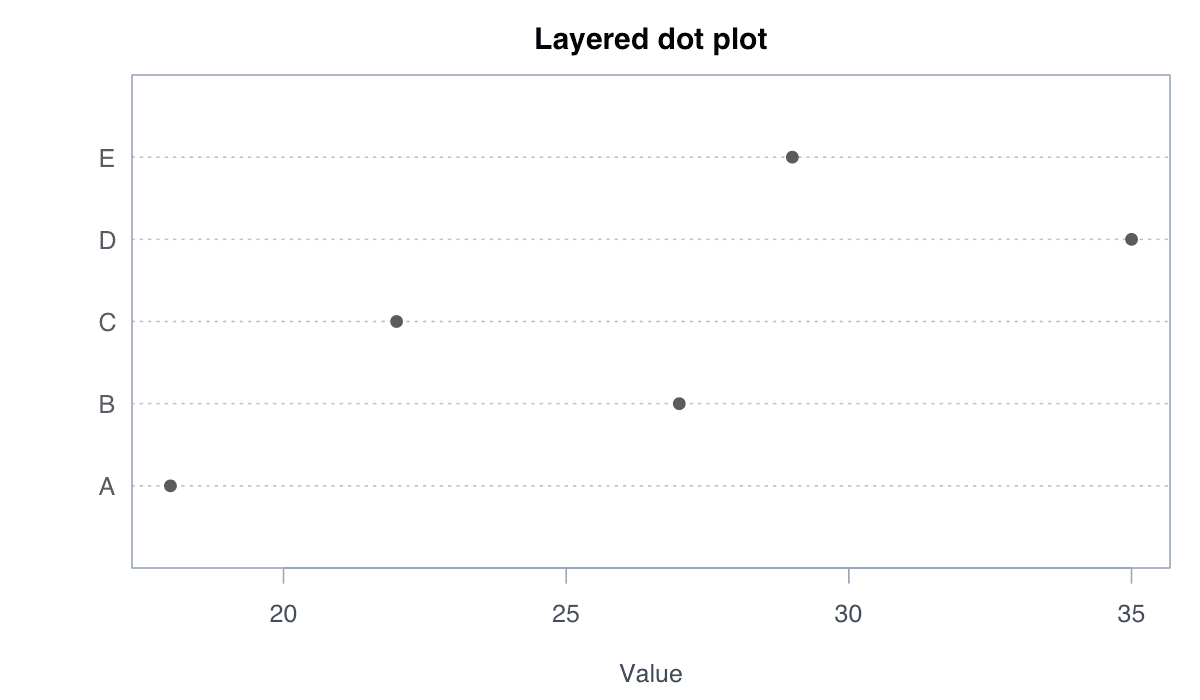
Create a Dot Plot with ggplot2 example generated in R
R-generated example output.

Run the code, inspect how the visual encoding changes, and adapt the labels, scales, and styling to the analytical question rather than treating the defaults as fixed.

RRun this code
library(ggplot2)
data<-data.frame(group=LETTERS[1:5],value=c(18,27,22,35,29))
ggplot(data,aes(value,reorder(group,value)))+geom_point(size=3,color="#2563eb")+labs(y=NULL)+theme_minimal()